Houses Revisited: Buffed up
Strict conditions on a vulnerable coastal site lead Godward Guthrie to develop clever solutions in the design for this house from 2007.
Mercury Bay’s main town of Whitianga has a permanent population of about 4,000 but swells with the summer tides by thousands more. On the northern end of the township is Buffalo Beach, named for the HMS Buffalo, wrecked in a storm here in 1840. These hazardous weather occurences have also risen over the years with climate change and have ultimately influenced a new beachfront home by Julian Guthrie of Godward Guthrie Architects.
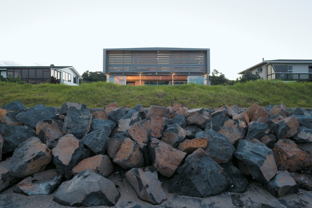
“In terms of siting the building, we had no choice,” Guthrie says. “What was scaring people off was the erosion report that had been done some years before. That stated that the site could be built on but it recommended no closer to the beach than the existing homes on either side. On the road side, there is a longstanding setback because it’s a highway, so a certain area has to be left for potential road widening. The highway restrictions effectively cut off the western side of the land and leave quite a narrow strip to work with. All-in-all, the house was sited by the constraints. Automatically then, the building would have to be lined up with the neighbours.”
Given the enforced alignment, Guthrie deemed it essential that the house be in context with the neighbourhood. “They are all older-style beachside settlement houses from the Sixties and Seventies, essentially situated on the main highway.”
Still more limitations on Guthrie were included in the erosion report. “Part of the report also stipulated that something would be allowed to be built if it was able to be relocated and that ability to relocate must be demonstrable. That, to me, was quite quirky and interesting. As a salient point of the building, this is what’s going on with rising sea levels. We could turn that idea into a positive.”

Guthrie didn’t need a specific brief from his clients as he’d done their previous beach house at Pauanui (Houses NZ, Number 2). “In that case, they had no sea view at all and that was what they missed. They were happy to have a bach-style dwelling of about 150m², with no garage and one open-plan indoor/outdoor living area. Like their last beach house, they wanted it to be practical and low maintenance.”
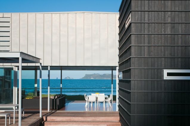
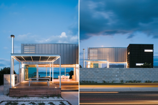
The solutions came down to thinking within a box, or a couple of boxes. “We came to the notion that [the house] should be a series of separate parts,” Guthrie says. “The three bedrooms became their own separate box, a sleeping container in the style of a shipping container. We wrapped that in zinc, which also folds down into the ceiling below. On the seaward side, we put zinc shutters. It is, effectively, a zinc-wrapped box. This we floated over the living area as minimally as we could.” The living area underneath is almost entirely aluminium and glazing. There’s kwila hardwood decking and floors throughout with big, wide steps to the east and west sides. These approaches to the house go straight into the living area. There is essentially no entranceway. “That reinforces the sense that this is a casual place at the beach.”
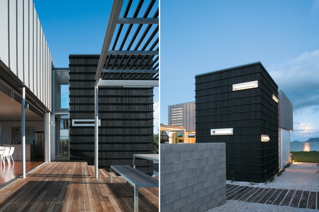
The other box at the back of the house contains the laundry, the bathroom and the stairwell. “Essentially, it’s a utility block. This is clad in black-stained cedar with a batten overlay. It looks like a fruitcase – like the type typically used as a transporting box that you pick up and move. The different cladding materials also fit in with the bach-type sense that pieces have been brought together. There’s a fully-glazed bridge link between the two boxes.”
Guthrie’s third component is a free-standing pergola that creates an outdoor room on the west side, with an outdoor fire and barbecue area. This fire is alongside one in the living area and are box in situ concrete. “They are the two anchors, and if the house were removed, the fireplaces is all that would remain.”
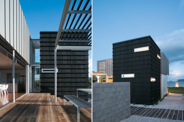
While it all appears to be simplicity, there are some deceptively complex elements at play. “The zinc wall shutters fold down and become a shade in the daytime,” Guthrie says. “They are on a motorised pivot, which is unique and was incredibly difficult to do. They are zinc planks rather than aerofoil or anything too techno. When down, they provide 50mm slots of the view while protecting the house from the nor-easterly storms which sweep down the coast. As well, the shutters provide security and privacy from anyone walking along the beach.”
On the western, inland side, a raw concrete wall acts as a shield from the road. But this is low enough for the occupants in the house to see the bushclad hills across the road and for the afternoon sun to fully manifest itself in the house. “The higher parts of the house have gun slot outlets that look back towards the west.”
The interior walls are painted plywood, simple, practical and hard-wearing. The internal layout Guthrie describes as “bach-style”. “There’s a couple of little wardrobes and there is an en suite,” he says.
As a comfortable beachfront home, there is nothing here to quibble about, and Guthrie is unabashedly pleased with the contextual appropriateness to the site. “It feels right on the site and it sits comfortably with the neighbours,” he says. “The overall approach can be seen also in the landscaping. Once we were finished, we put all the lawn back just as it was and planted agapanthus and hedging just like the neighbours. While being highly architectural, it retains a modesty about itself – the sort of qualities we grew up with but seem to be losing in our beach communities.”
Click here to see more Houses Revisited. And sign up to our email newsletters to receive Houses Revisited straight to your inbox.
Note: Since the time of writing, the architecture firm mentioned may have changed personnel, name or both.

