Houses Revisited: Easy stretch
In this project from the Houses archives from 2008, Megan Edwards demonstrates her mastery of the bungalow extension in an older Auckland suburb.
It’s one of those odd quirks of language that we so easily abbreviate those words that define extension: alts, ads, renos. (Meaning, of course, alterations, additions and renovations.) Those abbreviations make the projects sound snappy and straightforward, when in actuality they can be the most fraught architectural jobs. All those unknowns: foundations; insulation; wiring; untreated timber; coupled with often tight restrictions on altering the streetscape and tight shoulder-skimming sites. Usually, only the back garden is left as the available possie for the reno.
Megan Edwards, architect of this alteration and addition in Mt Eden, jokingly laments that she has been pigeonholed as an alteration architect, having not had the chance to do a new house in ten years. But all that practice means she is a master at these ‘abbreviated’ jobs. Even with this property, a house that initially looked grim due to the south-facing section and dark and cramped interior, she has managed to unfold the bungalow into the garden and create a contemporary and warm home while retaining the texture and character of the bungalow.
It is, of course, this indefinable ‘character’ that causes people to gravitate to old villas and bungalows. For all their draftiness and maintenance headaches, these houses have a richness often missing in modern designs. The texture of timber weatherboards and plastered ceilings, the elegant proportions of rooms with high studs, the surprise and comfort of nooks and crannies that open-plan designs forgo – all make for a memorable environment.

But, still, burrow-like collections of small rooms tucked off a narrow corridor are not spaces we now wish to inhabit. The single laundry door to the back garden doesn’t allow for casual unfurling onto the deck and the lack of insulation and drafty windows increasingly are regarded as intolerable. So there is great cause to reconsider these older house types, and to reconcile their forms and performance to contemporary domestic requirements.
Megan Edwards is particularly skilled at accommodating the lifestyles of her clients. Each of her projects, while often dealing with the same rear-end push-out and open-up, is treated quite differently. With this house, the clients both work at home and there are teenage children still roaming the house; there needed to be areas for family members to retreat from each other. One of the clients is a chef and magazine food editor who also takes cooking classes at home, and of course, this is still first and foremost a house for a family.
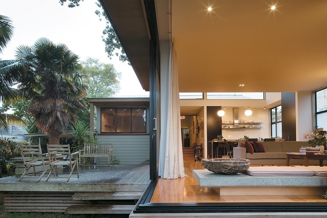
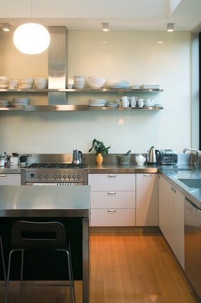
The architectural solution is seemingly simple. The bungalow has largely been left as is in the front (albeit with a bit of rearranging and renovating), while the back has been pushed out. An extruded pavilion now hovers over the rear garden. This design strategy naturally sets up a dichotomy of spaces: the front is contained, cozy, sheltered; and the back is light, open, modern. Between the two areas a large frosted door allows light to seep through, while closing off the back to offer privacy. The frosting is echoed in the strips of glass in the bottom half of each window in the pavilion that block out the neighbours, and in the office door. Consistently throughout this house, the architect has nimbly navigated between openness and retreat, privacy and familiarity.

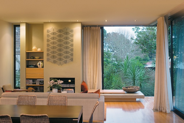
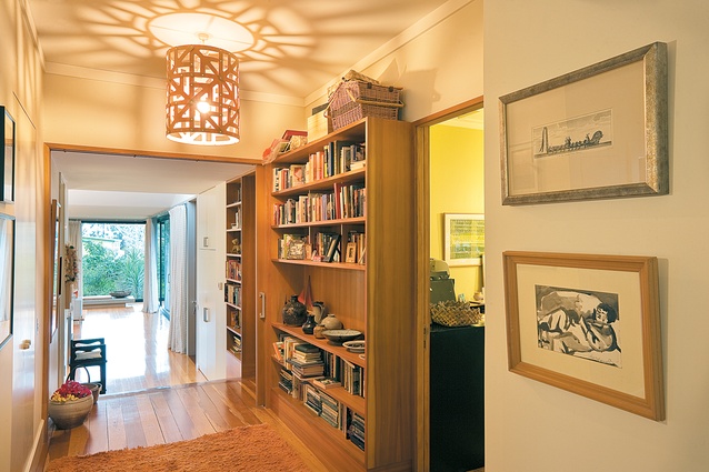
The hall, pushing through where a bedroom used to be, is a generous area holding built-in shelves filled with books, art and photographs. Even in a reworked element such as this there is a strong sense that the texture and character of the old house has been retained. Timber has been used to create a sense of warmth but much of the texture in this house comes from the clients themselves: from their ornaments and books, their prints on the walls and their cushions on the couch.
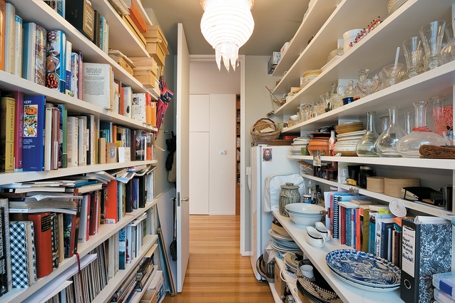
This isn’t a house that seeks anonymity; rather, it matter-of-factly expresses the fullness and purposefulness of the lives lived within it. The intensity of working careers bundled into two studies is particularly strong evidence of this layered occupation. The cook’s study is a narrow slot tucked in behind the kitchen, a thin space lined with books, platters and art. This tight and personal space suggests that although the butler has the run of the manor, he still feels most comfortable in his pantry.
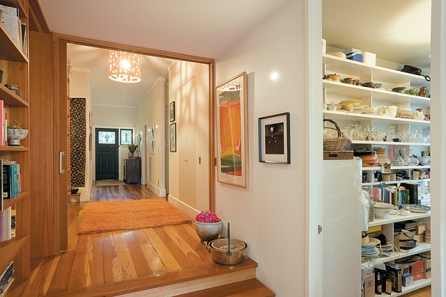
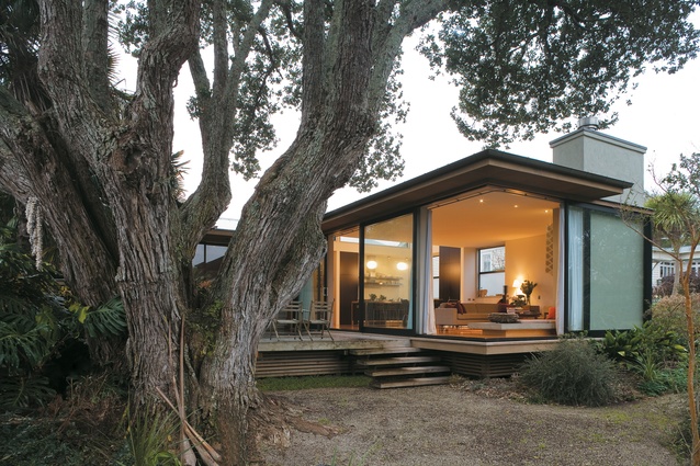
The pavilion, with a high stud that echoes the proportions of a traditional bungalow, is a simple box, with a pop-up saw-tooth rise above the kitchen area to a clerestory window that lets in northern light throughout the day. To the southwestern corner the pavilion opens up much like a tent with glass sliding doors that tuck away leaving the living room suspended over the garden. A huge pohutukawa, hidden before the renovation, takes pride of place in the garden. The tree, propitiously positioned to the west of the house, naturally filters low western light, allowing the glass box to work well in summer as well as winter.
By keeping the bungalow proportions this room engages with its front of house roots while defiantly pushing out of the Edwardian planning constrictions. From outside, rather than a simple break from one part of the house to another, there is a complex interlocking jigsaw-like arrangement where the new house is spliced into the old. While the addition seems straightforward and obvious, it is concealed moments such as this eastern elevation that hint at the careful and complicated arranging that occurred throughout the design. The architect’s particular attention to level changes, especially in the well-placed steps between the old and new sections and in the pavilion’s delicate lingering over the site’s slope, is where this house excels.
Alterations are about change. This renovation has not only changed a dark and somewhat uninviting house but has also transformed how the owners live in the house. Through careful investigation and consideration of the clients’ habits and hopes, Megan Edwards has crafted an inventive solution that fits comfortably with the original bungalow. Innovative or interrogative? It’s all just semantics, really. This is a lovely, relaxed house.
Click here to see more Houses Revisited. And sign up to our email newsletters to receive Houses Revisited straight to your inbox.

