Houses Revisited: Elocution lesson
Lance Herbst’s small apartment building in Parnell is a top-end model of clarity, first published in 2006.
Location, location … Nowhere does the real estate mantra have more point than in the inner suburbs of Auckland, where just a peep at the harbour adds big dollars to the value of a residence. So when an investor finds a small development site in a desirable street, with sweeping city and harbour views, there is enormous pressure to capitalise on every square millimetre of profitable space. Among the challenges waiting for any architect taking on such projects are the Council zoning laws relating to neighbouring spaces – Auckland has no shortage of inventive new small-site building designs that have been shaped or contorted to appease the regulators.
This boutique block of apartments in Alberon Street, Parnell, was zone-restricted to three dwellings and a height of 15m. But far from being irregular in shape, the building is a symmetrical box that appears to be one large dwelling, and as such not out of character with the heritage homes in the street. Architect Lance Herbst was fortunate to be able to work with a symmetrical corner section and design, in his words “a cubic form aligned with the site boundaries”. The real challenge, Herbst says, lay in maximising the floor space to create luxury apartments under one roof that would compete in spaciousness, appeal and price with new, purpose-built, single dwellings in the area.
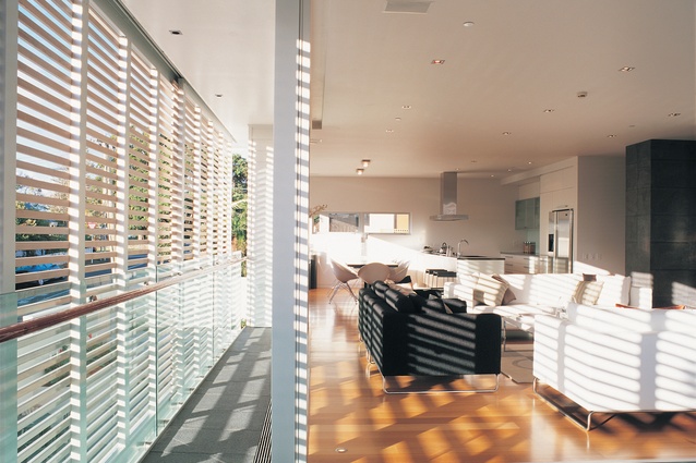
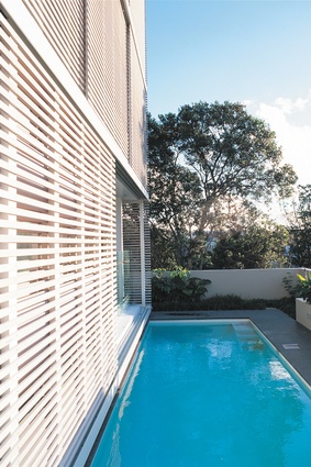
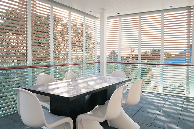
The building’s façades are, to some extent, expressive of two different building zones. The eastern and southern walls, facing multi-storey zoning on the interior of the site, are of raw, pre-cast concrete with small windows to preserve privacy. The street-side northern and western façades, where the zoning changes to single residential, are a combination of block walling, weatherboard (unusual in a building of this height), and large cedar shutters that break up the surface mass. When shut, these wooden curtains conceal 13m2 loggias, or terraced gallery spaces, carved from the cube shape of the building at each level. “The [loggias] bring the scale of the building down to a residential one in keeping with the neighbourhood,” says Herbst, pointing out the dapple light fashioned against the side of the building. “And they also provide a sense of enclosure and privacy to the living spaces.”

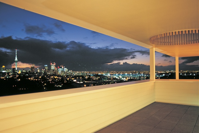
Inside, these shutters have the effect of open Venetian blinds, affording degrees of privacy while allowing inhabitants views through the slats. Herbst effortlessly pushes each set of three screens along their separate tracks so they park, overlapping, out of sight against the side of the building. A multi-million dollar view of the cityscape and inner harbour appears like the opening of a feature film. “Even though these are large apartments, we were still struggling for space, and in this market there is an expectation of size. So we pushed hard to blur the edges between outside and inside living with the screens.” Floor-to-ceiling glazing and sliding cavity doors complete this exercise in blurring or dissolution. The result, Herbst says, is that “views are very eloquent.”
A lift and stairwell, contained on the outside of the building in a curvilinear extension on the south-western corner, provides the only access to the interior. The first floor apartment, taking advantage of excavations for the garage and basement area, has ground access to its own private pool and small garden, compensation for its more modest views. All three apartments share a common square floor plan. Two have three bedrooms and are identical inside, while the penthouse has four bedrooms and is spread over two levels. Concrete floors separating each dwelling are overlaid with Tasmanian Ash timber sitting on an acoustic underlay. The square plan left a windowless space in the middle of each apartment that is used as a media room, an amenity which Herbst desribes as a “modern requisite”. Fitted out with top-range home entertainment electronics, such as Loewe plasma screens, these areas can be closed off with cavity sliding doors.

An outer wall of each media room is lined with coned basalt tiles, forming a dramatic feature with a black volcanic surface, an appropriate gesture in a city shaped by its now-dormant volcanoes. Basalt tiles, in various textures, also feature on the hearths of the open gas fires, over the heated bathroom floors, on top of the kitchen peninsulas (in polished form), and over the terrace spaces where the tile surfaces have been ‘flamed’ for a coarse effect. Other common details include the use of walnut for the cabinetry and the colour white in its natural striking brilliance.
Ceiling levels reach a generous 2.7m and internal doors are full length. Herbst swings one of the bedrooms doors to demonstrate its solidness: “Weighs a ton, moves like a Rolls Royce.” Extending over two floors, the living space in the penthouse apartment is comparatively voluminous but follows the uncluttered crispness of the other apartments. In the penthouse, a separate lounge on the second floor features a covered terrace offering the best of the building’s views, without having to climb up on the roof. Its solid, waist-level weatherboard balustrade imparts a sense of security to this high loggia.
Also on the penthouse second floor, the master bedroom features a 4.5m sliding glass door that opens up the northern exterior, while an internal window on a solid west wall offers further views through the upper living space and beyond. There is no shortage of room, either, in the ensuite, which is dominated by a spoon-shaped Agape bath in the middle of the floor. The bath’s bright white matt surface contrast starkly with the black basalt floor tiles. Off this bathroom is a dressing room big enough to have dancing lessons in – again, Herbst adds, “required at this end of the market.”
No glass louvres anywhere? Herbst laughs. Perhaps, I suggest, the ubiquitous louvre is an Australasian thing. Herbst trained in South Africa where residential architecture leans towards the European and building materials typically are solid. They don’t use weatherboard, for instance. This restrained Parnell building, with its crisp lines and thoughtful clarity, expresses the sort of formality one might expect from designs using more unyielding materials. “But I’ve been here for over eight years,” Herbst points out. Long enough for one architectural culture to merge profitably with another.
Click here to see more Houses Revisited. And sign up to our email newsletters to receive Houses Revisited straight to your inbox.
Note: These are stories from our archives and, since the time of writing, some details may have changed including names, personnel of specific firms, registration status, etc.


