Houses Revisited: Float on
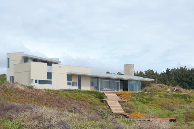
In another 2007 project from Gerald Parsonson, an assured house at Peka Peka rides the dunes rolling inland from an untamed coast.
Peka Peka is a quiet settlement north of Waikanae on the Kapiti coast, which is currently enjoying renewed interest as a place of escape. A series of dunes march back from the coast, rising slightly as they head inland. It is on one of these dunes that Gerald Parsonson designed a simple box for a couple in 2002. She worked in Palmerston North, he in Wellington, and they chose Peka Peka, the half-way point, as the place for their house.
Working with a tight budget, Parsonson created a simple form that lies across the dune, rather than digging in. This afforded views across to Kapiti Island, slightly to the south, and an uninterrupted horizon to the west and north.
The house was a simply decorated box that emphasised the horizontality of the site. A future extension – a vertical box – was designed at the same time. The owners were transferred and they never got to build the addition before they sold the house (which recieved a NZIA New Zealand Award in 2005).
However, the new owner – an expat with a love of this coast – was determined to build the addition. Aware that Parsonson had designed an extension, the owner approached the architect and together they revisited the scheme. Even though money was less of a concern now, the extension remained modest and true to the original house. The original house looks like it has alighted on the dune.

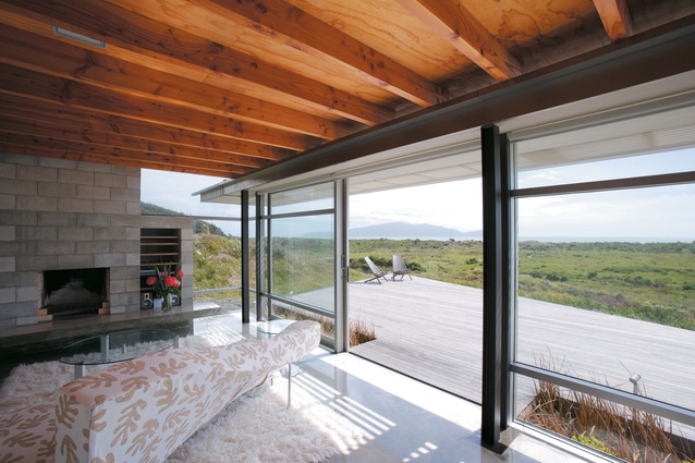
A panelled box form to the north contains the bedroom, bathroom, toilet and laundry. To the south is a simple space housing kitchen, dining and a small living room. This room is glazed to the west with a simple narrow pergola providing relief; here, the house flicks an eyelid up, winking at the horizon. Parsonson wanted to let the dunes be the dunes and emphasised the natural forms with a floating deck to the front. The house has a softened, loose relationship with the landscape, yet remains a tightly controlled space.
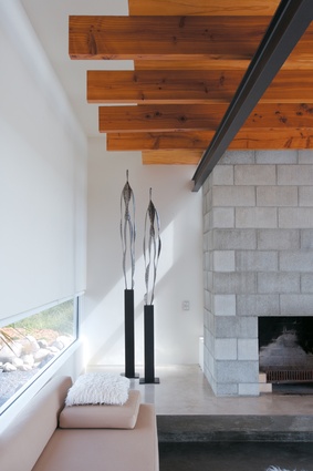
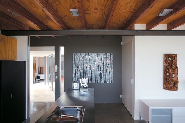
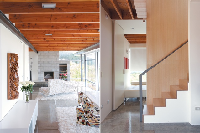
Entry is from the rear and is so discreet that it is almost invisible, hiding behind the façade. The main space is a series of sliding gestures – literally, with the doors that open to the west, and figuratively, with a beam overhead that slides past a supporting wall. This beam in turn supports ceiling joists that slide over the top of it. The fireplace slides vertically through the space. These simple gestures create extraordinarily intimate and intriguing spaces: the entry becomes a moment of pause before the dramatic view is revealed; a concrete window seat that continues the entry creates a small world at the end behind the fireplace.
The kitchen is simple with plywood cabinetry, meticulously detailed. The bathroom is fresh, with a low window over the bath. The bedroom at the end turns its back to the north, giving views to the Waikanae hills to the east and a low view of Kapiti to the west. The doors are not hinged but rest on pivots and when they are all open they appear as fins lining the corridor.

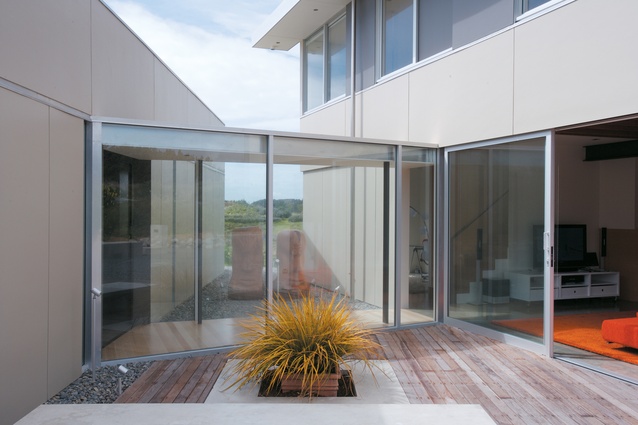
The new box behind is reached through a glazed link impeccably detailed with an exquisitely thin roof. This box, unlike its rectilinear parent, is slightly triangulated with part of its western face chiselled out. A sitting room downstairs to the south has sliding doors opening onto to the entry courtyard, creating a social space where once there was barely an entrance.
It continues the language of the first living room with sliding joists over a steel beam. The room is decorated in a fury of orange with a vibrant couch, plateaus of orange rust, floating on an electric square of anemone rug. This is consistent with the bold, yet not excessive furnishings, elsewhere.
A study with a daybed has the only view due north, ignoring the sea and the hills. A window on the stair provides eastern views, excusively of hills, and upstairs the position of the bedroom is reversed from that of the original building – here, it is to the south, with the bathroom at the north end. Slot windows give a partial view of Kapiti from the bed.
Flipping the planning is consistent with the change of form from horizontal to vertical. The extension becomes a companion to its predecessor and its complement. Both architect and client have resisted the urge to make a small house huge with the addition, keeping the faith. The original is a house of order; the addition is, in the words of the architect, “a thing scattered”. This scattering is evident in the new decks that fall into the dunes to the west of the house and in the simple decks and blocks of concrete at the entry. It is as if the building has grown older and wiser, and less uptight.
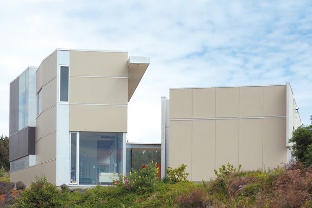
Materials throughout are elegant but not expensive. Polished concrete alternates with Victorian Ash on the floor. The pine ply of the kitchen is not pristine but clean. Outside, fibre-cement sheets are detailed to run past the windows, disguising mullions. On the extension, the sheets alternate with panels of aluminium. At the entranceway, they alternate between horizontal and vertical, like giant scales of a beached fish. This movement of sheets makes the building a house of cards, but one of substance not fragility.
It is a collection of walls that combine to become a three-dimensional tessellation of space and form. The building is at once private and exposed; its skin in some places hides the form and in others is peeled back to reveal it. Elevations are laid upon elevations to create layers in very thin skin. This is a light, airy, transparent building, yet one that still has a sense of place and shelter. It is very economical, and almost precise in its informality.
Dunes are temporary things, forever lifting, shifting and relocating, wild and uncontrolled. This simple house at Peka Peka is neither. It is, however, almost casual in its restraint. In the hands of someone else, it might be called lazy; in Gerald Parsonson’s assured hands, it is relaxed. This house of two boxes, each alike in their dignity, exceeds the sum of its parts.
Click here to see more Houses Revisited. And sign up to our email newsletters to receive Houses Revisited straight to your inbox.

