Houses Revisited: Hataitai kitchen
A cool, calm and collected kitchen designed by John Mills, first published in 2012.
John Mills’s clients wanted a kitchen that would sit thoughtfully in the Hataitai house he was designing for them. They wanted it to be tidy and elegant, but it did not need to be large. They are a family of four, and felt that a standard sized kitchen would better allow for other living spaces to take the lead role. According to Mills it is designed to be quiet, friendly and very much residential.
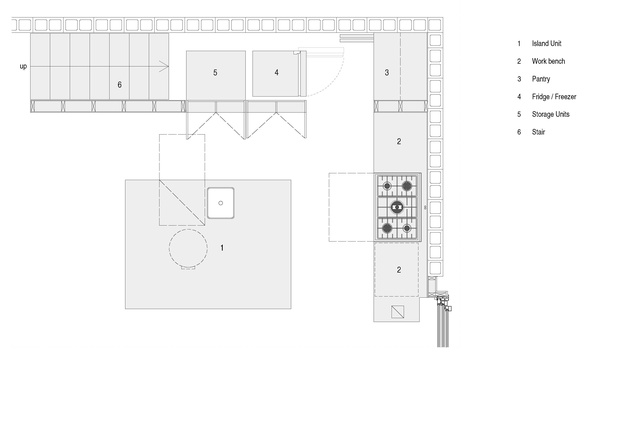
The placement of the kitchen in the northwest corner of the living space was to allow for the lounge to get most of the sun and light, and make sure that the kitchen didn’t take up the prime real estate. The room is open, so it is still a light space and shares the views past the lounge to Evans Bay and the Miramar Peninsula beyond.
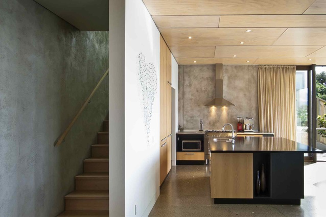
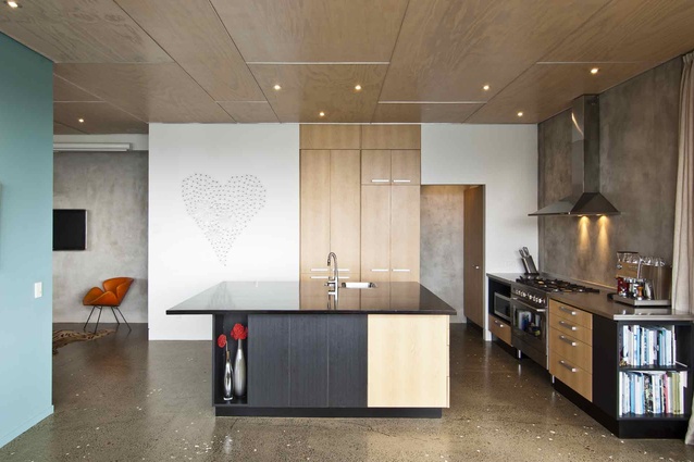
The placement of the oven and rangehood also creates privacy from the neighbours on the north side. The fridge, pantry and storage space are neatly tucked under the stairs. There is an open walk in space to access the fridge and pantry on the west wall.

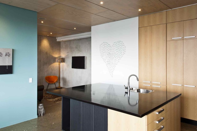
The material palette used is also in keeping with the house. The island bench has stained dark plywood offset with sections of pale plywood around the base. The cabinets echo the blonded ply of the ceiling panels. A soft, textural grey splashback has been achieved with a pumice and plaster mix. This is used throughout the house.
“The clients wanted the kitchen to quietly speak kitchen and loudly speak lounge,” says Mills. The island bench is a distinct move away from the rounded edges, circular shapes and vivid colours that can been seen in many kitchens designed by Mills. This was a response to the clients’ desire for the island to look like furniture rather than a kitchen bench.
Mills has successfully designed a modest, elegant kitchen for his clients. The materials are neutral without being dull, and the plan is simple and thoughtful.
Click here to see more Houses Revisited. And sign up to our email newsletters to receive Houses Revisited straight to your inbox.
Note: These are stories from our archives and, since the time of writing, some details may have changed including names, personnel of specific firms, registration status, etc.


