Houses revisited: Herne Bay house
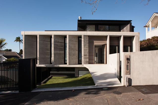
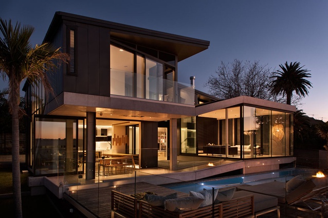
In an area of predominantly heritage homes, a new build must pay homage to what has gone before. In response to the grand character villas that surround this house in Herne Bay, architect Daniel Marshall has created what he calls an ‘unravelled villa’, a home that interfaces with the street, but still allows for privacy within.
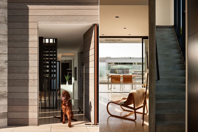
Set back six metres from the street, the public face of the house consists of a series of concrete louvres, which act in a similar way to the front porch of a colonial villa, screening private life while still remaining friendly to guests. Off-shuttered concrete and cedar weatherboards further this connection to the past.
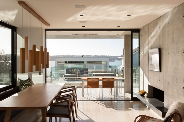
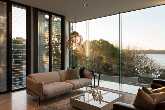
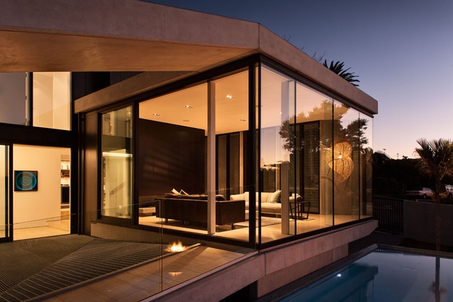
“Conceptually, the layout of the house can be seen as unpeeling like an orange around a central void. This also helps structurally. To use another simile, you could think of a wine barrel. The steel straps hold the shape of the wood. Similarly, we have used a ring-beam of concrete around the outside to hold the house together, which in turn allowed us to use a lot of glazing, important when you have all those sea views,” says Marshall.
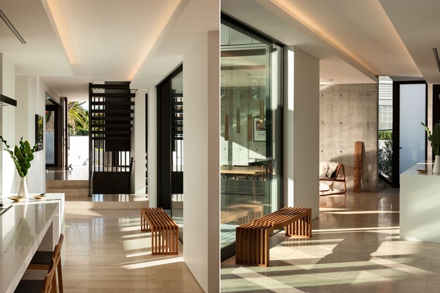
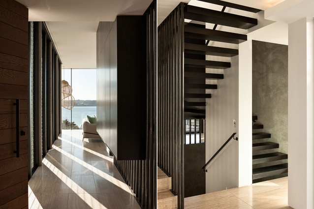
The central void the architect speaks of carries through all three levels of the home and allows light and views to the central spaces. On the ground floor level, where the living areas are located, the void is covered with a metal mesh, which can be walked upon, but still allows light to the lower ground level, an area containing garaging, a media room and a study.
“Being so close to the street, we wanted the house to have more of a pedestrian interface, as opposed to using valuable space for storing cars, so we put garaging underground. Upstairs, the living rooms are spread over three levels. The front lounge is set at a higher level to better access the sea views, but also logistically to allow cars to pass underneath,” says Marshall.
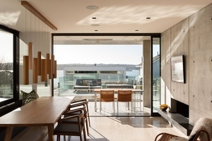

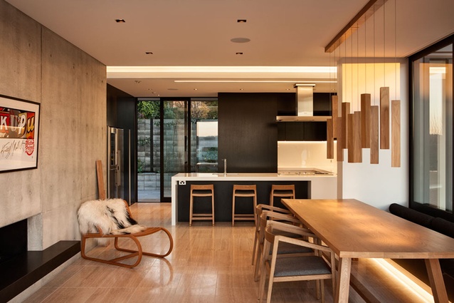
It is on the ground floor that the orange peel simile becomes clear, as the periphery of this level curves up as it goes around, with the lounge room accessed by steps from the dining area and a ramp from the deck. A conversation pit is nestled a step down to the right of the front door, opposite the raised lounge, furthering the play on levels. This space can be closed off completely for a winter snug, or opened via French doors to a lawn area.
Externally, Marshall has used Anthra zinc cladding on the upper level, to counter the pale, precast concrete downstairs. Inside, the master bedroom has its own staircase accessed from the kitchen and dining. This removes the need for a corridor between the central stair and the master bedroom, which in turn allows more light into the third bedroom from the central void. The master bedroom features a bathtub positioned alongside the upstairs deck, so the clients can look out at the sea while having a soak.
Click here to see more Houses Revisited. And sign up to our email newsletters to receive Houses Revisited straight to your inbox.
Note: These are stories from our archives and, since the time of writing, some details may have changed including names, personnel of specific firms, registration status, etc.

