Houses Revisited: High society
From the Houses archives, first published in 2009, this penthouse apartment by Cook Sargission & Pirie provides clear evidence of the rise of Freemans Bay.
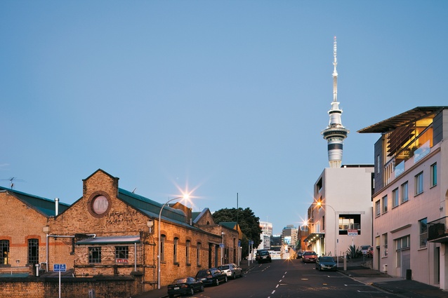
Architect Marshall Cook estimates that the structure supporting this Auckland penthouse of his design dates back to around 1906. Casual research shows that this figure agrees with the establishment of what is now Victoria Park Market, which is across the road. The apartment has been integrated into the third level of what was at one time a printing company – now repurposed with a small number of boutique commercial premises. In contrast, the market is a now-sorry relic, where, with the exception of a couple of popular restaurants, vibrancy has taken a holiday.
Further research shows that in 1905, Victoria Park Market was the Auckland City Council Works Depot. The chimney that now towers above the apartment was an integral part of the evocatively named ‘rubbish destructor’. Another street over sits Victoria Park, which also dates back to 1905. In 1918 this ground’s wooden grandstand functioned as a temporary morgue during the great influenza outbreak. In 1960, an elevated motorway first flew over the park. That viaduct now provides both an animated view and urban white noise for the apartment’s owners.
There are plans afoot for the motorway to be buried. That will be a boon for residents, but it’s quite clearly a case of ‘believe it when you see it’. But if the motorway is eventually buried, and the Tank Farm is indeed transformed into a park, then this area’s residents will be sitting on some very valuable real estate indeed. This would be quite a turnaround for Freemans Bay, which in the middle of last century declined into little more than a slum as inner-city dwellers upped sticks and headed for the greener grass of the outer suburbs.

What does this tell us about this apartment? Well, perhaps very little of its detail, but it’s interesting to look at history and context before examining the footprint new architecture will leave on a suburb. As it stands, Freemans Bay now abounds with a mixture of residential and commercial spaces, and the better buildings lining the narrow streets integrate those industrial stalwarts brick and steel into clean-lined modern forms.
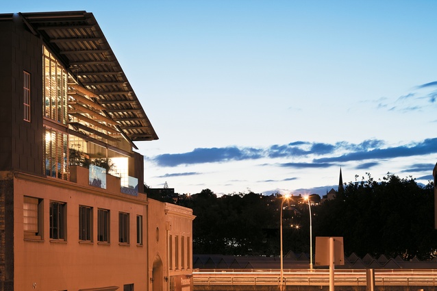
This Freemans Bay apartment, too, is a subtle reconciliation of the industrial with the comfortable. The modern envelope, clad partly in zinc, sits squarely upon its more historical plinth. From the street, the roof form of the structure is razor-like, angled to allow space for a second-storey mezzanine bedroom and sunroom. To achieve the precise profile of the roof, Marshall Cook says “the bottom web of the edge detail was cut out”, that is, the undersides of the supporting members were cut away at the ends. To reduce the industrial effect of the steel supports, the architect specified that beams be only the sizes they needed to be. There’s no over-embellishment here, but the result is not at all factory-like but “a highly rational structure clearly expressed.”
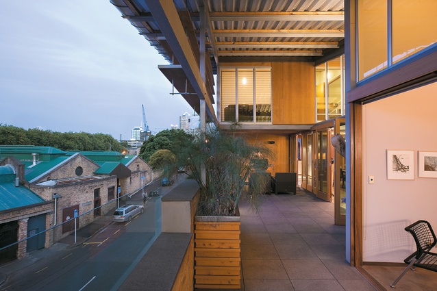
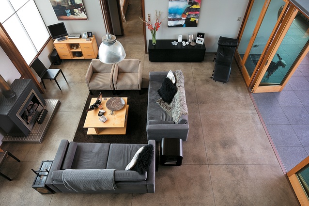
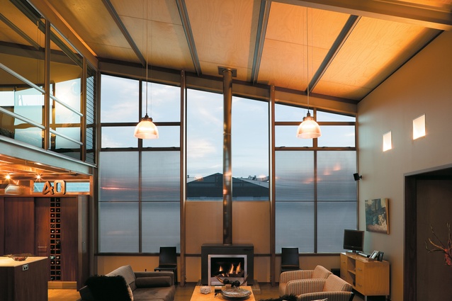
There are other industrial elements besides the visible steel, such as polished concrete floors. Another industrial element is the layered sheets of translucent polycarbonate sheeting, which provide the fenestration on the back wall, obscuring “raffish views out back” of sheet metal roofing, aerials and air-conditioning units. Exposed brick from the original structure is another such element. Comprising the patio’s balustrade the bricks provide an identical visual connection with the outer wall of the market.

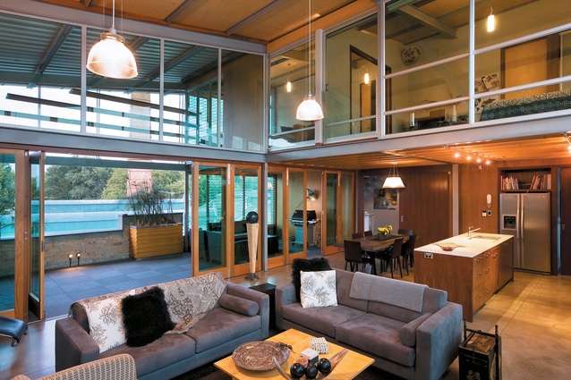
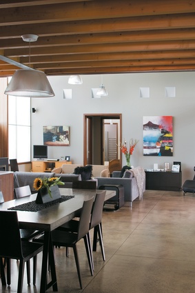
The industrial is tempered by a softer palette of timber – hoop pine ply panels on the ceiling, cedar joinery, jarrah cabinetry – and sparing amounts of thin-profiled cararra marble. At approximately 120m2 the penthouse is not excessively large, yet the well-proportioned spaces are appropriately scaled. The guest bedroom, located in the aforementioned mezzanine, has sliding glass panels that open the room directly onto the kitchen and living area below, although blinds provide requisite privacy.
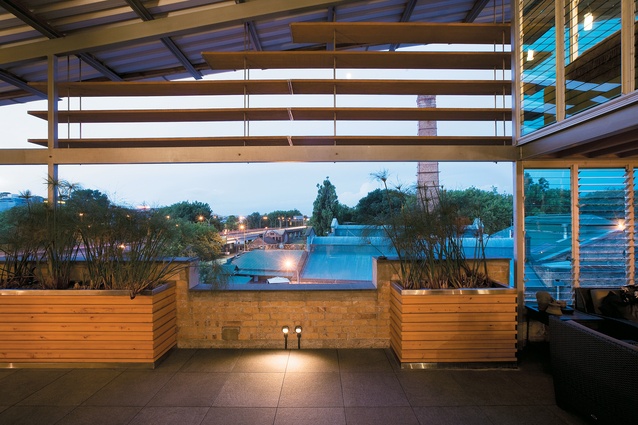
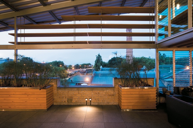
The adjacent sunroom makes this upper level almost self-contained. Louvres, rather than solid panes, were chosen for the sunroom, for the obvious cross-ventilation benefits, and also as a response to the apartment’s limited outdoor space. “They don’t enclose the space, but form a blending area. They also let noise through, which is one inconvenience,” says Cook. But, after all, this is an inner city environment, and as such noise is a constant accompaniment to living.
To say the apartment has no outdoor space would be an exaggeration. It contains a decent patio, protected by the extended overhang of the roof form. Cedar-framed doors fold back to open the whole space up to the living area, and there is also an excellent example of an outdoor room. Here, the presence of more louvres makes it hard to define whether it is indeed outdoors at all, although the area’s positioning and the presence of a barbecue are obvious hints to its true purpose.
The penthouse’s kitchen and living area are positioned between the two light-introducing walls. Each space is clearly defined by the change in ceiling height, with the kitchen sitting like a piece of furniture in the double-height space. Jarrah cabinetry neatly conceals the cleverly arranged cooking equipment, providing ample storage in a compact space. The carrara marble countertop has a fine profile, and a vertical counterpoint in the master bathroom. Throughout the various rooms there is a skilfully choreographed interplay between shadow and light. The well-considered artificial lighting includes recessed up-lights that wash the upper edges of the ceiling, highlighting the timber beams and steel supports, and keeping the ceiling plane free from recessed cans.
While the roof form is a highly visible architectural response to building regulations, and, especially through the addition of timber louvres constructed from scaffolding planks, quite an attention-grabber, what is equally appealing here is the social nature of the layout, the outdoor fringe and the easy connections. Marshall Cook reckons he’d move here in a shot and, motorway or no motorway, it’s hard to disagree with him.
Note: Since the time of writing, the design practice featured may have changed name, personnel or both.

