Houses Revisited: In at the deep end
First published in 2009, in this home on the outskirts of Auckland Tim Dorrington designed a pool house, and just kept going.
This is the story of an architectural project that growed like Topsy. When Auckland architect Tim Dorrington was first consulted by clients in Whitford, he was asked to design a new swimming pool and pavilion, plus a small extension. But by the time the project was finished three years later, the entire hillside property had been rebuilt, re-landscaped and redecorated.
So extensive are the changes to the house, designed in the 1980s by the late Robert Paterson, that Dorrington is unsure whether to describe the project as an alteration or a new build. “I guess it is an alteration in the sense that it was strongly influenced by what was here,” he says, “but as it turns out there’s probably less than ten per cent of the original house left. I suppose it’s somewhere in between the two.”
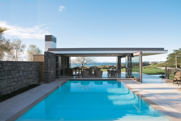
The old kidney-shaped swimming pool, where the project began, was “a bit mean and a bit scummy. The clients wanted it bigger and opened up.” The 10 x 6 metre pool that now graces the site could hardly be more different: it has a “weir edge”, which means that the water can be maintained at the same level as the surrounding tiles; “thruster” jets on one side that allow swimmers to exercise without doing lengths; and an automatic floating cover that can support the weight of ten party-goers.

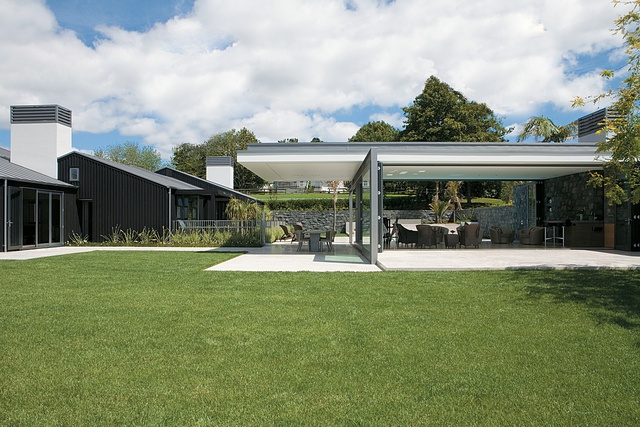
The ultra-modern pool pavilion and “entertaining space” is also filled with hi-tech equipment. On a cold day, sharp northerly gusts can sweep up the hill from the Hauraki Gulf so the pavilion had to be wind-tight. However, when the sun is shining the retractable glass sides can be pulled right back so that the building becomes “a floating roof”.
The amenities include an open fireplace, a bar, a drop-down screen and projector, a bespoke sound system and even a heated concrete dining table. Perhaps surprisingly for a pool house, there are no changing facilities.
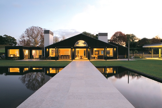
Away from the pool, at the back of the main house, a dramatic white stone “pier” has been installed, “floating” across a black-tiled rectangular pond to the edge of a cliff. From there, one can look out to Waiheke Island in the distance, or turn back to admire the renovated house in all its glory.
So how did a new pool turn into a complete rebuild? Dorrington says the clients were concerned about the possibility of wet rot and investigations confirmed that the house’s external plaster system needed to be replaced. (It has been, with cedar board and batten.) Next, they decided on a new zinc roof.
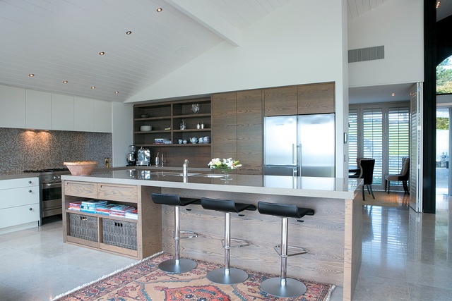
At that point it seemed sensible to redesign and rebuild the interior. Originally, the living space on the ground floor comprised a number of separate rooms but it “felt like a labyrinth”, Dorrington says, and the clients wanted to open it up into one [98m2] space. Three sets of tri-fold doors across the back mean that the whole area can be opened up when the elements allow.
No detail has been overlooked. Anodised aluminium used in the joinery was custom-coloured to match the zinc roof; glass for the extra-large pool house doors was brought in from abroad; and a bevy of consultants and craftsmen worked on everything from dark stained oak cabinetry to “home automation”.
In choosing colours and furnishings, interior designer Anna Desbonnets aimed for what she calls “a classic look but slightly twisted so that it’s not too elegant or precious”. An antique dining table is placed in the centre of the large living space, with a view straight down the pier and out to the Hauraki Gulf. It’s surrounded by high-backed chairs covered in “a modern metallic snakeskin fabric”. Above the table, architectural lighting consultants Lumen Design installed a two-metre, handmade, wood veneer chandelier, imported from Spain.
Cow skin rugs are scattered on the floor and in a formal dining area, button-back dining chairs are covered in an adventurous mix of natural linen and “tactile” black cow hide. Art work chosen by the clients ties in with the country theme. A large Mike Petre oil painting of cattle hangs in the entrance hall, while a nearby wall features a “woven lattice” sculpture by Jeff Thomson, made from strips of old corrugated iron.
A locked room to one side of the entrance turns out to be a wine cellar lined with heavily scented macrocarpa. Initially it looks rather like a sauna, but the temperature inside is carefully controlled to protect the racks of vintage wine. From the main living area, corridors lead to two separate wings.
The master bedroom suite is entered through two oak pivot doors; as a security measure they can be locked by remote control from the bedside. A raised plinth in the bathroom ensures that the occupants can lie in the bath while admiring the view. Next door, a capacious dressing room is lined with exquisitely constructed drawers and shelves.
The second bedroom wing houses accommodation for the clients’ two grown-up sons, and, at the far end, a media room. Here, Dorrington opted to retain an existing spiral staircase leading to a mezzanine-level guest loft. Linen wallpaper and a large leather chair lend a traditional feel to the room despite the presence of a 60-inch plasma TV.
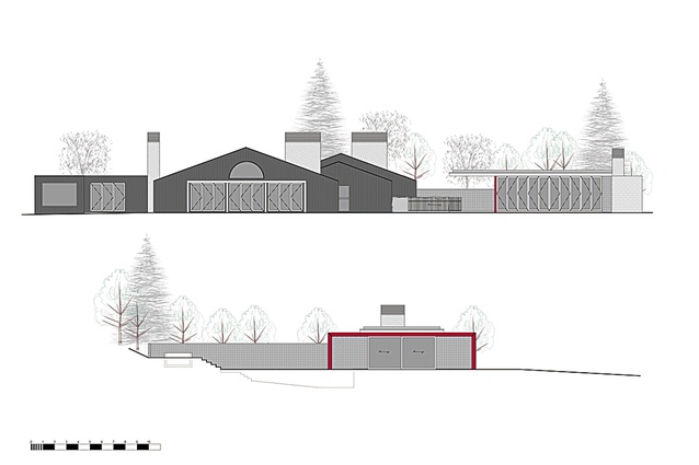
Pressed to describe the style of the remodelled house, Dorrington comes up with “contemporary country cottage”. Did he find it difficult to reconcile the design of the house with the starkly modern pool house? “The pool house has quite a different aesthetic but it’s an intentional contrast with the shed look of the main house,” Dorrington explains. “[As a practice] we don’t really go down the ‘in-keeping’ line. I think you get a lot of richness from juxtaposing two looks.”
Given the amount of time and money required to remodel the property, one wonders whether it might have been easier to knock it down and start again. Dorrington reports that a new build was considered – and rejected – early on. When the idea came up again it was no longer feasible.
“By the time we made the final decision to start re-planning the inside of the house, we’d already invested too much in the exterior to take it down. In the circumstances, renovating was the right thing to do.” In the end, the project was forced over the finishing line by a family wedding and plans to hold a reception in the grounds. As a friend of the groom, Dorrington was amongst the guests. What better way to appreciate one’s work than with a glass of Champagne, partying in the pool house?
This article first appeared in Houses magazine


