Houses Revisited: Karori House I
John Melhuish of Herriot + Melhuish: Architecture (now called Herriot Melhuish O'Neill Architects) has altered a tired existing Wellington house to respond to the owners’ needs while discreetly experimenting with form and space.
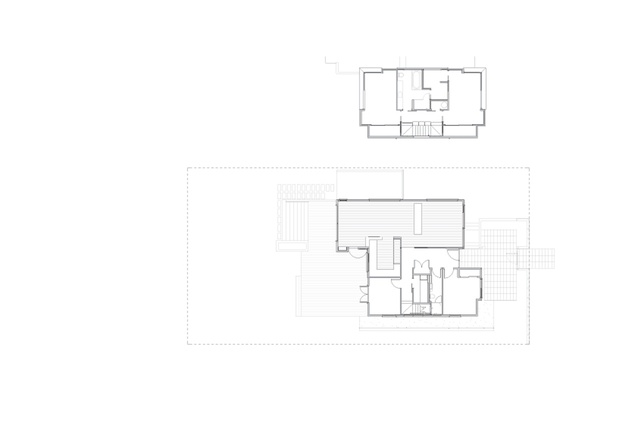
This comprehensive house alteration designed by architect John Melhuish was a response to the clients’ growing need for space and a reaction against an existing house layout that was contrary to the good use of the site. Only the existing house’s sub-floor structure was retained and the original plan was reversed at ground level to bring sun, light and views into the main living areas, while the addition of a second level provided extra sleeping space.

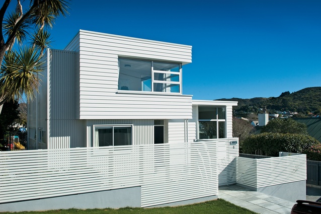
The simple composition of the three white timber boxes forms the conceptual foundation of the house. It was, in part, a response to the existing site conditions and height planes, but more specifically, “a reference to the New Zealand modern movement houses of the ’50s and ’60s,” explains Melhuish. This reference causes the house’s era to not be immediately obvious, especially in its urbanised context, which perhaps could also read as a nod to the existence of the original house.
Externally, the three boxes are described through the movement of planes and the varied use of horizontal weatherboard and vertical battens. The strength of this architecture is that the three boxes do not disappear upon entry, but are continually referenced.
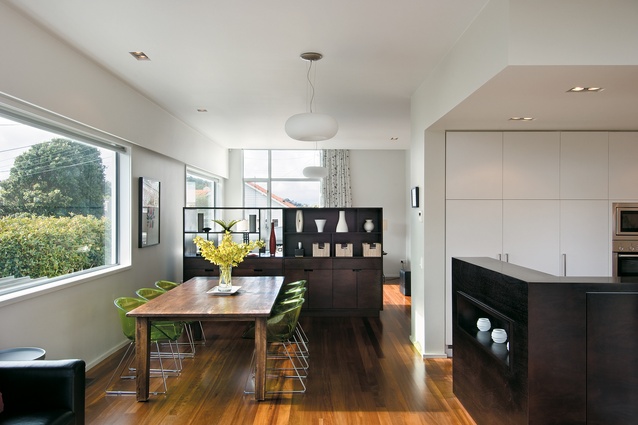
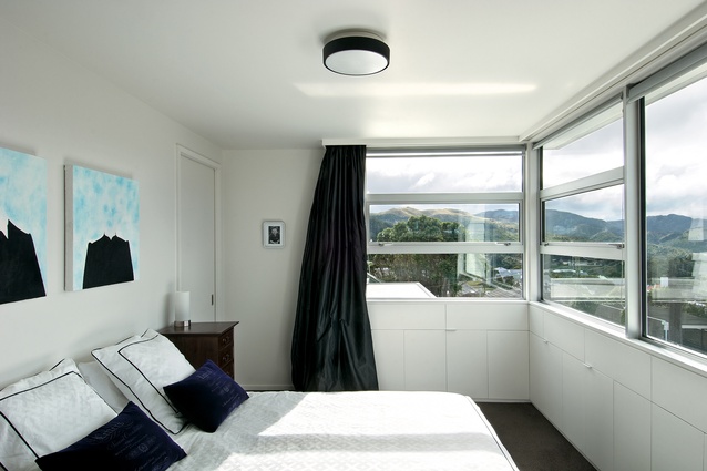
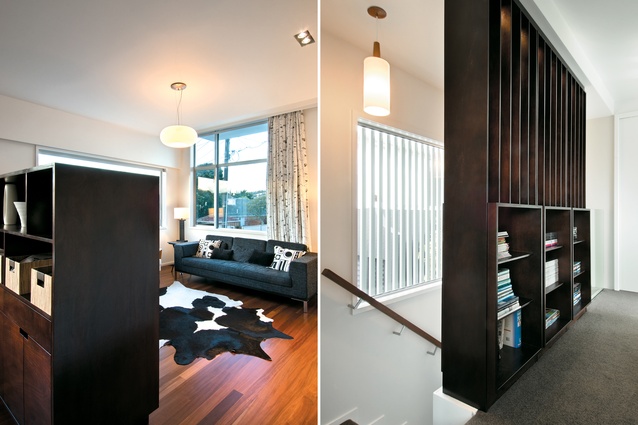
Due to this, interesting spatial arrangements are created and spaces, while open and connected, are given a clear identity through shifting ceiling planes, subtle detailing, and storage units, which also have been used particularly notably in the upper level bedroom where they give mass to traditionally-thin timber walls.
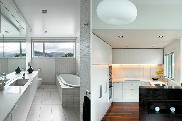
These details, it seems, also are a subtle reference to the house that was here prior to this one; the rendering of the three boxes makes spaces and fittings appear as they are carefully slotted in, in respect of something else.
In first instances, the formal aesthetic of Karori House I appears respectful and relatively restrained, but it possesses a discreet experimental quality that offers many interesting moments.
This article first appeared in Houses magazine


