Houses revisited: Kelvin Heights house
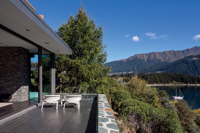
Facing out toward Lake Wakatipu, one might feel on top of the world when standing in this home, and like the house Bob Geldof is referring to in his tune of that title, it is a family home, far away from the humdrum of busy towns and dual carriage ways. First published in 2013.
Not only are there similarities between Geldof’s lover’s home and this one designed by Tony Koia, but it was a love of the ‘70s that unintentionally found its way into this home, from screening slats and built-in seating, to the references of the original crib that was on the land.

Koia says these features were an expression of the personality of the owners, organically reproduced through the close working relationship between he and them.
“They are very open people. They want to be open to the community and were open to the creative process that influenced the vision as well as the details of the design.
“This sense of transparency was a critical feature. For example, the house doesn’t face away from the community and roadside as many houses that are built toward the view do.”
The result is a collection of interlinking unimposing spaces that are visually open yet private. It is a retreat as well as a base for extended family, catering for a few or for many, in both winter and summer.
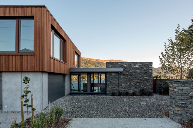
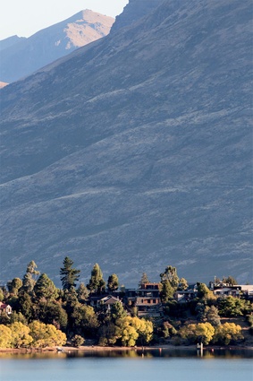
The aesthetic vision is immediately apparent from the road – an open home that interfaces with the historical vernacular and the landscape. Four distinct materials – cedar, schist, glass and stone used inside and out – provide division of spaces, organic expression and connection to the nearby and distant land.
The predominantly glazed entranceway provides a glimmer of the view, inviting and welcoming. The parking area is wide and flat, encouraging visitors to stop by.
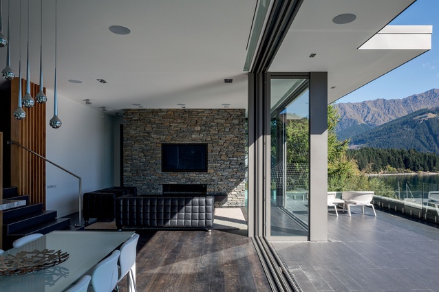
However, on entry, the double-height living space is, it turns out, lower than it first appears. It is private from the street, open and spacious with floor-to-ceiling sliders that completely fold back to provide a seamless indoor outdoor connection. In winter, the thermally-efficient stone floor, fireplace, extremely well-sealed Belgian joinery and triple-glazing keep it warm and cosy without compromising that sense of being on top of the world.
The house unfolds again, rolling down the bank toward the lake, opening into two lower floors that contain a media room, guest lodging and a private outdoor entertaining area; a suntrap that has a fire pit, barbecue and ample inbuilt seating.
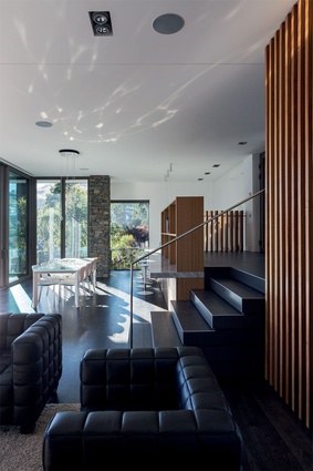
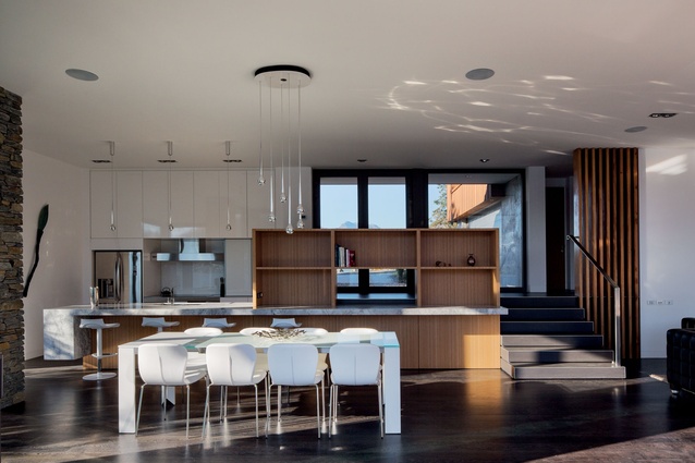
The interior stairwell path mimics the path that led from the original crib to the lake. The rimu slats screening the stairwell wall are reclaimed joists from that property.
If you head up from the living space, you enter the private sleeping quarters of Koia’s clients, housed in the cedar clad box that stands upon the road level, sharing the skyline with its neighbours.
Although individually clad, the exterior shapes are connected by vegetation, shared geometry and sightlines.
“The house looks as though it has been pulled apart and reconstructed, and in time the vegetation will filter the hardness of the shapes, creating another interface between the house and the land,” Koia says.
Click here to see more Houses Revisited. And sign up to our email newsletters to receive Houses Revisited straight to your inbox.
Note: These are stories from our archives and, since the time of writing, some details may have changed including names, personnel of specific firms, registration status, etc.

