Houses Revisited: Lakeside connections
Architecture Page Henderson’s Taupo holiday house, first published in 2007, is a sensitive response to site and client requirements.
Such is the contemporary obsession with coastal real estate it’s easy to forget that for much of the last century a bach by a lake was as desirable a property as a bach by the beach. In a society under-endowed with status symbols, though no less conscious of them, a house at Taupo was enviable evidence of success – especially for Wellingtonians who, unlike the residents of most capital cities around the world, flee town not to escape summer heat, but to find it. For decades Taupo was the place where partners in law firms and senior civil servants, together with farmers, import license owners, car dealers and affluent tradesmen went to get warm.
You’d have to say that, whatever they did to get their dough, Taupo’s bach owners showed sensitivity in their choice of holiday retreat. This may be an unexceptional point, but lakes are less obvious than beaches. At the coast, what you see is what you get, and what you see, or at least stare at, is a horizon. It seems incongruous that in the coastal pavilions so beloved of lifestyle magazines a telescope is a standard appliance. What’s out there? Few ships now sail along our coastal sea lanes. Perhaps coast watching is in our DNA? (The Russians/Germans/Japanese are coming!) Or perhaps this question is out of focus, and it’s not what’s on the sea that draws the coastal gaze, but who’s on the sand. Simple voyeurism might be pumping up coastal inflation. From the new beach-side and cliff-top pavilions, not a bikini’d body goes unperved.
Lakes, especially in windy, rainy New Zealand, are more likely to encourage brooding than gawking. An inland sea, perhaps, is conducive to an inner life – even at Taupo, with its Via Dolorosa of Roto-Vegas motels and squadrons of hoons on jetskies. The great thing about Lake Taupo is that there is so much of it; much of its littoral is relatively undeveloped, for the moment.
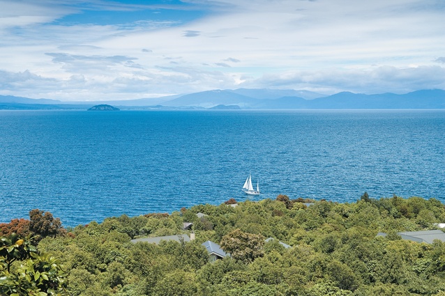
One bit of Taupo that has become built up over the last couple of decades is the land around Acacia Bay, at the north end of the lake, west of the town centre. It’s a suburb, now, but if you drive through it, you reach – but, unless you’re a resident, cannot enter – a headland occupied by a holiday home development. The 60-acre estate is about 15 years old, and is showing the benefits of an intensive planting programme and the original decision to limit development to one dwelling per acre.

As these developments go, this estate has been very well done (you don’t have to travel far to find more recent, less accomplished, greedy alternatives). Many, though not all, of the houses are designed to fit in into the land- and tree-scape; they’re the products of their owners’, and their designers’, realisation that on this site you can have a view without becoming an obtrusive part of it.
The house featured in this article is the latest in a series of residences designed on this former farm by Te Puke-based architect David Page. Mr Page has also designed a charming tennis pavilion that serves as a community centre for the development. His clients for this house are a country couple who over the course of half a century have turned scrubby land in the middle of the North Island into a successful farm. One of the clients, moreover, as a child hunted and played on the land now occupied by this estate in the days when it was a relation’s farm. Listening to the clients talk about their land, the old-fashioned term ‘good stewards’ comes to mind.
One also gets the impression that the clients and their architect enjoyed a close alliance (family ties between clients and architect go back decades). Stories of architects and their clients tuning each other out are hardly uncommon, but here everyone seemed to be on the same wavelength. The respect inherent in the client-architect relationship is manifested in the treatment of the site and the design and making of the building.
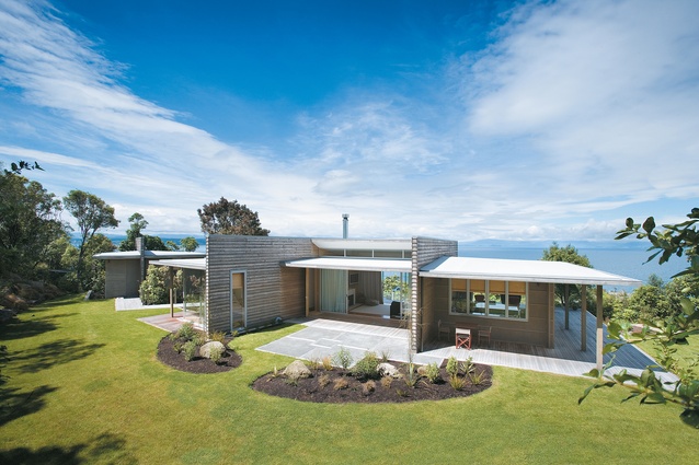
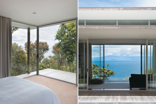
In order that the house should blend in with its elevated site, it was decided that its height should be restricted to one level. It was important to provide shelter from the wind. The house presents a buffer to breezes (or gales) coming off the lake, protecting the levelled rear lawn sited between the house and the slope behind. In effect the house has two prospects: one wild, one tamed. To the south, the house looks across the lake to the mountains of the Central Plateau; to the north, it looks onto a domestic vista of lawn and garden.

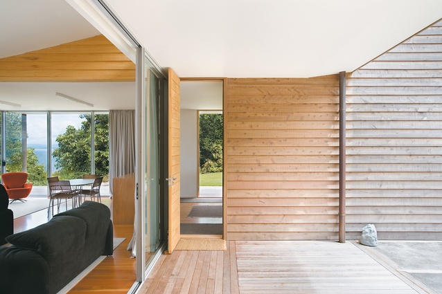
The plan is essentially a four-part arrangement of connected rectangular forms. A pavilion-like living area, fully glazed to north and south, bridges a kitchen/dining area and a bedroom wing. A walkway leads to a separate structure housing a third bedroom, a refuge for the clients when their children and grandchildren are visiting. Although the house is for the most part one room (or one space) wide, it is no skinny box. The perception of depth is encouraged by a stagger in the plan and the provision of generous roof overhangs – a design strategy that has produced a series of sheltered outdoor spaces on the north side.
The outlook, obviously, is important. Inside the house, one of the clients says, “it doesn’t matter where you are you can look out and see the lake”. The primacy of the view is most apparent in the see-through living room, and this is, perhaps, the one place in the house where it’s possible to think you can have too much of a good thing. Views to the left, views to the right, and a fireplace and TV along the one solid wall. Where do you look? Where do you sit? It’s true, curtains can be pulled to make the space more room-like, but it’s not easy to centre yourself in a glass case offering so many focal points. At a banal level, the design of this living/viewing area does offer a furniture challenge: what chairs do you get, and where do you put them?
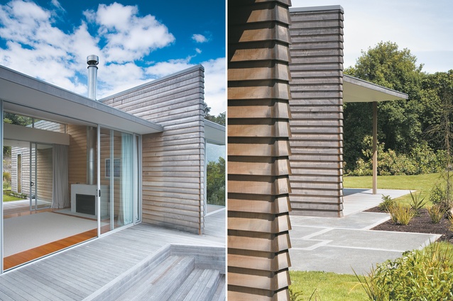
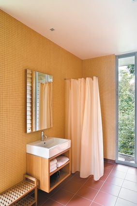
This part of the house is really the only element that shares the well-mannered blandness typical of the modern waterfront holiday home. It’s a little discordant only because other aspects of the project suggest a determination to connect not just with the site, but with the clients’ lives and histories. For example, the macrocarpa that lines the house is milled timber from their farm, and the 200 punga planted around the house are from the farm, as are the rhyolite boulders in the garden. A pragmatic use of resources typical of farmers, one could say, but also a tethering of a holiday place to a place that has been the clients’ lifework.
This residence is intelligent, restrained and well made – a holiday house fit for people who have worked hard for their success.
Click here to see more Houses Revisited. And sign up to our email newsletters to receive Houses Revisited straight to your inbox.
Note: These are stories from our archives and, since the time of writing, some details may have changed including names, personnel of specific firms, registration status, etc.

