Houses Revisited: Light touch
From the 2007 archives: In a paddock outside Levin, Chris Johns designed a comfortable and disarmingly simple country home.
On this project a highly competent architect has applied the experience gained in the course of a long and successful professional career to a modest house in a provincial town in an unfashionable district. But late architect Chris Johns didn’t see any incongruity in the situation; in the latter part of his career he enjoyed “getting back to the basics of architecture” and working on residential jobs – probably the most satisfying of all architectural commissions.
The house for a retired couple in Levin, in the middle of the Horowhenua, was also a return to familiar geographical territory for Johns. In the 1970s, his practice was based half an hour down Highway 1 in Paraparaumu. Johns left the Kapiti Coast in 1978, after one of Prime Minister Robert Muldoon’s economic squeezes throttled the life from the building industry, and moved to Milford, one of the east coast bays on Auckland’s North Shore.
In Auckland, he teamed up with John Sinclair in a commercial architecture practice that benefited from the mid-1980s boom, experiencing growth so rapid it was unnerving. Johns recalled taking a head count on a company outing to Rangitoto: there were more than 300 staff and dependents on the trip – as he said, “a lot of mouths to feed”.
The 1987 stock market crash had an enormous effect on the construction industry and, therefore, the architecture profession. Johns said his firm didn’t feel the full impact for a couple of years – work already in the pipeline could be completed, but the supply of new projects evaporated. For a while, Johns headed the architecture division of an engineering firm trying to turn itself into a multi-disciplinary company, but wasn’t comfortable in his hands-off role. It was a relief to return to domestic work, he said, and start over again with the adds and alts that make up the staple small practice diet.
“I love doing alterations,” Johns said; in fact, “all architects should live in an alterable house”. A move from Milford – no longer a relaxed beach community, just another built-up North Shore suburb – to Waiheke Island gave Johns a new lease on his professional life. The move might have presaged retirement, but Johns still worked for five hours a day at the time of writing, accepting commissions from a wide circle of contacts and, occasionally, helping out the young Melbourne practice in which his son Peter is a partner.
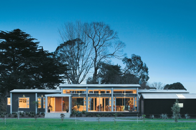
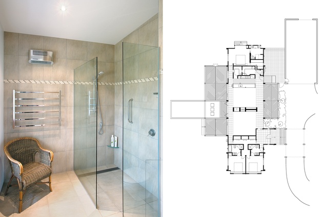
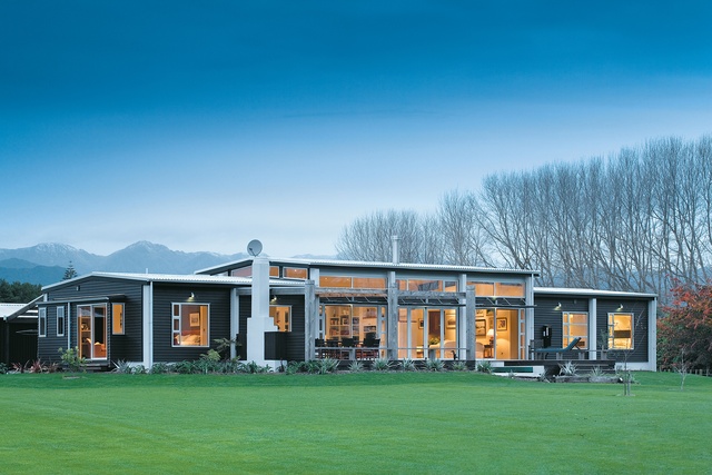
The clients for the Levin house had seen a Chris Johns bach in Pauanui, and a small house designed by Johns at Akatarawa in the Hutt Valley hinterland. In essence, Johns said, the Akatarawa house comprises living areas, or a “social core”, flanked by bach-like bedrooms. This straightforward arrangement, Johns said, has been continued in the Levin house which, in form, is a pavilion book-ended by baches, and accompanied by a shed. Simple, but not at all simplistic; this house is an eloquent response to the clients’ requirements, and to the challenges and opportunities presented by a semi-rural site.
The clients are Levin locals who, Johns said, wanted “to downsize and upspec”. The brief was sensible about ends without being prescriptive about means. Besides requiring less than half the space of their previous home the clients wanted a house that would be light, warm and comfortable, and would accommodate their furniture and art. The design would take advantage of views to the Tararua Ranges, and anticipate possible future development on or near the site. A decent-sized farm shed was essential.

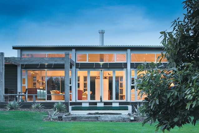
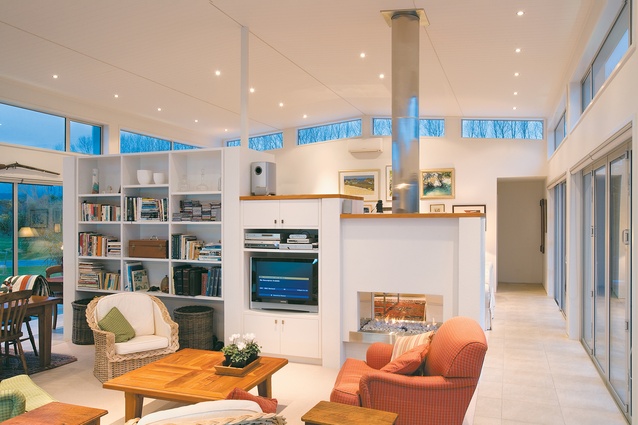
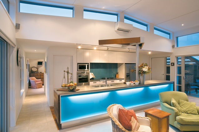
In response, Johns produced a rectilinear plan to a 2.75 metre grid, ordered on a North-South axis to gain both morning and afternoon sun. Raised above the ground, the house is a single storey throughout, but the roof above the central pavilion, which contains the kitchen, living and dining areas in one volume, is popped up to provide more space and admit more light. This “public” core is divided, rather than walled; circulation is along the length of both the east and west sides of the pavilion. Decks to the east and west extend the house towards its surrounds; on the western deck, a small pool with a fountain provides some visual and aural diversion from the quiet fields.
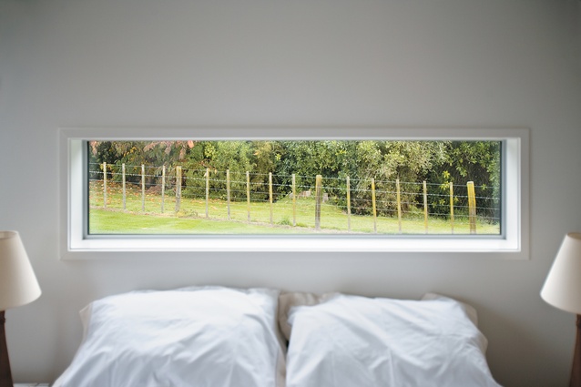
Transparency was a guiding principle of the design – the architect was not hampered by the privacy concerns that must be taken into account in the suburbs. The bedroom boxes at either end of the house are more enclosed than the fully glazed central pavilion, but these private areas, too, have access to carefully considered views and to warming sunlight. The house is by no means at the extreme end of the sustainability spectrum, but it has the climactic controls – correct orientation, for instance, and passive solar heating, double glazing, shade screens – that should be standard in a modern home.
After he designed the house Johns said he was able to give his clients the assurance they’d been longing to hear after long experience of Levin’s winters: “You’ll never be cold again.” In summer, the pavilion’s glass doors and columns of small windows allow for cooling cross ventilation.
The form of the house is intentionally rural. The bedroom wings and the shed, especially, are overtly farm-like in their simple shapes, economic materials and dark colours. Even on the house’s exterior, though, Johns was careful to signal that it is a home: the entry composition of stairs, porte cochère and cedar front door offers a formal gesture of welcome and a sense of arrival. The interior is quite different. Having established a sense of place, the architect, in the ‘public’ areas, proceeds to dissolve space in order to provide a relaxed environment.
The design combines consideration (the breakfast table sited to receive morning sunlight) and panache (for example, the bench lighting that allows the kitchen to either feature or fade). One gets the impression that in this house the clients got what they wanted, and are happy to have been pushed a little further than they might have expected. In other words, a good architectural result.
Click here to see more Houses Revisited. And sign up to our email newsletters to receive Houses Revisited straight to your inbox.
Note: These are stories from our archives and, since the time of writing, some details may have changed including names, personnel of specific firms, registration status, etc.

