Houses Revisited: Living inside out
By the wild entrance of Wellington harbour Studio Pacific Architecture experiment with climate control in this 2007 house from the archives.
Such is the value of land in the city now that what was once the windswept and forlorn is now the highly desired and newly developed. Wellington, pushing itself to the limits, has reclaimed Point Dorset (formerly Fort Dorset) on Seatoun’s coastal edge, creating a hitherto unforeseen potential in perhaps the windiest part of the windiest city. Great gusting northerlies pick up speed across the harbour and slam into land once used only to harden up the military and now boasting a school, a new subdivision and prices that would put the wind up the hardiest of souls.
Developers Globe Holdings have taken the site closest to where the inter-island ferry Wahine went down in 1968 and transformed it into a mini village. They have taken care with the design of the streets and lanes and equal care with the selection of the architects they have used. On an island created by these lanes, Studio Pacific Architecture was appointed to design a medium density development.
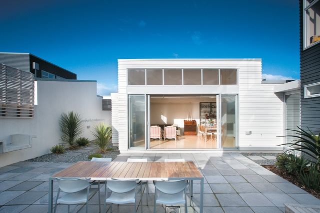
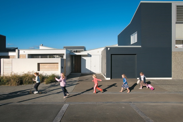
In their precinct, the architects have challenged the nature of the typical New Zealand suburban plot where the house sits in the centre of the lot surrounded by yards and grass. Their response has been to divide the block into thirteen sites of courtyard houses. There are two house types: the single storey 16M (a 16-metre deep site) and the two storey 20M (a 20-metre deep site). Everything is paved to perfection. Sunday mornings are filled with the sounds of espresso machines, not lawnmowers: these are apartment dwellers in sight of the sea. By the Seatoun foreshore, suburban is the new urban.
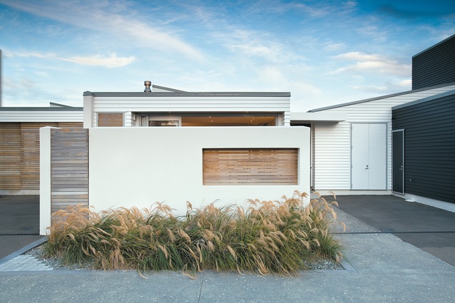
Traditionally, suburban houses use a front yard to create privacy from the street. This privacy decreases to the back of a site; at the rear suburban houses often let their guard down, opening to their sections and occasionally to their neighbours, creating a sense of community. Studio Pacific’s development inverts this order: the courtyard at the rear becomes the house’s most private place. Instead of a front yard there is a garage and additional parking area. The kitchen opens onto a patio that opens directly to the paved parking (and hence the street). Community connections are to be found here, at the front, not at the rear where a courtyard wall, not a back fence, is shared with one’s neighbour.
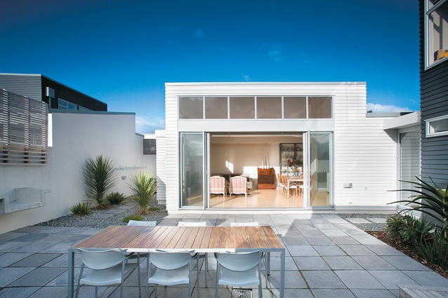
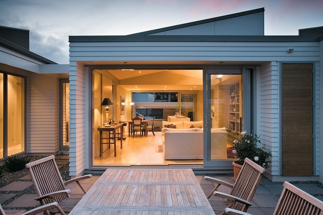
This solution is in part pragmatic as it addresses the extreme climate and allows occupants greater control over their environment. The courtyard itself is a minor essay in composition. A variety of paving and planters divide the space in an almost (but not quite) Japanese fashion. Provision for a barbecue comes in the form of a concrete slab structure inset into the wall. The overall effect is mannered and formal, so much so that it is hard to envisage this as a space in which to relax. Once the outdoor dining table and umbrella have been installed what do you do? A case, perhaps, of too much Zen and not enough Zealand?
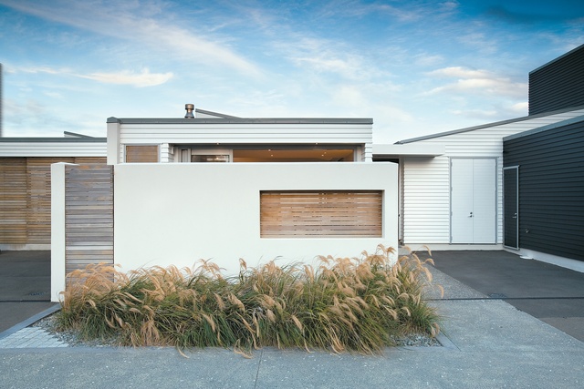
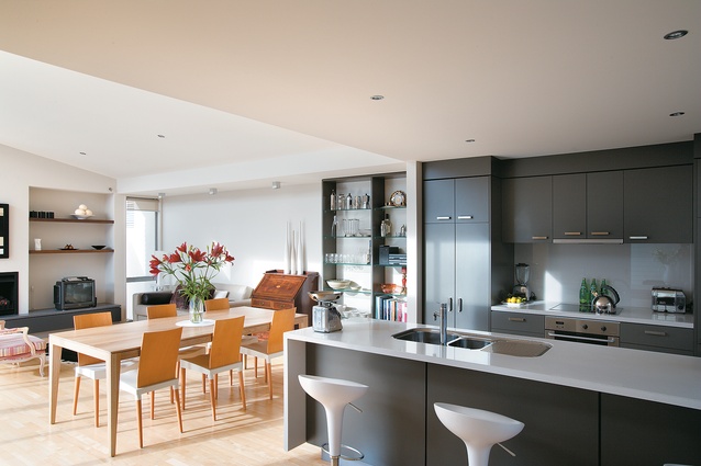
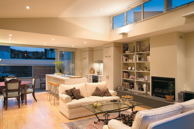
The houses are planned as two rectangles that slide past each other, with the living areas housed in one box and the bedrooms in the other. These are held apart by a transparent entrance that maintains the illusion of transparency by using weatherboard on the interior walls. The living, dining and kitchen are combined in one box with wide doors to the courtyard and a clerestory above to bring in additional light.
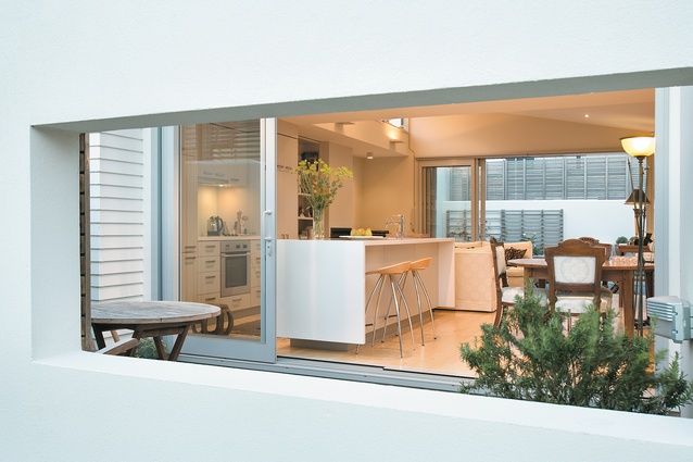
The dining area floats (as they always seem to do in this modernist configuration) in the no-man’s land between the living and the kitchen. The latter is a generous galley with its own back door on to the mini patio, a door that slides to let in as much (or little) as is desired. The patio forms a cleverly conceived zone between the intimacy of the kitchen and the openness of the parking area. This boundary is mediated by a sliding timber screen, offering further spatial and privacy control.
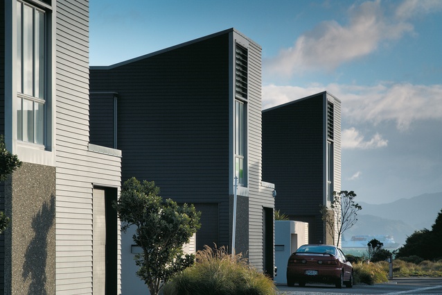
The smaller, single storey 16M type contains two bedrooms, a bathroom and laundry in the bedroom rectangle with the main bedroom opening on to the courtyard. The two storey 20M allows for a double garage and an office (or second living) downstairs and three bedrooms upstairs. Alternating down the block the two apartment types give the block a one-up one-down rhythm.
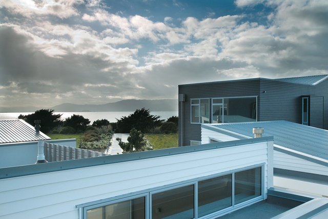
Generous windows in the upper level bedrooms are designed carefully so it is almost impossible to see into other houses or their courtyards. The second storey form is somewhat abrupt with angled roofs turning the buildings into sentries. The outlook from upstairs across the tilted roofscape of the rest of the development is both pleasant and somewhat alarming: the stringent privacy creates a startling anonymity, at the cost, perhaps, of a sense of community.
There is, of course (like apartments built by developers), almost no storage of any substance. This is inexplicable considering the highly consumerist nature of the demographic the houses are marketed at. Apparently most of the owners get around this by parking outside and filling their garages with the stuff of a lifetime.
These, then, are skilfully designed houses that have turned the traditional mid-century view of suburbia inside out. The house is split down the middle with its edges flung to the boundary; the back yard is here a walled and private courtyard and the front yard, free of lawn, connects the kitchen directly with the street. The problem with this process is that the block has been turned inside out as well, so the kitchen looks out on to the street and beyond, to regular housing. To truly test this model, and perhaps realise its potential, it needs to be in a group of several blocks to enable the intimate lanes to be the living outdoors of each house.
The Point Dorset development is an experiment that explores the relationship between closure and exposure. As an experiment it treats architecture as a form of social determinism, instructing us how to live: privately, in a courtyard; publicly, in the street kitchen. Should we be worried by such design dirigisme? We (being the market) readily accept such social engineering in apartment developments, so why not in the suburbs? Studio Pacific Architecture has made the first bold attempt. Time will tell if others will follow.
Click here to see more Houses Revisited. And sign up to our email newsletters to receive Houses Revisited straight to your inbox.
Note: These are stories from our archives and, since the time of writing, some details may have changed including names, personnel of specific firms, registration status, etc.

