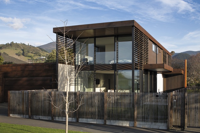
Matai House by Palmer & Palmer Architects
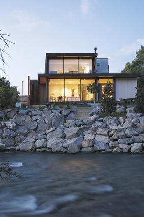
This proudly modern house, designed by John Palmer, sits on a uniquely well-positioned site on the edge of Nelson’s Matai River. The river is a spectacular feature of the property. It is tidal, and goes from being a series of roaring rapids to completely still at high tide.
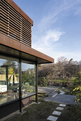
Creating a strong connection between the river and the house was an important part of the brief. To do this the site needed some work. Palmer removed the willow trees that lined the riverbank to create a visual connection to the river, rebuilt the bank with placed rocks and provided access to the water. Mature trees were also planted.
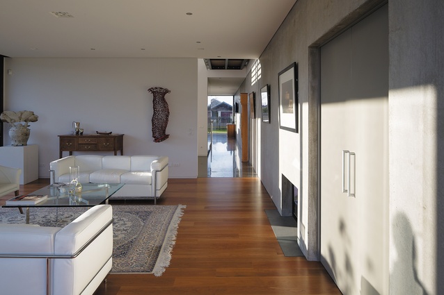
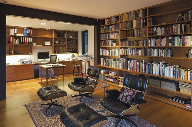
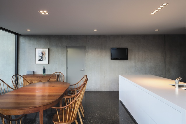
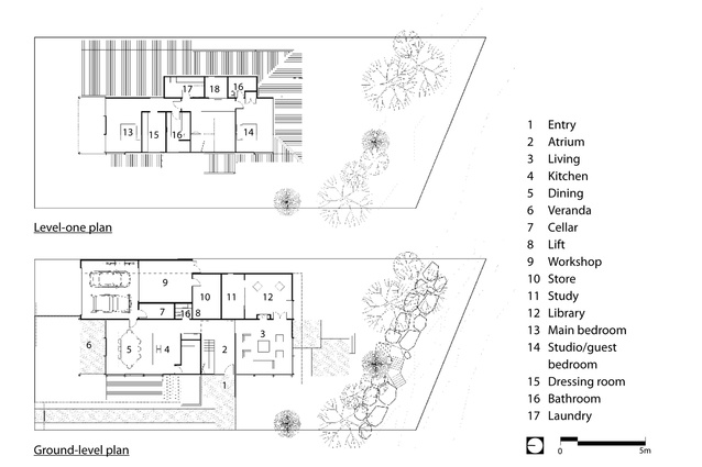
The clients lived in the country outside of Nelson, in a house also designed by Palmer some time ago. For this project they wanted a modernist house, more suited to the city location. The pavilion shapes that make up the plan of the house were inspired by the clients’ love of modernist architecture. The pavilion form runs from north to south towards the river, with the dining room towards the street and the living room and library on the river side. Morning and midday sun shine through the dining area and in the early evening the light comes back across the river into the living room and library.
Palmer describes the concept for the design as being influenced by the river with thoughts of floating, reflection, tributary, bridge and transparency. “It’s pared back but it has everything the clients need,” he says. This must have been a tricky mix to achieve. On the one hand a totally pared-back aesthetic, with spare, clean lines and on the other, a plan that includes two bedrooms, a library, study, dressing room, workshop and kitchen, dining, living and bathrooms.
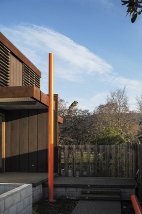
Palmer had to strike a balance between a modernist aesthetic and the practical realities of modern living – a need to house many objects. The plan achieves this balancing act within a two-storeyed linear pavilion. It is simple and unfussy and still contains all of the rooms that make a house comfortable to inhabit. “It’s the simplicity of it that is the really appealing thing,” he says. The dark, masculine materials of the house were all picked for their robustness and their ability to age with grace. The front door is redwood. This is teamed up with what looks like rusting steel on the exterior, but is in fact steel with a painted effect. This is a lot more cost effective, and requires the same low maintenance. An autumnal-orange sculpture that stands tall and skinny at the entry was designed by Grant Palliser, and sits perfectly alongside the dark-brown colour palette of the house.
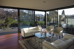
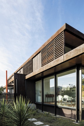
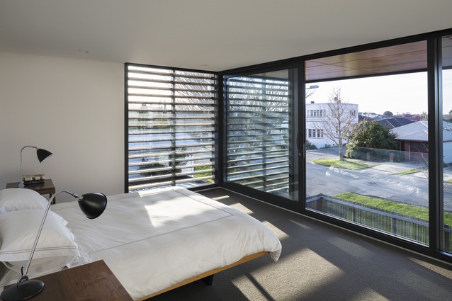
Screens along the side of the house protect it from the easterly and westerly sun that strikes into the living spaces. The deep eaves of the house are designed to also protect against this sun. Polished concrete floors throughout the house mean the mass is in the floor, and together with the concrete wall that runs through the middle of the house like a spine, they act as a heat sink.
Along with the plan and the material use, a key element in achieving the minimalist look his clients wanted was to keep the wrapping of the structure external. To achieve this, the steel mullions sit outside rather than inside the window mullions; this back-to-front glazing creates a really minimalist look inside.
Palmer has successfully designed a unique, comfortable house with the modernist look and feel his clients were after. Thoughtful consideration of the darkness of materials and the changing light of the area has resulted in a space that works perfectly on its riverside site.
Click here to see more Houses Revisited. And sign up to our email newsletters to receive Houses Revisited straight to your inbox.
Note: These are stories from our archives and, since the time of writing, some details may have changed including names, personnel of specific firms, registration status, etc.

