Houses Revisited: McFarlane Street House
Revisit a project where a contemporary addition designed by Andrew Sexton revitalises the service spaces at the back of an existing Wellington house.
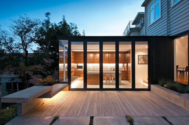
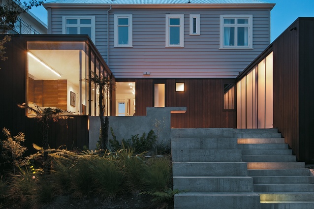
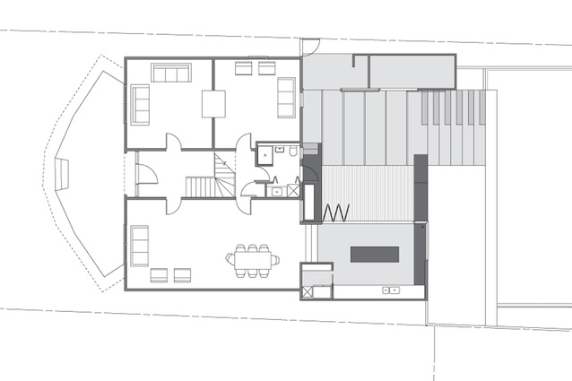
Two sleek and modern boxes have been attached to the back of a Mount Victoria villa in Wellington. The additional volumes were architect Andrew Sexton’s dramatic solution, while hidden from view amongst Mount Victoria’s mostly traditional homes, to sensitively but radically fulfill the owners’ requirement for a new kitchen and shed extension ‘to replace existing dilapidated structures’.
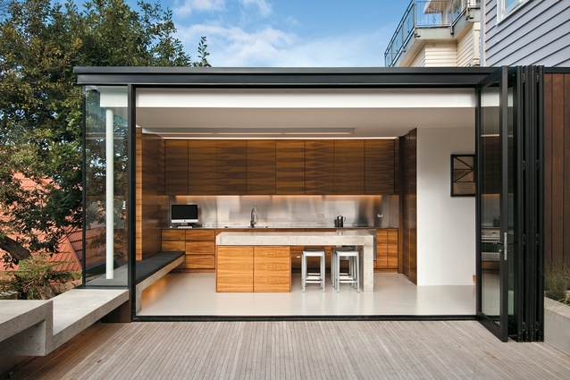
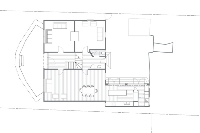
The two boxes occupy the corners at the back of the existing house, and a new deck links the two elements. The existing house had no level connection to outside spaces so a key concern of Sexton’s was to better the relationship of the lower garden to the house. So, as well as creating a deck connecting the two additions, Sexton designed the kitchen pavilion to be rebuilt at almost a metre lower than its original level, and from the deck, terraces descend to the back yard.

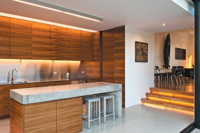
The internal change in level from the existing house to the new addition makes one aware that they are entering a new space. While the existing structure is traditionally restrained, the contemporary material palette of the addition, consisting of timber, concrete and stainless steel, employs a strong elemental appearance.
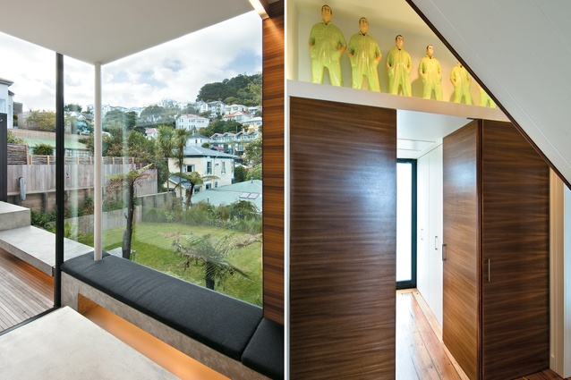
Timber veneer used for the kitchen joinery continues past the cupboards and wraps the walls, reducing boundaries of form and function; the concrete island bench and seating appear to have been extruded from the concrete floor; and a skylight, which is just a slit in front of the kitchen joinery, in combination with lighting, highlights elements like pieces of art.

The use of materiality to define as well as blur boundaries continues through to the addition’s exterior, with the kitchen’s concrete seating continuing outside and the dark-stained timber wrapping the new volumes and continuing over the existing lower level of the house.
This approach creates the impression of the addition’s singular form. It also accentuates the description that this is a contemporary addition, and through contrast, places additional value on the character of the original house.
This article first appeared in Houses magazine.


