Houses revisited: Mellons Bay house
Greenfield sights in established Auckland suburbs, especially those close to the sea, are as rare as the proverbial hen’s teeth. Those that do exist tend to come with one or more challenges that mark them as being impossible to build on in the eyes of the average homeowner.
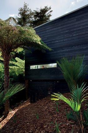
With its steep slope, narrow right-of-way approach and natural watercourse running down one side, this Mellons Bay plot was definitely not for the faint of heart. Perhaps that’s why it was architect Serban Teodorescu who saw its potential as the site of his future family home.
“There is no doubting that it presents as a challenging site: steep with a limited natural building platform and with the small stream on the north-western boundary throwing up possible drainage issues further down the south-facing slope,” says Teodorescu.

“On the positive side, the top of the site gets all-day sun, which presented us with the opportunity of designing a house with a high level of passive ESD inclusions. Also, at 870m2, the site offered plenty of space and a lot of privacy also.”
Teodorescu is director of T Plus Architects, which is primarily a commercial practice, so he says he approached the project from a commercial mindset at the beginning.
“There are no bells and whistles here, the technology and materials are fairly standard. What we have done is designed the house for our lifestyle and injected a certain amount of flexibility into the design so that the house will grow with the family.”
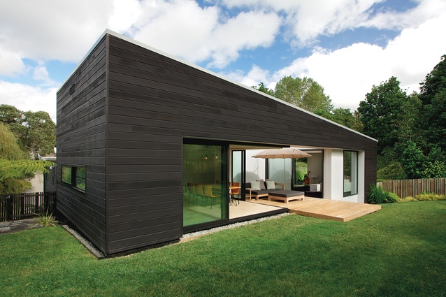
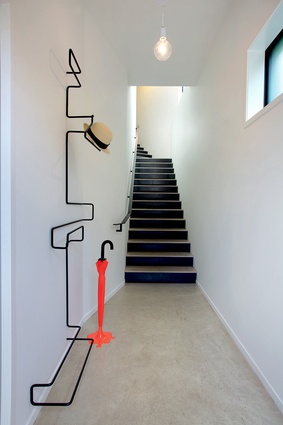
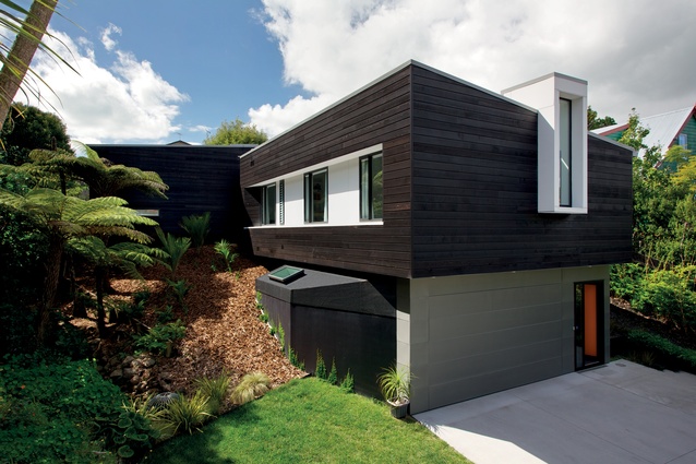
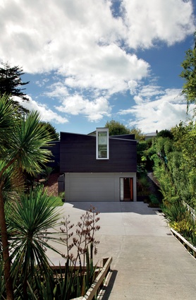
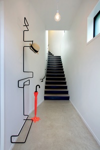
The house steps down the slope over two-and-a-half levels — which required minimal excavation of the site — and has been arranged in an L-shape. The lower level houses the garage and entry, from which a staircase leads up and around a bend with just the slightest glimpse of more stairs and an as yet unidentified room.
A small landing about two-thirds of the way up provides access to the bedroom wing — which runs back atop the garage — on one side and a cleverly concealed powder room on the other.
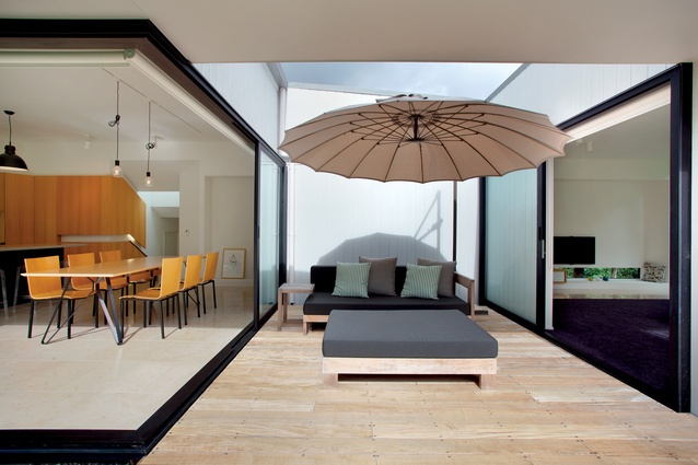
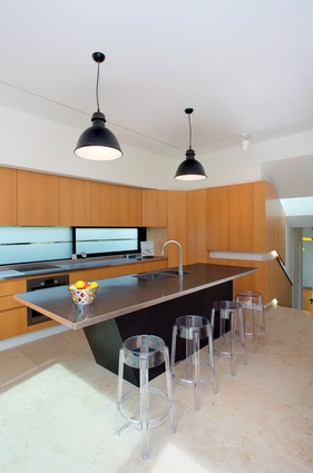
A half-dozen more steps lead to the open-plan kitchen and dining area, small semi-enclosed courtyard and lounge. Outside there is a level rear lawn, made possible by using the excavated material as fill, for the children to play on.
“The house comprises two wedge-shaped forms set perpendicular to each other and arranged so that the roof lines run in opposite directions. Both volumes have been clad in black-stained cedar. Beneath the first volume, the garage is clad in zinc,” says Teodorescu.
The pared-back forms set the tone for the internal layout, which favours simple, clean lines and easy circulation, says the architect.
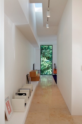
“Essentially, every room in the house is accessed via one of two corridors, each of which is accessed from the stairs. This sets up a very simple programme that ensures there is no wasted space.

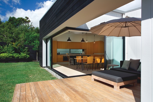
“Similarly, the transition from indoors to out had to be as seamless as possible. In the kitchen/dining area the entire northwest corner opens to the outside creating a very open feel. Aside from the obvious indoor-outdoor flow and passive ventilation benefits this creates, it also meant that we could do away with a dedicated outdoor dining area, which, with Auckland’s changeable weather would go unused a significant amount of the time, anyway.
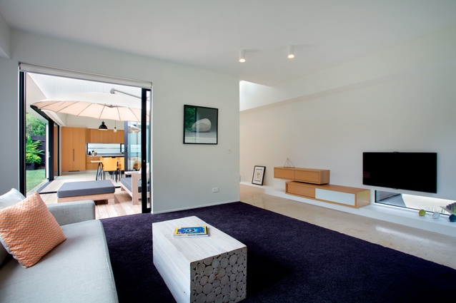
“A small, central courtyard does provide outdoor seating and doubles as a dining space when required. Another ranch slider accesses the lounge and means this entire space can be opened up to accommodate large groups when we entertain.”
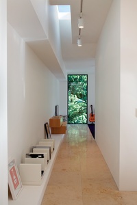
Complementing the understated simplicity of the architecture, the material palette, too, is minimal. Timber veneer and limestone tiles add natural warmth, off-setting the white walls and black joinery. Unexpected pops of colour, such as the purple-hued carpet in the lounge, are pleasing diversions and stop the overall effect from becoming sterile.
Throughout the house, the architect has punched through the building envelope to create a dialogue of voids and projections. These serve to admit natural light but also offer intimate glimpses of the garden, making artworks of the trees and shrubs.
“We were very conscious about creating a home that was a response to our lifestyle,” says Teodorescu. “It was important for our home be a space that we could share with relatives and friends while at the same time providing a sense of sanctuary for us as a family.
“There is nothing here that doesn’t need to be; each space has a clear purpose that works in concert with those around it. Material choice, orientation, form, landscaping — all come together in what appears to be an almost effortless cohesion to create the family home that we envisaged from the outset.”
Click here to see more Houses Revisited. And sign up to our email newsletters to receive Houses Revisited straight to your inbox.
Note: These are stories from our archives and, since the time of writing, some details may have changed including names, personnel of specific firms, registration status, etc.

