Houses Revisited: Mutual support
Take a look back at this home, first published in 2009: a Malcolm Taylor project by the Waikato River that shows architect and builder can get along fine.
Use the word ‘architect’ near a builder and you’ll often hear the builder muttering under his breath. Something along the lines of architects knowing little, if anything, about building and being difficult to work with – that’s how it commonly goes. With this predisposition in mind, you have to wonder what the relationship would be like when the architect’s client is a builder. The client for this house by Malcom Taylor and Associates, known as Xsite Architects at the time of this project’s design, was exactly that, a builder (and his wife), yet Taylor describes the process as being “refreshing and liberating”.
“There was the ability to talk in detail and have a continual dialogue about the way in which the thing should be built,” says Taylor. “It was comforting to know that the clients understood what we were trying to achieve in great detail.” Because they are closely involved in the building industry the clients were well versed in and understood the pressures of building. They had also done their research: they knew what they wanted, and they knew which architect could help them to achieve it.

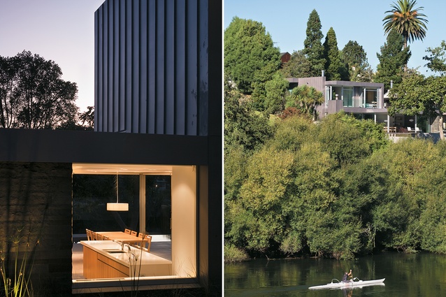
The site is on the banks of the Waikato River, near the centre of Hamilton. It is on a section that has been subdivided several times, making the building plot very tight. Fortunately, this constraint also means that the house, being down a driveway and behind a row of houses, is advantageously removed from the very city-centric road that it is accessed from. The section was bound by Council-dictated height and heritage restrictions, subject to additional boundary restrictions placed by the previous owner and sub-divider, and, explains Taylor, “there was also the challenge of addressing the dominance of the southwest and northwest properties to the house”. The solution resulted in a house that is hunkered into the banks of the river.
Because of the relatively small useable section size, the garage was embedded within the hill. This placement helps ground the property firmly – and literally – into the site. Also, says Taylor, “it means that the garage didn’t become overbearing, as they sometimes do”. There was a large amount of excavation required to achieve this embedding, which involved digging extremely close to the neighbouring northeast property, a two-storied block of flats which is supported by the bank. “It was required that four 600-millimetre-diameter concrete piles needed to be sunk seven metres into the ground and cantilevered up five and a half metres to support the neighbouring property,” Taylor explains.
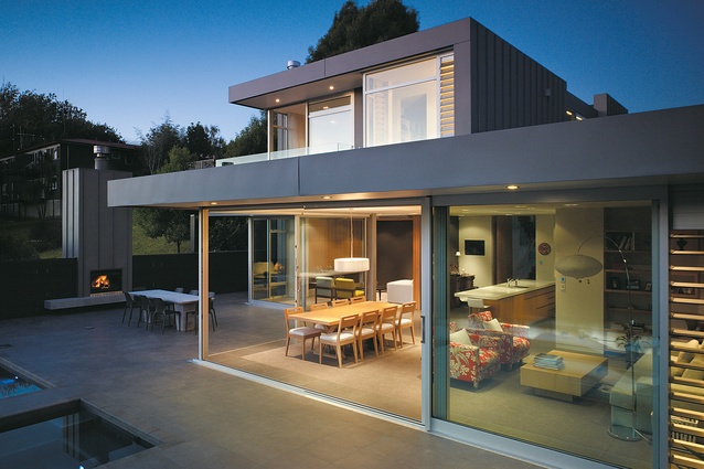
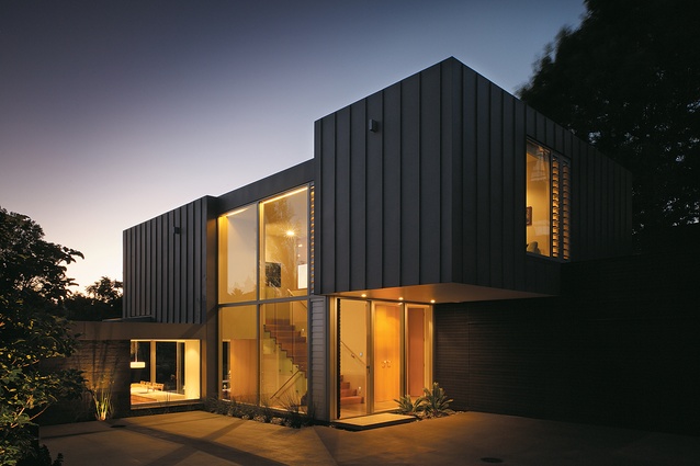
Taylor says he used materiality to reinforce design elements. For example, the dark-stained cedar slat cladding of the garage makes the house appear to recede deeper into the bank, and the basalt on the southeast wall is a representation of the barrier between the imposing southeast property. Zinc is also used to clad the varying sized block forms, and glazing is used to define and break up these forms.
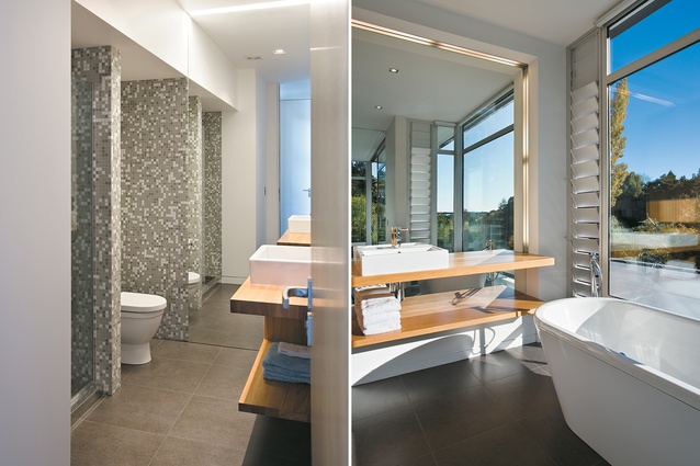
The double-height glazed space forms the entry and houses the circulation inside. Entry is on to a mid-level floor and the perfectionist approach of the architect and the significant detailing within the house becomes immediately apparent. One notices that a door that is disguised as one of the cupboards in fact leads to the bathroom. Also on this level are the garage and the gym. The Tasmanian oak stairs are expertly constructed, and as with all the timber detailing throughout the house, give a warmth to a space that would otherwise feel rather bland. Upstairs are the three bedrooms, the en-suite and the study, which all fit neatly within the constrained form.
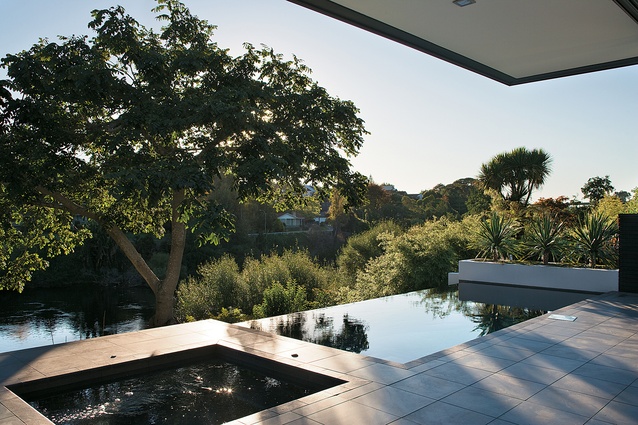
Back downstairs, the living space sits 1400 millimetres below the entry level. The excavation presented an opportunity to get closer to the water below; the strategy allows height in the level as well as complying with the height restrictions. It also begins to form a carefully considered line of connections. With the living spaces then spilling out on to the front terrace – unobstructed through the use of full-height glazing – which then, with the aid of the infinity pool, spills out towards and provides a strong connection to the river. The result provides the house with a point of difference and works to accentuate the site’s views.
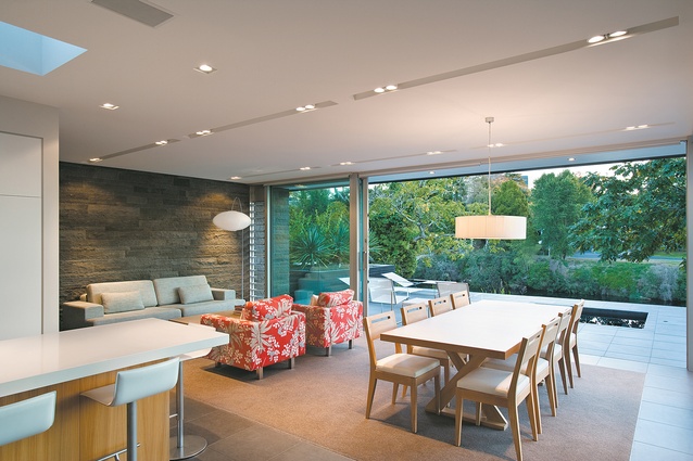
The living space comprises kitchen, office/laundry, dining, living and media room. Although the living spaces could be described as open-plan, a great amount of attention has been placed on the articulation of separate functional rooms. Consideration of the way the space may be used in relation to its neighbouring space, as well as the continuation of viewing lines, is apparent; solutions have been devised without recourse to the creation of one box form. Carefully placed walls and sliding doors are used as a technique to define separate zones, creating privacy.

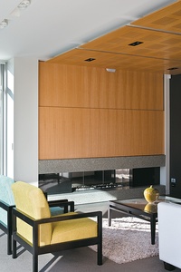
Carpet inserts within the grey tiled floors also help to define the living, dining and media rooms, and the use of timber acoustic panels in the media room gives the space a stronger sense of encasement. Sliding doors provide the means to further enclose the media room, but the use of a recessed detail means that when the doors are open there is little clue that they exist. The living space is further accentuated by the basalt of the exterior southeast wall wrapping into the interior of the living space, again reiterating the barrier between the properties, and distinguishing and providing texture to the space.
The terrace at the front of the house is what connects these spaces, and encourages the open-plan feeling. Spanning the width of the site, the terrace links the entire river frontage of the house making the living spaces seem much larger than they are. Malcolm Taylor – never one to spurn an opportunity for detailing – has used the northwest boundary to hide the pool equipment, barbeque and wood-store within the fence, and on the southeast boundary has disguised the pump room and garden shed as a planter box.
It is in the details that Taylor excels in his design. Working with a builder with a vested interest in the property has meant that the architect has been encouraged to resolve these details beautifully. On this job, at least, there has clearly been an entente cordiale between those oft-frustrated codependents, Architect and Builder.
Want to be the first to see Houses Revisited, received straight to your inbox? Click here to subscribe to the ArchitectureNow newsletter.

