Houses revisited: Oakura house
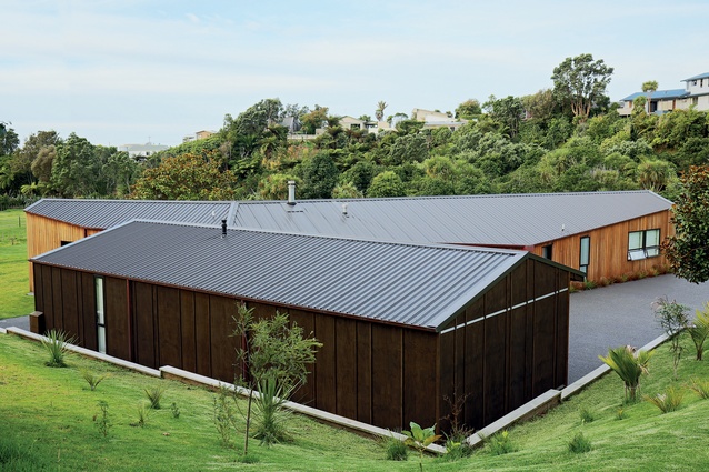
Like an origami model, this experimental family home folds and bends along its site. First published in 2015.
When the owners of this home first sat down with architect Glenn Brebner he knew the house he would eventually design for them was not going to be your typical box. “Their brief was relatively straightforward — a three-bedroom family home with accommodation for guests and a carport. Their inspiration, on the other hand, was anything but. They had brought with them a number of images of various buildings they liked and without exception they were all angles and truncated forms.”
Brebner says as the design process progressed they started experimenting with pieces of cardboard and folding them in various ways to create a pleasing shape.
“We quickly realised that the traditional L- or U-shape wasn’t going to do it and the design starting moving more towards a Y-shape.

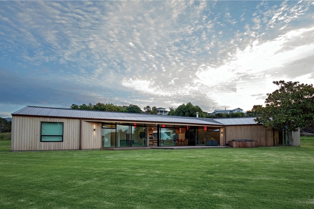
“The problem with that is you run in to circulation problems with this shape. The solution was to divide the house into two separate yet linked structures. What this allowed us to do was design the main structure in the form of a relaxed ‘C’ with all the rooms oriented towards the north with a circulation corridor along the perimeter.”
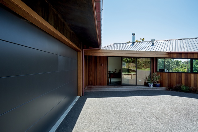
“A linking element, in this case the entry foyer, then connects the first structure to the minor form, which houses a guest suite, a storage area and a large garage.”
Despite what appears on the surface to be rather complex, Brebner maintains that there is, in fact, a simple construction logic within the house.
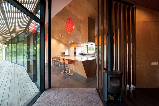
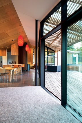
“If you look past the angled walls you realise that the ceiling lines actually run in parallel, which allowed us to create a clear span of 15-metres without the need of support posts. When you’re inside the space there is an effortless feel to it that is further enhanced by the flush-sitting floor-to-ceiling joinery.”

“In terms of a heirachy of spaces, again, this follows an easily discernible programme. The kitchen serves as the pivot-point from which everything else revolves, culminating at one end in the parents’ bedroom and the children’s area at the other. In between there are a couple of living spaces. Neither of these is particularly large, but because they abut the circulation corridor they feel bigger than they are,” says the architect.
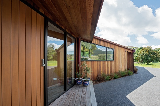
These spaces all lead on to a partially covered, north-facing verandah, the roofline of which aligns with the ceiling parallels.
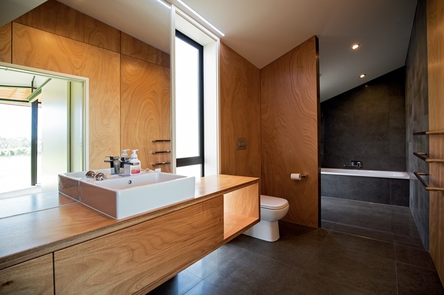
“On this side of the house, where the light comes in, we’ve given the ceiling a light, painted finish, whereas, on the southern side, we’ve kept the feel dark and intimate with the stained ply, which is picked up again in the tonal difference of both structures,” says Brebner.
Click here to see more Houses Revisited. And sign up to our email newsletters to receive Houses Revisited straight to your inbox.
Note: These are stories from our archives and, since the time of writing, some details may have changed including names, personnel of specific firms, registration status, etc.

