Houses Revisited: Polite subversive
Revisit a project where Wendy Shacklock discreetly shuns convention with a modern chalet design near Queenstown.
Wendy Shacklock doesn’t sit still very often. As photographer Emily Andrews and I arrived, she was tidying the kitchen, moving furniture, pouring wine, and fretting about the weather. She had reason for concern. The car’s wipers were on full as we sloshed through muddy puddles to reach this house on the outskirts of Queenstown. Though it was two in the afternoon, it was misty and dark, which made the warm house and the fire that much more welcoming.
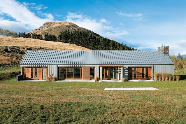
The house is on 50 acres in a planned subdivision of lifestyle blocks. Queenstown is renowned for its rigid planning regulations but in this case, design guidelines set out in the subdivision’s covenants further restricted what could be designed and built on the site. Design stipulations included a requirement for 80 percent gable roofs, a very low height, and materials that referenced the local environment.
Well, architecture is about solving problems, and Wendy Shacklock has managed to work with those constraints to create a modern chalet within traditional bounds. And, given the architect’s seemingly inexhaustible energy, it’s not surprising that this seemingly straightforward house masks a huge amount of thought and complexity.
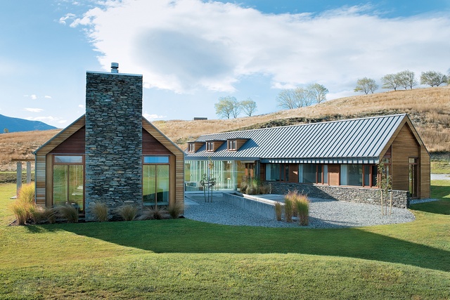
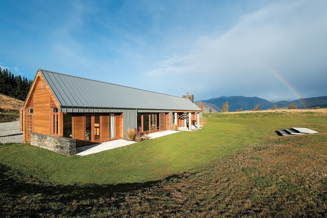
The plan consists of two gable-roofed wings, one thrown off parallel from the other to flare out in a subtle ‘V’. Lancing through these two long rectangles is a tapering hall that starts as the cosy office at the thinnest end, dematerialises in glass as a hall linking the pavilions, and finally disintegrates completely as a pergola gives out to wedge-shaped steps that lead out to the paddock.
The idea of the two pavilions linked with a perpendicular shape isn’t new, of course – if anything, it has become a modern diagram for living. What makes this house different is the significant twist from a rectilinear plan to create a widening slot between the wings. Also, the placement of the hall, not to one side, but cutting through the middle of the wings to quarter the house, is a striking departure from the norm.
This layout has the effect of creating one large courtyard to the west that, due to its flaring shape, still draws sun from the north in throughout the day, as well as a smaller, more sheltered courtyard to the east.Wendy Shacklock envisaged this small eastern courtyard as a modern interpretation of the kitchen garden.
While it is used as a sheltered garden for the kitchen, its other purpose is to provide a spot to sit in, après-ski. Just as down at the local Cardrona pub punters in ski gear can take their mulled wine to the outside tables to sit near the fire, the inhabitants of this house can warm themselves by the fire rather than having to traipse through the house in wet ski gear. The eastern courtyard serves as a back entrance to the house; the owners of the house and any guests can enter the house through the garage, and shed their wet gear in the drying room.

I like to imagine Wendy Shacklock wrapping Christmas presents; I get the feeling the card and the paper would be perfectly matched, the twine knotted and most efficiently tied with even, looping bows, until a stack emerged that looked like a department store display – such is Ms Shacklock’s practical and not-a-hair-out-of-place energetic competence. But back to the house: the entrance is actually a two-part exercise. First, the exterior door brings you to an anteroom that acts as a wind-lock and a shelter for removing coats and boots, and also accesses the small study which can be used for business meetings entirely separate from the rest of the house.
The entrance sets up a strong language of procession and unfurling that is continued through the materials and shifts of scale in the house. This anteroom, and the study to the left of the front door, constitute one end of the flat-roofed perpendicular element that runs through the house. Here, the steps have the same wedge profile that at the other end of the house serve to disintegrate the form; the wedge-shaped steps act like parentheses, bracketing the two edges of the house.
That wedge or V-shape is found throughout the house, from the steps themselves to the relationship between the pavilions to the tapering of the perpendicular hall. The V-shape also begins to imply a sense of movement in the plan, a pulling apart of the buildings. This effect is echoed in the application of materials, both in the cladding on the exterior and in the interior design.
The exterior is coded. Most of the two wings, both roofs and walls, are clad in wide strips of zinc, the matte grey finish promoted by Wendy Shacklock as a material in keeping with the natural environment, in particular with the dark mountains in the distance. This zinc is then “peeled back” around openings to reveal a set-back, cedar-clad section. The zinc thus reads as a hard shell, in contrast to the softer openings.

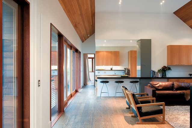
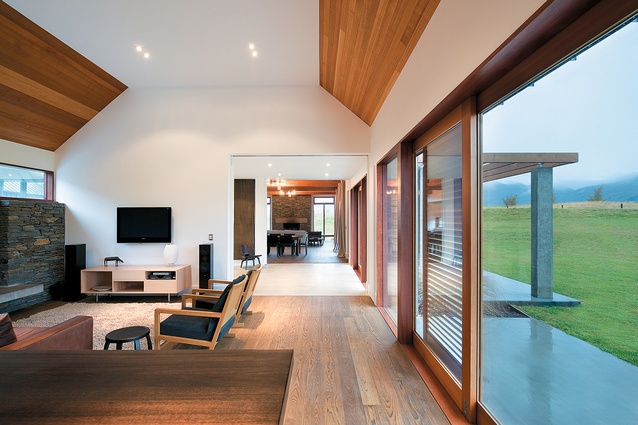
In the interior, Victorian ash has been used on the slanted gable ceilings to continue that sense of skin, while a dropped, flat ceiling is differentiated in plasterboard. As you progress through the house, from the small anteroom, to the entry, through the glass loggia, to the double-height living pavilion, you experience a constant unfolding as the spaces enlarge and grow until you reach the final stage: the expansive outdoors.
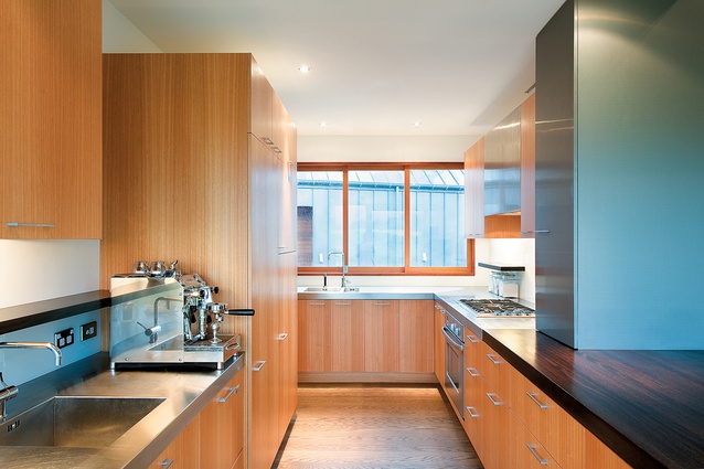
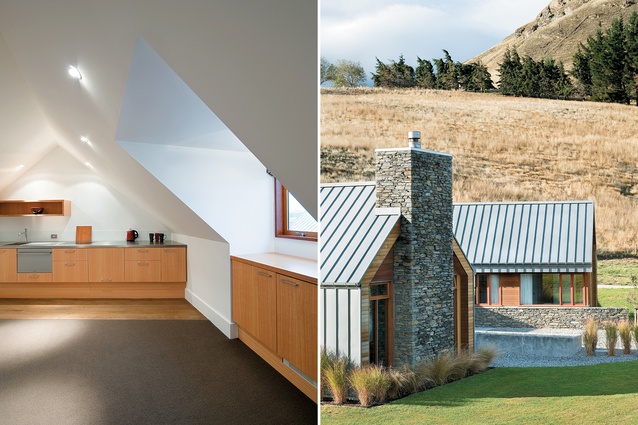
The kitchen again makes use of these two signature materials, the timber for much of the cabinetry, with a zinc cabinet shaped around a large steel beam, the metal casing descriptive of what it is hiding. The kitchen is not a show kitchen; much of the work area has been tucked behind this line of cabinetry to take away from the performance aspect of modern entertaining.
This is a house that is relatively rustic and appropriately relaxed, but always revealing of Wendy Shacklock’s determined pursuit of design sharpness and rigour. The house fits well into the Queenstown schist-and-gravel scene, but stands out from that crowd as well. It’s gregarious, but careful, sincere and perhaps rather guarded. That’s fine: in the alpine climate of Central Otago, it’s nice to be reassured a house is first and foremost a shelter.
Want to be the first to see Houses Revisited, received straight to your inbox? Click here to subscribe to the ArchitectureNow newsletter.

