Remuera House by Daniel Marshall Architects
In Auckland’s leafy Remuera there is a huge range of building types. Grand old dames, state houses, modest bungalows and 1980s glassy glamour-models sit alongside each other. The common element in this part of the neighbourhood is sites that run down the hill and allow most of the houses a unique combination of privacy and views. First published in 2012.
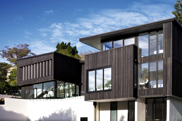
This house, designed by architect Daniel Marshall, replaces a 1970s house that the clients had been living in on the site. The project was originally an alteration – but turned into a new house when it became clear that the works needed for an alteration would require similar resources.

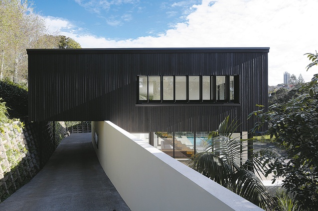
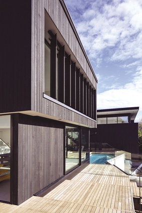
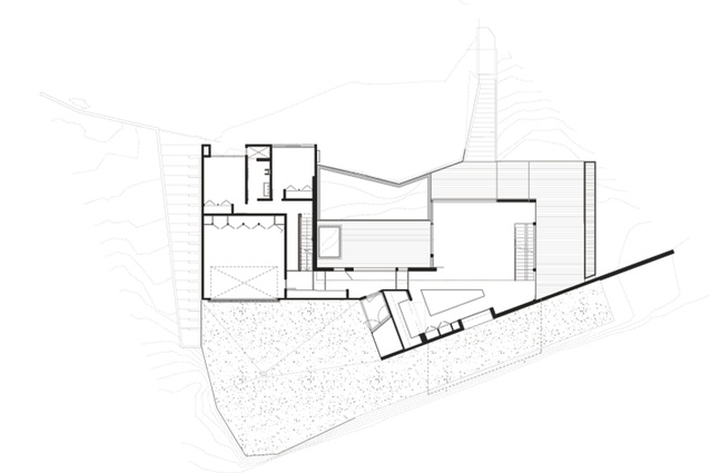
The site is at the end of a long driveway so the house can’t be seen from the road. Once visitors get closer to the house it presents as a single-level, discreet, black-stained cedar box that sits over the top of the driveway. I was reminded immediately of the motor-courts of my childhood when I saw the driveway running under part of the house.
A drive-through was the ultimate in urban sophistication to my seven-year-old self and I am pleased to report that it is just as impressive in its modern iteration. A white wall runs down the north side of the driveway, creating a separation from the house for the visitor and privacy for a deck on the north side of it.
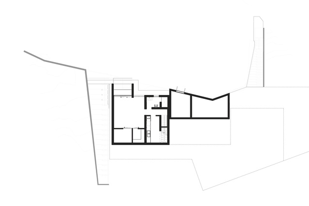
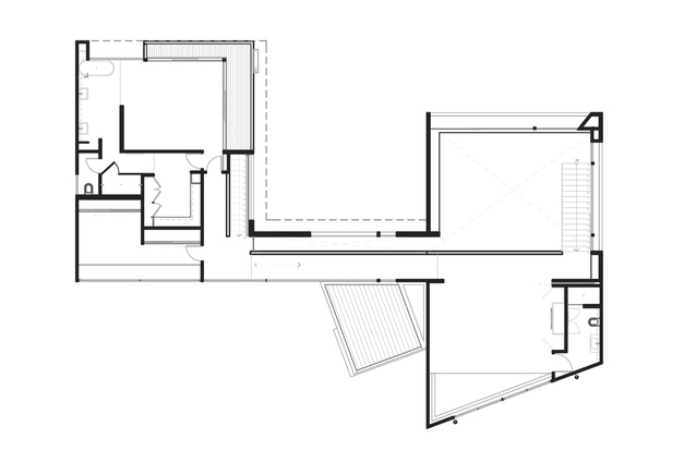
The plan is composed of two cubic volumes – a living wing that runs perpendicular to the boundary wall at the back of the site and a bedroom wing that sits parallel to it. They are connected by a central core space that comprises the entry door and hallway. The house is three storeys high, but is built to run down the steep slope of the site, so can only be seen at full height when viewed from the tennis court below.
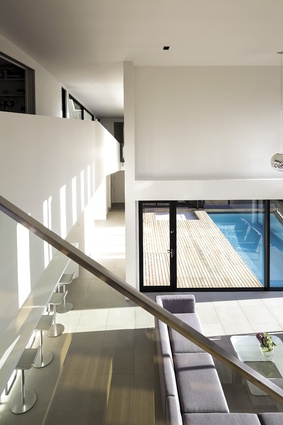
Inside the hall is a narrow, tall space – full-height glazing gives a wide-framed view of the deck and pool and the trees that line the section edge below. The north edge of the house drops away to the original tennis court, which is being renovated.
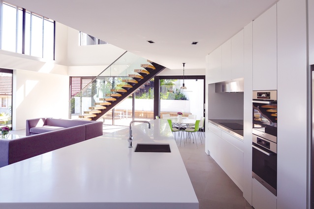
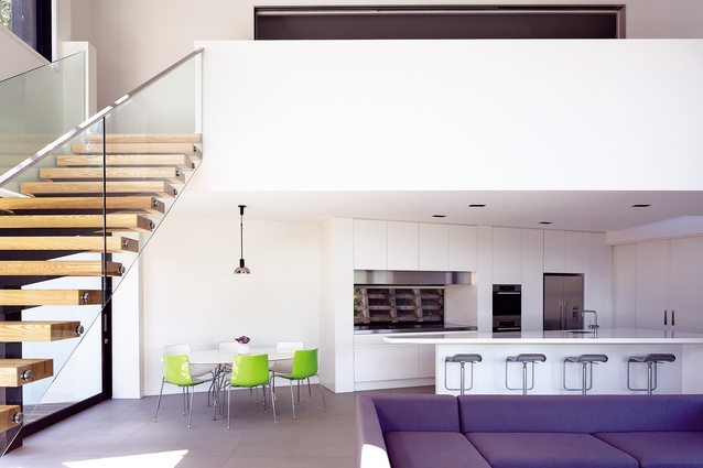
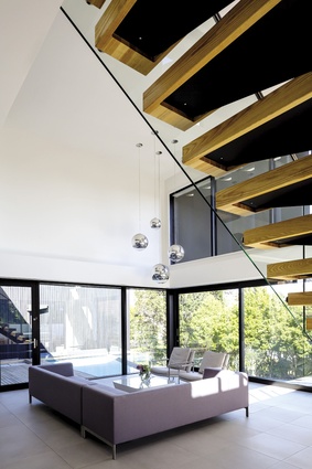
Visitors walk north along the hallway up a few stairs to a large, double-height living space that includes the kitchen, dining and living room. Lovely light timber stairs with metal detailing run up one side of the room to a second, mezzanine living area with television. This is a less formal space, perfect for the children to use or to watch a movie.
From this room a ramp runs down to the second building volume – the grown-ups’ wing – with a study that faces back towards the driveway and entry, the master bedroom and bathroom, and a dressing room. The master bedroom is open to the bath – which enjoys total privacy and a great view. Keeping the rooms open creates a sense of more space in the bathroom and master bedroom – but privacy is protected in the toilet and shower which are placed at the back of the room, connecting to the dressing room.
Downstairs in this wing are two children’s bedrooms and a bathroom and then on the lowest level – a guest room that has an access door to the tennis court.
The house is very cleverly layered with different glimpses of views of the neighbourhood and city from each part of the house. The plan works around the steep site with easy grace, and the thoughtful material finish means this house should avoid slotting neatly into a dateline in a few years’ time.
Click here to see more Houses Revisited. And sign up to our email newsletters to receive Houses Revisited straight to your inbox.
Note: These are stories from our archives and, since the time of writing, some details may have changed including names, personnel of specific firms, registration status, etc.

