Houses Revisited: Retro slick
Working with design-literate clients, and his builder brother, Michael Melville has fused seventies suburban optimism and contemporary experimentation, first published in 2006.
It has to be a dream project: you’re a cutting edge industrial designer, your old friend is a cracking good architect, and his brother is an ace builder. Put it all together, and what do you get? In the case of Adam Ellis, Michael Melville and Daniel Melville, a friendly cooperation that has produced a superb new house in film-fuelled Miramar in Wellington’s eastern suburbs.
Adam Ellis and partner Gabrielle Stevenson had been looking for an empty site for a while. When an opportunity came up to grab a property with a sub-dividable section, they leapt at the chance to build a new home. Referencing the long stream of mid-century Modernism that runs through the bloodline of Wellington architecture, the new house has a delightful air of both fifties retro and 21st-century slickness, combining well-crafted details with experimental product design.
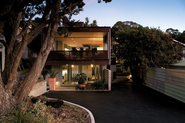
The house features a small self-contained studio flat downstairs-“it softens the mortgage a bit” – which allows the main floor to rise up, hovering above the studio flat. The main floor really does float free from the ground beneath, projecting forward with a large deck looking out at tree level. An additional segment is the rooftop eyrie, which offers views out over suburbia to the surf break at Lyall Bay (this is one part of Miramar where you can literally see the sea). As Adam Ellis says, the house is made to “sneak the views”. As well as Lyall Bay, with its hardy surfers, the prospect comprises Wellington Airport, Cook Strait and, in the far distance, the snow-topped mountains of the Kaikōura Range at the top of the South Island.
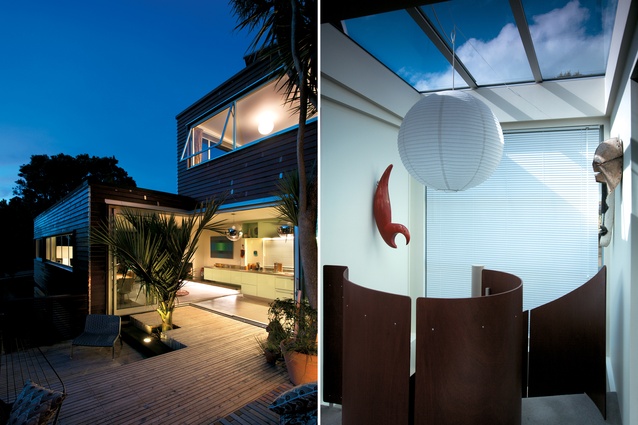
Despite the house being brand new, it has a carefully cultivated feeling of having been around for many years. This is a deliberate effect, in large part achieved by the care taken by architect and owners with the existing trees on the site. A huge rambling pōhutukawa graces the front of the property, the top of a nīkau palm is growing up through the outside deck, and a sculptural tī kōuka (cabbage tree) is still clinging determinedly to the craggy ground outside. The site had also had a couple of Norfolk pines, probably planted at the same time as the other trees. To get room for the house, the exotic pines had to go. With the log burner going in Wellington’s chilly winter, the Norfolks are performing their final service.

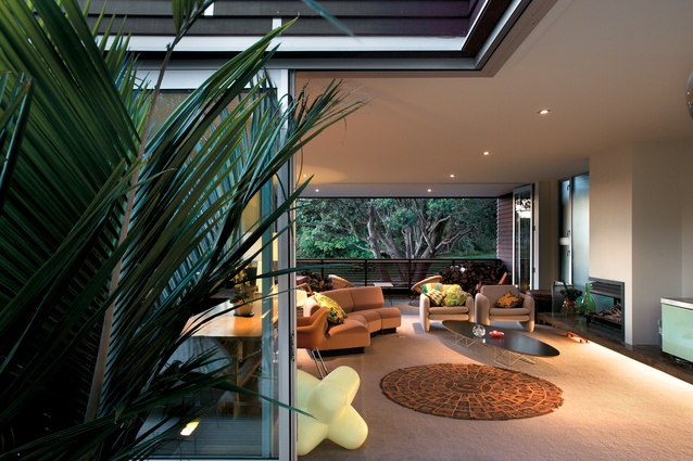
It’s not just the trees that make the place look settled, though. Architect Michael Melville has carefully referenced the neighbourhood’s seventies villas, picking up both a tradition of open-decked optimism and the commonly used cherry-cola red cladding stain. In this house, the windows have dematerialized the walls, with the long slit windows in the living room continuing outside on the spacious deck. Melville notes that each and every window has a purpose, framing and reinforcing particular views.
While Wellington is often (and reasonably) thought of as a windy place, it is truer for those who live on exposed ridges. In a southwest-facing suntrap such as this Melville’s clients can escape the bracing breezes and full-on gales that assail the city. While the warm and blustery northerly sails by overhead, the frigid southerly is deflected by the neighbours, and the house can bask in a tree-clad microclimate, with tui squawking and honking at their windows.
This is a very comfortable house, its livability derived from its concrete block core, heavily insulated external frame, double-glazing, underfloor heating, and solar collectors for hot water. Avoiding the modern trend of placing the kitchen at one end, this house instead features a narrow pinch point in the centre (“the bridge”), with the kitchen spanning the divide, blurring the domestic zones. This strategy maximizes the amount of space in the living room, and sets up the option of a wonderful L-shaped living space when the sliding doors are open onto the deck.
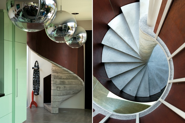
The long, sleek kitchen is composed around a huge linear stainless steel bench and a series of menthol-mint-green cupboards that pack a huge amount of storage. Where the benchtop stops, the concrete suspended hearth continues along below, cantilevering into the living area, again blurring the distinction between cooking, dining, and living. Three sexy mirror balls, produced by Adam Ellis when he worked with design guru Tom Dixon, hang just above head level, stepping down the central zone with the air and flair of a rave nightclub, pointing at the circular sculptural stair.

The pièce de resistance of the house, of course, is the concrete staircase. Originally the clients wanted an atrium with a stair running through it. Over time, the atrium got refined down to the present precast construction. It’s not the sort of thing you can buy off the shelf; rather, it is a custom special developed by Adam Ellis himself, and built, piece by heavy piece, in the basement. Using his design skills and a few prototypes, along with 6m of reinforcing and 110kg of concrete (per step!), Ellis beavered steadily away and produced the 17 heavy interlocking concrete treads. These were carefully lowered over a central steel pole and then wrapped in a thin skin of laminated meranti ply to produce a result that is a true one-off. What’s to stop the top of the stair wobbling around? Michael Melville reveals the secret is a 20mm-thick slab of steel that does duty as the top landing and also locks the stairway together (and keeps the engineers happy).
Right at the top of the stair is where the project all comes together. The rooftop bedroom and bathroom are held within one volume, bisected by the top of the stair and rooftop skylight overhead. Sliding panels offer the option of privacy, and eventually another deck will grace the roof terrace. Meanwhile, the clients can sit back and relax, enjoying the satisfaction of living in a house that they themselves helped create, and enjoying the views down to the south coast. Miramar has never been flash, but at dusk in this house, says Adam Ellis, he can “watch as suburbia turns to fairyland.”
Click here to see more Houses Revisited. And sign up to our email newsletters to receive Houses Revisited straight to your inbox.
Note: These are stories from our archives and, since the time of writing, some details may have changed including names, personnel of specific firms, registration status, etc.


