Houses Revisited: Salute to the sun
A Michael Wyatt pavilion executes a graceful pose on its well-favoured Queenstown site in this home from the archives.
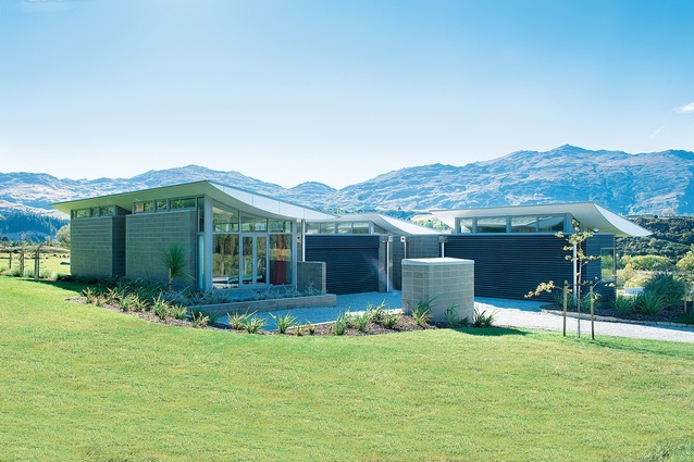
Here you’ve got a yogi on a hill. Upward-facing dog, chest out, straining in an arc towards the sky. You might expect this dramatic bend to tip up to the view, but instead it rather looks like our yogi has turned his back on the vista, toes to the north, head lofted towards the south. The anthropomorphic swivel has been sensibly designed by architect Michael Wyatt; it squats a bit closer to the ground on the northern side with the curve soaring out beyond the wall to shade the interior of the house from the summer sun while tempting in those much-needed winter rays. The swoop up higher to the south allows a line of clerestory windows to fit in under the ceiling on the south side, emphasising the one-room depth of the pavilion plan.
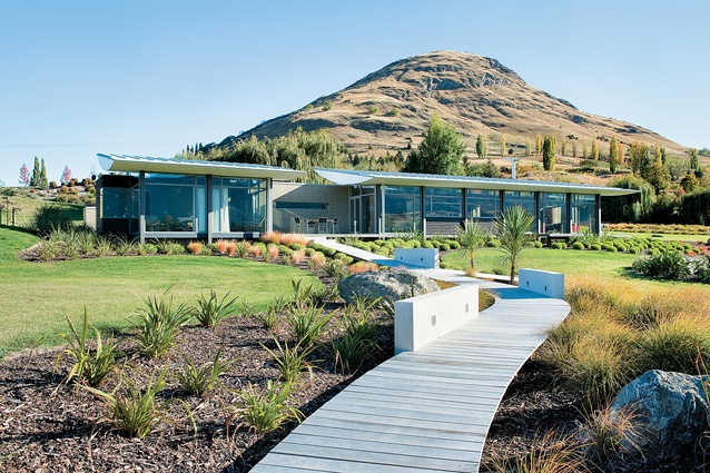
Maybe the yogi comment is a bit gauche. This is hardly a place designed around the rejection of material goods, although the pursuit of enlightenment may well be encouraged. With a view like this, and sprawling windows designed to capture as much of that view as possible, you could conclude that quiet meditation was the order of the day here. And the owners might agree, especially when they wander down the timber path to the spa positioned at the edge of the cliff. From spa to handrails, this is a house designed for comfort, but the design goes about its business it in a Kiwi way (besides, in these times, it’s no bad thing that luxury comes a little understated).
The site is spectacular. Planted in its section, on a plateau land overlooking the Shotover River near Queenstown, the house makes the most of its uncommon position. A neighbour is nearby but out of sight, just below the lip of the hill to the east. For all intents and purposes, the clients have this spot to themselves. The Shotover, with its photogenic braided tributaries, the deciduous trees – in autumn gold and bronze – and the big sky, all live up to the received version of southern splendour. Even a visitor might imagine himself the lord of the all he surveys. (When I was there, the clients were conveniently absent, and I could briefly entertain the fantasy that this was all mine.)
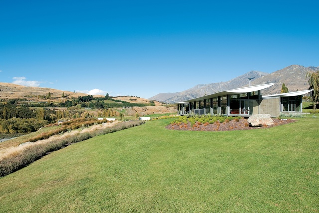
Whether the train of thought is on the rails or not, when I think about this house, my mind still strays to yoga. In its bold and quiet way, this house embraces both strength and flexibility – a combination that lends the building the feel of a solid family home, but also allows for sufficient whimsy that occupation might be experienced as escape.
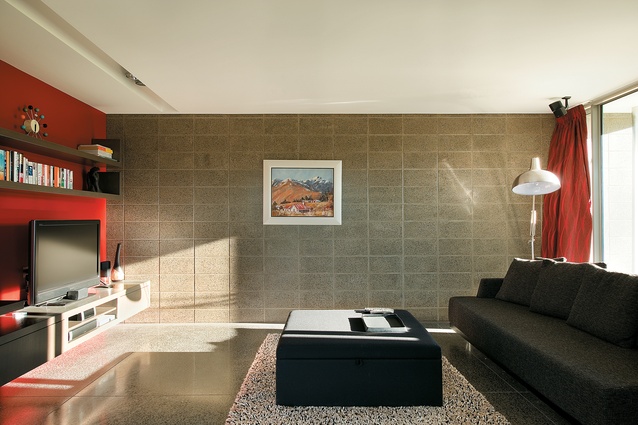
The house is rectilinear and straightforward. The sloping section has the particular advantage of not only looking out over its valley, but looking north over the valley. Thus the house, a long rectangle resting on the crest of the site, responds not solely to the view, but also to the sun. Family, kitchen and dining areas spread along the length of the house, with the master bedroom tucked away at the eastern end, separated from the living areas by a deck. For the winter months, a snug living room is accessed off the open plan living, allowing the clients to turn on the fire, close the doors, and hibernate.
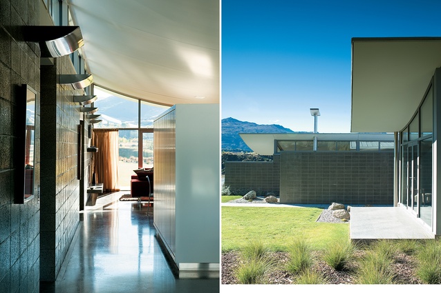
Perpendicular to this main axis, a wide hall connects the living pavilion to the bedroom pavilion sitting parallel in behind creating a three and a half-sided courtyard sheltered from wind whipping up over the cliff. In the afternoon, as the sun heads west, the light throws the filigree shadow of a tree in the courtyard against the concrete wall of the hall, bringing a sense of the natural landscape into the rectilinear house.
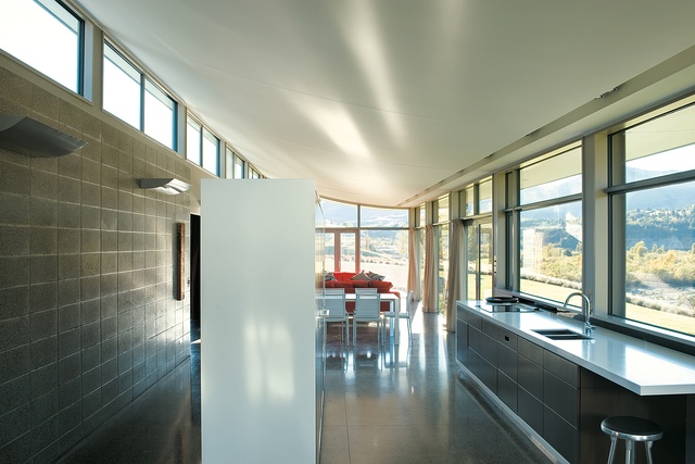
In both plan and elevation, this is a house that is easily reduced to geometric forms. From the side, the form of the building is a crescent perched on a cube. The rectangular base is heavy and resilient; in contrast, the arced roof and ceiling feels light. In photographs, these distinct geometries can feel too overbearing, even too obvious (although a roof like this is anything but what-you-see-is-what-you-get). However, the experience of the space is quite different. Walking around and through the house, glancing up and around, the ceiling doesn’t seem gimmicky; rather, one is caught in the uplift, that saluting out to the view, that rising up that reveals a glimpse of the mountains to the south.
What prevents this ceiling becoming merely an architectural stunt is the consistent manner in which the subtle curve has been drawn through the entire house. Its most obvious incarnation is in the living area: a marquee drape gives this space a tent-like reading. The same ceiling is repeated in the bedroom wing; it skims above not only the bedrooms but the bathrooms as well, creating a surprising soft arc above the shower and basin.
The quality of the craftsmanship in the curve makes it appear effortless, although a quick word to project architect Neil Slater reveals it was anything but. This sense of craft is also expressed in details such as the custom-designed up-lights that mimic the same curve. On the exterior, the edge of the crescent has been detailed so as to be free of obvious flashings and gutters, and to continue the clean, strong shape.

Underneath the curve is where all the living happens and the shape helps create simultaneously a sense of cosiness as the ceiling hugs down lower on the north end, and also a spacious effect as the ceiling glides up to the windows and beyond. The curve form responds, then, to the dramatic climate of Central Otago, a region with hot summers and cold winters, by filtering strong light in summer and accessing desirable light and warmth in winter.
The planning is straightforward – the house is a diagram of modern living: a stretch of open plan, facing the view and the sun, with bedrooms separated for privacy and quiet, linked with a glass hall. The house is able to comfortably accommodate different numbers of visitors, closing down to the single front pavilion for just a couple, or opening up into the guest wing for a larger group.
The house is considered and highly competent. More than that, Michael Wyatt has created a house that is both rigorous and organic, a place that’s comfortable but not overwrought, simple and streamlined, and assured enough to tip its cocked sunhat to its spectacular Central Otago surrounds.
Want to be the first to see Houses Revisited, received straight to your inbox? Click here to subscribe to the ArchitectureNow newsletter.

