Houses revisited: Speargrass Flat house
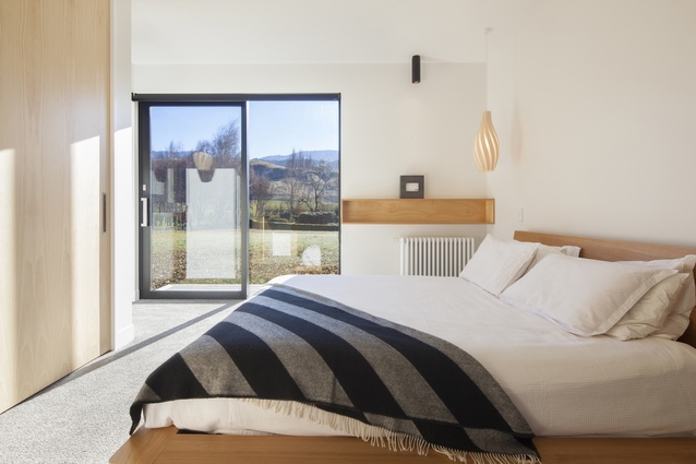
Homeliness is sometimes thought to be plain, but this holiday home demonstrates this is not always the case. Contemporary in its striking silhouette, pared-back palette and minimal furnishing, it is welcoming, hardy and yes, homely.
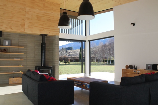
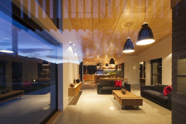
A concrete floor that spans the entirety of a large open living area meets a wide concrete terrace that looks out upon a long unfussy lawn and onward north to the mountains. Inbuilt features and raw materials enhance the simplicity, the usability, the integrity of this space, a space that is designed to last.
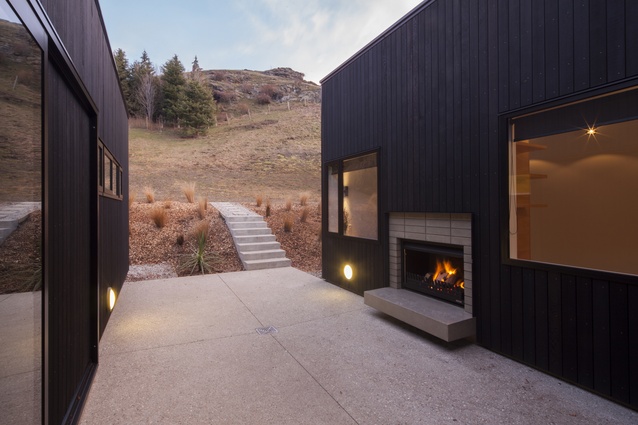
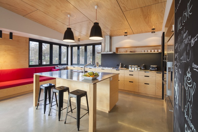
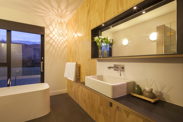
It is the character of the materials — natural and textured — that gives this home a warm and unpretentious quality. As well as concrete flooring, the interior features untouched breeze block walls, dark slate tiling, a plywood panel-covered ceiling and plywood kitchen cabinetry, as well as an exterior stained weatherboard wall, which becomes an interior wall.
This raw palette is, for Pete Ritchie and Bronwen Kerr of Kerr Ritchie Architects, as much about style as it is about substance.
“While we favour using raw materials for their integrity, character and personality, for this home they also provide much-needed robustness, affordability and low maintenance,” says Ritchie.
This holiday home will need to accommodate family activities throughout the year, serve as a holiday rental and, as Ritchie says, be robust enough to withstand children riding their bikes through the living room, should they want to.

Inbuilt features, such as floating plywood shelving and a kitchen booth seat, are an ideal solution to preserve the look of the house, ready for the next guest.
“By building in some of the furniture we can maintain the character of the interior and provide a homely feel as soon as someone enters, without it needing to be heavily furnished or maintained.
“These elements become integral and permanent to the space,” Ritchie says.
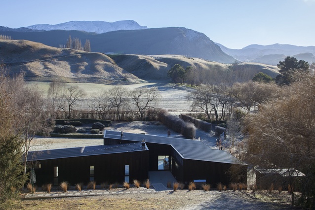
There certainly is an element of permanence to the structure. Hunkered against a hill, this long and dark, pitched and sharp 250m2 two-bedroom home makes a statement within its surroundings.
The designers were presented with a favourable north-facing 6000m2 site to work with; however the budget was tight, the clients were overseas and there were many iterations throughout the two-year process.

“Every site has a context, and this design changed several times. At each step we re-assessed, and then pulled it together like a puzzle.”
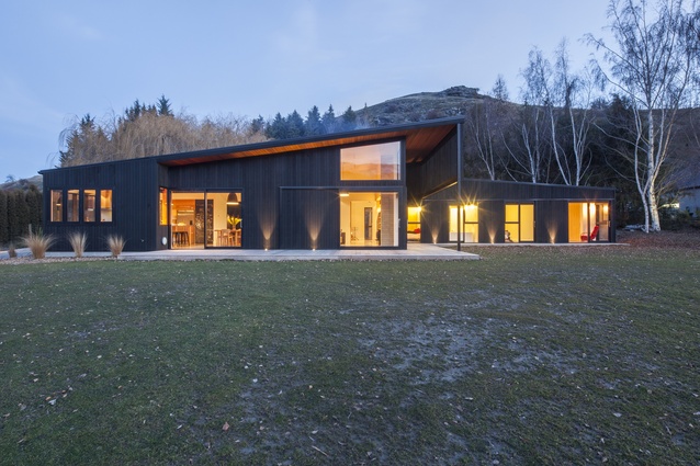
By pitching the roofline toward the windows at the northwest end of the living space, the family enjoys great views and sun. This is enhanced by over-the-cladding sliders that open up the corners allowing a seamless flow to the outside. The concrete flooring and north-facing design gains from passive solar energy too.
At the height of summer, an extended eaves with louvres filters direct sunlight. The louvres, like other design features of the home, are more than just utilitarian; they accentuate the rhythm of the vertical timber cladding. And, where one window frame line ends, another frame begins, subtly but confidently pulling these pieces together. Indeed, like a puzzle.
Click here to see more Houses Revisited. And sign up to our email newsletters to receive Houses Revisited straight to your inbox.
Note: These are stories from our archives and, since the time of writing, some details may have changed including names, personnel of specific firms, registration status, etc.

