Houses Revisited: Sympathetic intervention
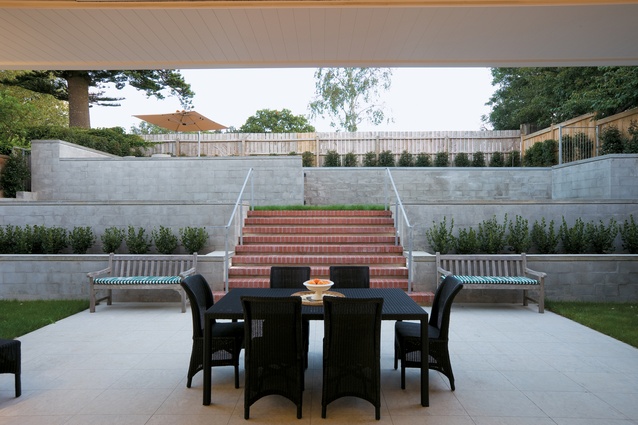
A patio now extends out towards the terraced back landscape.

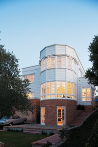
The orange brick of the house’s base is a visual and physical connection with its frontage.

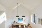
A large square island is the kitchen’s focal point. Backpainted glass cabinetry recedes into the background.
We revisit a project from the March 2009 issue of Houses where Michael Fisher takes an Auckland art deco house through the rehab process.
The drive, these days, from Kingsland to Parnell, is complicated. Sorry to bore all those from outside Auckland with the trivialities of life here, no doubt you have your own problems to be getting on with; but there’s just no easy route. Boston Rd, Khyber Pass and Symonds St all suffer under the burden of interminable road works. Grafton Bridge is lost forever to the passenger vehicle commuter.
Parnell may as well be an island – split from the west of the city by man’s infernal tinkering, if that’s not selling these much-needed infrastructure projects too short. It’s not until you hit the corner of St Stephen’s Ave and Parnell Rd that the last vestiges of road/drain construction/repair fall behind. Then you can marvel, as I did, at the roof form of the Anglican Cathedral, and be amused, as I was, by the swarm of council groundsmen on ride-on lawnmowers, larking it up down the middle of Gladstone Rd. Are my rates paying for that? Is it too late for a career change?
The joys of Parnell are no doubt many and wondrous. If Remuera is Toorak, then Parnell may be Prahran, and as a long-established suburb it has its fair share of houses in the art deco style of the one we’ve come too see today. But, whereas most deco houses are subtly curving, with monolithic plaster facades, this house is a more angular composition. “A unique piece of 1930s modernism in both its British art deco influences and the unusual use of rusticated weatherboard as a cladding and brick as a base”, says architect Michael Fisher, from the practice CPRW Fisher.
Originally designed in 1936 by A.C Jeffries for one Maurice Yock (who is not at all world famous in New Zealand, despite introducing and manufacturing the iconic jandal), this house had much of the original architect’s design intent stripped away through a series of poorly executed renovations. Infernal tinkering of a dastardly, residential kind, or, as Fisher puts it, “a series of alterations with no empathy for the original structure”.
A glance up the street is enough to confirm that architectural tinkering hasn’t been constrained solely to this site. Some more recently renovated neighbours have not been improved by alteration, although a white plaster-clad Richard Priest-redesigned deco house two doors down has admitted appeal. At Fisher’s site, the world has been put to rights. In a series of architectural interventions, this much interfered-with house has been transformed into what it was intended to be. Some grandeur has been squeezed out of its bones, and those bones realigned in a way that allows a modern lifestyle.
The house wears its renovations well. There are no modern accoutrements – no tinted glass, louvres, or glass balustrades. This three-storey house sits on an orange brick podium, with upper levels clad in cedar weatherboards, painted a stately cream. It also wears its size well. It doesn’t overpower its site, despite a reasonable footprint. In the spirit of neighbourliness, the upper level steps in, away from the neighbours, providing valuable breathing space. The idea of “doing the right thing for the street”, as Fisher says, permeates the design. For instance, the brick base now relates to the front landscape through a series of small terraced walls, and the front boundary now keeps the rhythm established by the houses further along, stepping along in an orderly display of community spirit.
Is it a symptom of the modern condition that life’s formalities are slowly becoming extinct? In this house, some traditions are kept alive, but not at the expense of liveability. An unusual aspect, says Fisher, is that the front door is not at the front but down the side. It opens into a well-proportioned entrance foyer – a place to take off coats and say hello. The architect cites improved circulation as one of the greatest successes of the redesign, and from the foyer one has an almost intuitive feel as to how the house works. At right, the kitchen opens out through wide doors into the terraced back garden’s high terraces and the (at this residential stratum) obligatory pool. At left, the library and the main living space push out into the semi-circular bay window towards views of the city’s wharves and North Head.
Draw a long bow and the arrangement of living spaces could metaphorically be a celebration of dining. From the kitchen there is a neat progression through dining room to post-dinner sitting room to patio. The sitting room and living room are semi-open plan, with easy connections either side of the fireplace, which was moved from an obstructive position in front of the bay window. The fireplace surround is black and white marble; a material also used in the master suite’s showers stalls.
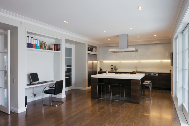
Perhaps the greatest success of this house is that it’s not trying to be something it isn’t. The greatest gestures, or concessions to modernity, are found in the kitchen and bathrooms. The kitchen is large and, through the chocolate hue of the wood floors and dark-stained cabinetry, welcoming. The feature island is a generous work area, and helps fill the space and delineate the room from the casual living area adjacent.
The master suite occupies the third-floor bay window. Interestingly, in a case of preventative architecture this room, which was previously a sunroom, had its ceiling height abruptly abbreviated (i.e., cut off) to prevent the spread of rot. Restored to full height, “it’s now like the ship’s bridge,” says Fisher. There are big views to be had from the bath, which is recessed into a podium and flanked by two basins.
This might not be the house for everyone. Fisher points out that the owners saw potential where many wouldn’t. They were interested in the house’s story and heritage, and not afraid of the rebuilding process. By building on what was originally intended, and by providing new interior and exterior connections, the architect has rendered the house more appropriate than it has been at any time in its past.
Note: Since the time of writing, the design practice featured may have changed name, personnel or both.