Houses Revisited: The art of graft
In another project from the archives, a Mt Eden addition where Megan Edwards deftly engineers a twenty-first century lean-to.
It’s a poser for any alteration: Does a house feel coherent if half of it is buttoned up in Victorian garb and the other half is prancing into the back garden in a steel-stringed bikini? One option is to disguise the new with the frills and corsets of Victorian dress. But this tactic brings its own conundrums.
There’s the issue of ‘authenticity’, and also the question of relevance. Isn’t the renovation an acknowledgement that the old girl’s small rooms and divided planning aren’t working for modern life? The other option is to embrace this dichotomy and concentrate on the connections between the two. We all have a few personalities cohabiting within us, why not our houses, too?
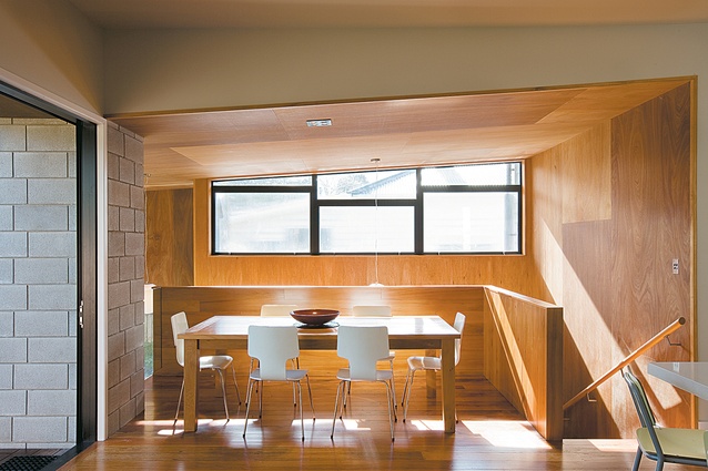
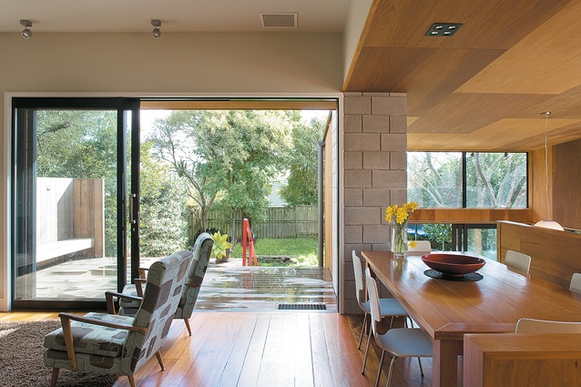
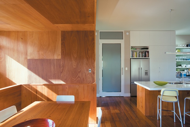
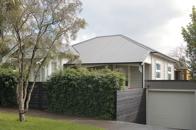
Megan Edwards, architect of this alteration and addition in Mt Eden – just around the corner from this renovation – has resolutely embraced the multiple personalities of a house that keeps a foothold in two very different centuries. Here, we’re not dealing with dichotomy as much as schizophrenia. There’s the front part of the house that keeps most of the features and planning of the bungalow, as well as, resolutely, the front façade. Then there’s the rear addition, in which the hall flows into a bright and light space that overlooks the garden below. Alongside, articulated with a dramatic shift in materials – the switching out of white Gib for stained plywood – is a second living area that folds under and to the side of the house, creating a cozy Seventies vibe.
Designed for a young family, the house is intended to suit the current lifestyle of the inhabitants and to handle the changes that will soon be upon them. The placing of the kitchen, dining and living areas on the same level as the bedrooms makes for a simple and workable arrangement for a busy family. You can imagine the life of the house: both parents and kids running up and down the hall, from the breakfast table to the bathroom, then back to pull on shoes, and up the hall again to return a toy.

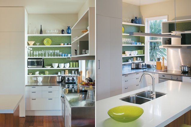
The freshness of the kitchen, in white and green, is again an easy-to-use space that is well organised, with ample storage. The extensions were thought of as a couple of lean-tos. This has always been the addition form-of-choice in D-I-Y New Zealand. Edwards acknowledges the historical precedent, but adds, “Lean-tos at the back of bungalows were consecutively pushed out and added to and became lower and lower and shabbier and shabbier. With this project I was trying to do a lean-to that gave a sense of spatial volume. There is a sameness to villa and bungalow layouts, here I tried to do something different with the planning – a new aesthetic.”
Megan Edwards details some extraordinary moments. The handrail edging the deck stair to the garden, for example, is a folded fire-engine red length of steel – a tiny detail but one that helps give the house an unexpected and welcome sense of fun. In other areas, the architect has specified the windows to the north-east to be heavily pixilated so the neighbours blur to an indistinct haze. And downstairs, an inbuilt desk, shelving and hidden cupboards have been thoughtfully detailed to provide seamless storage.

To the right of the kitchen, another stair wraps around the dining nook and leads to the downstairs study and library – bundled efficiently into an open corridor – an extra bedroom, the garage and the second living room. Here, a fireplace is set into the wall, underscored with a floating slab of honed concrete, wide enough to provide a comfortable seat or, draped in old blankets, a hut for the children. This room is a very tall space, its proportions entirely different to the original bungalow, and it wears its modern garb defiantly.
It’s not a barely-there bikini; the space keeps itself bundled up except for the welcome stretch of north-facing windows. The patchwork pattern of the stained ply sheets becomes a central feature here, similar, in a way, to those oversized seventies flowered prints. It is arresting on first glance, bold and elegant but you may be unsure if you like it. Settling into the space you find yourself becoming quite comfortable here, relishing the gameness of the cladding. It makes you feel a bit bolder yourself.
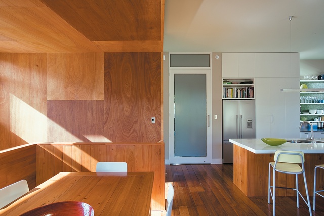
This space is the heat store for the house. Megan Edwards sought to design this house around thermal considerations and so the orientation was tightly controlled to draw in as much warmth as possible. The concrete floor acts as a heat sink which absorbs the sun’s radiant energy during the day, double glazing retains that heat inside the envelope, and warmth is then released back into the rest of the house. The rich cladding is, then, a visual cue for the invisible role it plays in the house.
This is a sort of engineered evolution. Grafted like a hardy foreign species to the back of a tasteful bungalow, this modern and spacious addition has bolstered the original house. With a bit more time, the grafted and the graftee will become stronger from leaning on the other. Isn’t that the key to evolution? You need a bit of something new to carry the whole genus forward.
Click here to see more Houses Revisited. And sign up to our email newsletters to receive Houses Revisited straight to your inbox.

