Houses Revisited: Tui house
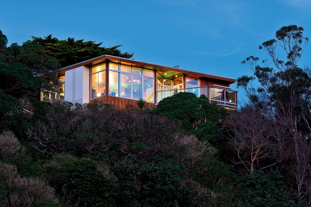
On the edge of Wellington’s town belt, near the Zoological Gardens, local architect John Mills has tightly nestled a new two-storeyed home within neighbouring houses and bush. Tui House cleverly responds to its steep Melrose site by providing total privacy for its occupants, without fencing the new building off from the adjacent properties. First published in 2014.
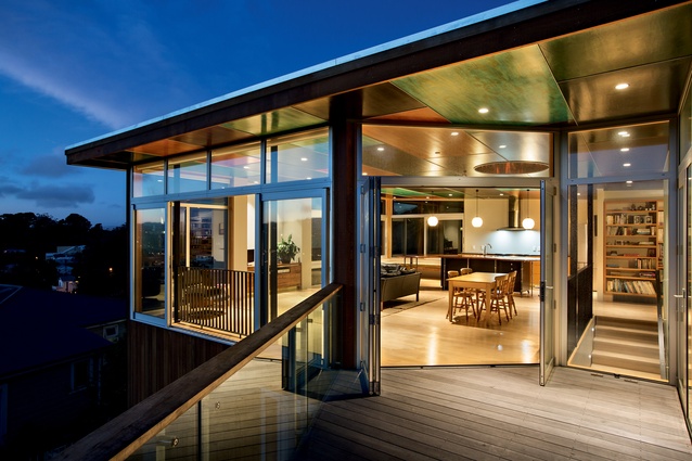
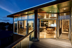
Access to the site is from the end of a cul-de-sac, down a path towards the southeastern corner of the building. The cedar-clad frontage shows clean lines, with visual clutter minimised by concealing a storage locker and drainpipes within the building. The cedar-panelled recessed entrance opens up into an expansive open-plan kitchen/dining/living area with panoramic bush, city and ocean views to the north, west and east.
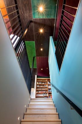
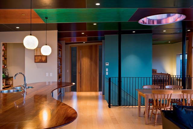
The ‘wow moment’ here is a ceiling that essentially floats over the pavilion-like building, metaphorically repacing the sky with a spectacular cubic assemblage of colour-stained plywood. These natural hues are inspired by the colourful flash of plumage seen on a tui in flight (tui inhabit the surrounding bush). The tui-in-flight theme is carried into the form of the ceiling, which subtly dips and twist from the north and west towards the south and east. Above the dining table, a lovely feature is a gleaming copper lightwell that casts sun or moon shadows throughout the space, day and night.
The kitchen is the soul of the house, mainly because the owners are keen cooks: it is large and functional, incorporating ample bench surface and a large no-door pantry. A curvaceous Tasmanian blackwood benchtop sits atop whimsical aluminium supports that were handcast by John Calvert from branches of larchwood — in true Hobbit style. Beside the kitchen, an L-shaped window seat stretches around the eastern corner of the house, offering a sunny perch for the owners to enjoy their morning coffee.
A bedroom on this ground-floor level leads out to a decked terrace which flows back into the living space. Window boxes provide cosy nooks to enjoy the sun and view at different times of the day. On the lower level are two more bedrooms, a media room and another decked terrace. A special feline feature - a discreet cat flap placed in the downstairs floor, rather than the door - is accessed under the building, keeping both the cats and the architect happy.
Various energy-saving measures were incorporated into the design, including solar water heating and wool insulating batts. It is particularly inspiring to see a Kiwi house that doesn’t pay homage to the motor car: there is no garaging but, instead, a car pad utilises a small area of the site.
Mills suggests that the intention of the design isn’t “to appeal to the fashions of the moment” but to fit harmoniously within the area, stand the test of time, reflect the diverse tastes of its owners (one a fan of modernism, the other of chunky wooden furniture) and with future occupiers’ needs in mind. Everything is lovingly crafted, adding an engaging personality to what is a truly comfortable home.
More projects by this architect can be viewed on their website.
Click here to see more Houses Revisited. And sign up to our email newsletters to receive Houses Revisited straight to your inbox.
Note: These are stories from our archives and, since the time of writing, some details may have changed including names, personnel of specific firms, registration status, etc.

