Houses Revisited: Watson-Smith House
A subdivided section offers the opportunity to illustrate how a house can fit within a snug site.
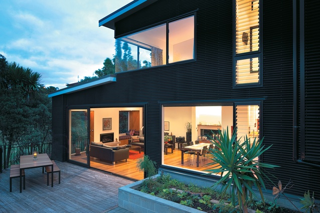
Carolyn Smith’s family house sits on a site that was created from the dissection of an existing house’s long, thin, bush-covered backyard – a site that most people would take one look at and probably decide it was unable to be built on. Despite the section sloping steeply to the south and Smith having to adhere to a multiplicity of zones and rules, the compelling and defining feature of the site, for Smith, was that it was bound by a narrow stream and public reserve, rather than being built in on all four sides.
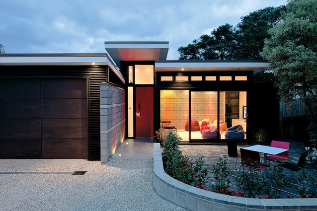
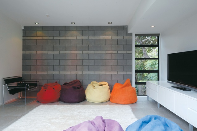
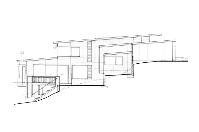
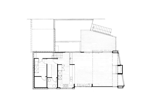
The house has been designed to follow the contours of the site and its interior quality reflects this. The entry is from the upper, northern end of the site, where the building is constructed of substantial materials. Fair-faced concrete block walls and concrete floors reflect the house’s solid grounding, as well as maximising passive solar gain.

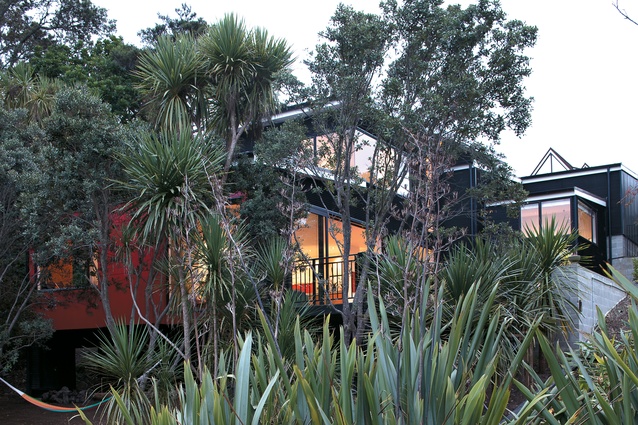
The main constraints on the building platform were four 15-year-old pohutukawa trees scattered around the section. Fortunately the trees were able to be repositioned and now they sit at the bottom of the site bordering the stream, creating a dappled screen partitioning the house and the public reserve.
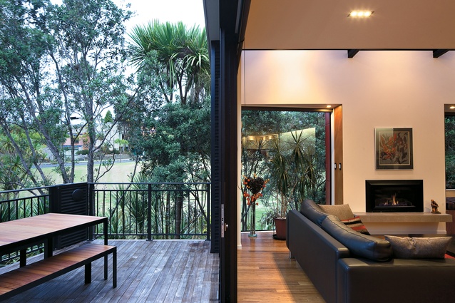
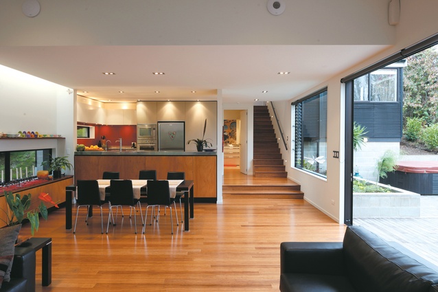
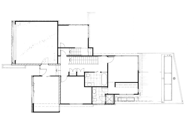
The lower half of the house responds to the surrounding plant life and sits more lightly on the site; the bounce under one’s feet due to the timber floors and pole foundations express this. Likewise, as you move back into the site at the lower level the coldness of the earth is felt through the solid materials used. Moving through the house is a tactile experience.

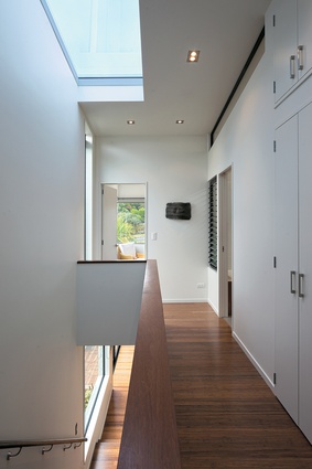
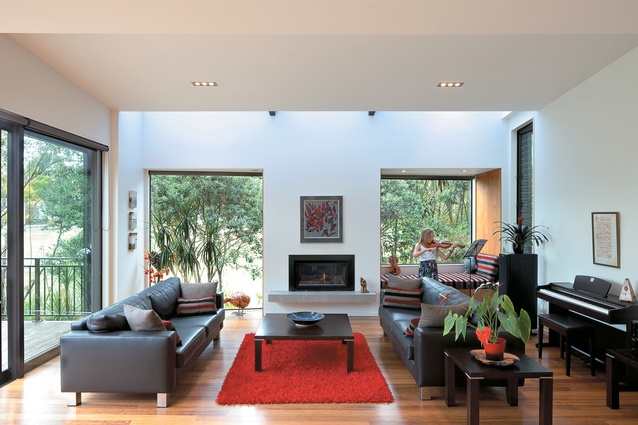
Glazing to the east and large skylights over the stairwell and the lower living spaces let an abundance of natural light into the house. This works to avoid the potentially dark and gloomy spaces commonly associated with south-facing properties. A unique scattering of light shifts throughout the day, drawing attention to the house’s natural surroundings, and heightens the connection with the exterior site despite the house having limited outlook.
Because of the tightness of the site Smith has designed a relatively introverted house, and rather than creating a house you are constantly looking out of, the design focuses on creating visually and physically interesting spaces. This is a responsive house that enables a heightened awareness of architecture’s internal condition.
This article first appeared in Houses magazine


