Houses revisited: Blackpool House
Connected to, yet standing proud of, its surroundings, this bach is akin to an eyrie. First published in 2014.
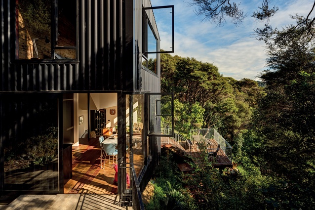
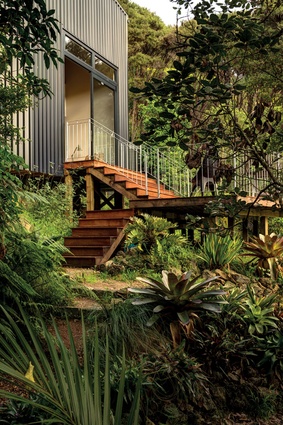
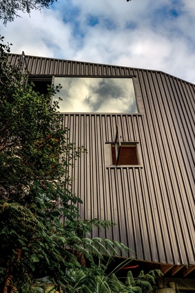
Monolithic in form, the black metal façade of this one-bedroom bach stands tall among the thick native bush that covers the steep site situated above Blackpool Beach – one of Waiheke Island’s lesser-known southern shores. While the dense bush canopy prevents any particularly defined views, it does provide a beautiful and private setting.
Designed by Glamuzina Paterson Architects as a rural retreat for an Auckland couple, entry to the house is by way of a winding path descending through the heavily treed area. A small entry porch juts from the otherwise ascetic façade. Above, just one aperture lends itself to the bush setting on this elevation — from the mezzanine library.

The black metal provides an interesting contrast to the otherwise green environs of the site; the metal folds around the corners like a steel ribbon creating a singular verticality and giving the structure a depth of shadow throughout the day. The use of black aluminium joinery further accentuates the façade’s continuity.
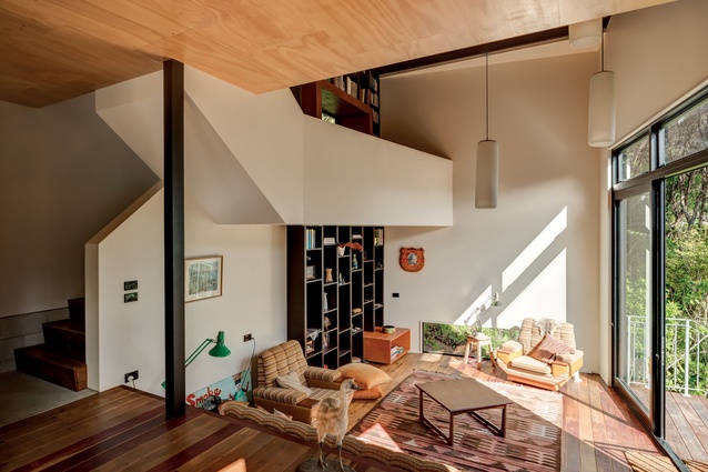
The compressed entrance opens volumetrically into a large double-height space inside. Verticality in the interior, like the exterior, is a feature of this tower-like structure.
“Coming down the path you are really funneled and channeled into this tight little space, and then you are opened into these huge volumes,” architect Aaron Paterson says.
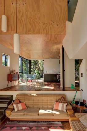
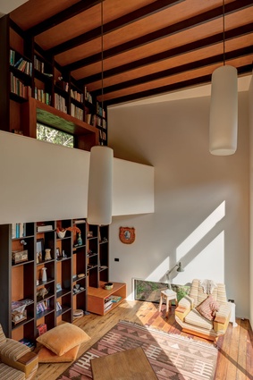
Inside, the predominantly open spaces consist of four split levels. The bedroom hangs, the only solid volume in the house, above the kitchen and dining area. Half a level below, the living space extends languorously, framed on one side with generously high joinery, and on the other by floor-to-ceiling bookshelves that extend the full height of the double-height space, the shelves becoming the exposed ceiling rafters.
“This was a chance to really expose the vertical elements of this space,” architect Dominic Glamuzina says. As the library rises upwards it meets a mezzanine nook, in which a sit-in window provides one of the carefully choreographed views of the surrounding landscape.
“This was a great opportunity to be in the middle of this double height space. It is multifunctional and was a real opportunity to develop the language of the building and the internal spaces.”

While strictly a one-bedroom house, the mezzanine provides the capacity for another sleeping area should it be required.
The use of various timbers, collected by the clients from Trade Me, gives the interiors a rustic, rudimentary feel. The floors are recycled totara, while the dining area walls are pine. The void ceiling features stained meranti ply and black rafters. “The furniture is kooky, but kooky cool. It really suits the house” says Glamuzina.
Stairs lead from the living area down to a deck that hovers in the native canopy. “We felt immediately that the living area should be on the ground floor. There is something about being connected to the bush,” Glamuzina says. To the east, another deck extends from the dining room.
Strictly speaking, the house was completed last year, but various finishing touches are planned for the future, including a fireplace, and a ceiling hatch allowing access to the roof - creating another space to soak in the idyllic surrounds.
Click here to see more Houses Revisited. And sign up to our email newsletters to receive Houses Revisited straight to your inbox.
Note: These are stories from our archives and, since the time of writing, some details may have changed including names, personnel of specific firms, registration status, etc.

