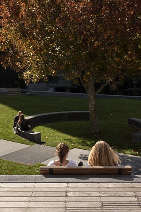
Hurstmere Green
If we are talking natural amenity, then Takapuna’s charms are hard to resist. From its wide swathe of coast Rangitoto appears so close that you can almost reach out and touch it. It is, of course, immensely popular in summer for all sorts of users but the long, shallow beach is particularly popular with those with small children. Takapuna even has one of those egalitarian things that have fast become anachronisms: a campground. This one is slated to become a National Ocean Sports Centre.
You might say main streets have become a bit anachronistic as well. Takapuna’s main drag, Hurstmere Road, has a few charms, but it’s location works against it – the street runs parallel with the coast and is set a ways back. When you find a place to push through, there’s a belt of car parks and a road to traverse before you reach your destination. There’s untapped potential here, a fact that hasn’t gone unnoticed by Sills van Bohemen (SvB), an architecture firm that also works in the realm of urban design and planning.
Prior to undertaking its work at Hurstmere Green, which was the result of winning an invited competition in 2006, SvB was commissioned to do an urban design assessment on Takapuna. That, says Aaron Sills, one of the firm’s directors, was the beginning of a good amount of work the firm has completed in the area.
“The assessment looked at Takapuna, how it would cope with change, and looked at making connections between the beach and the high street. Hopefully, what this project is doing,” he says of Hurstmere Green, “is helping Hurstmere Road, which has really struggled.”
Those struggles are with big box and mall retail, and the exodus of commercial tenants to newer developments, such as Sovereign Park, and in Takapuna’s case, the rise of Albany as an alternative North Shore centre.
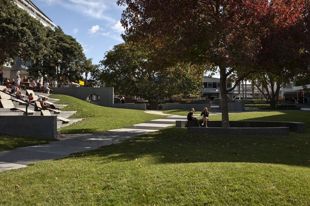
Back at the Green, SvB has focused on connectivity and the opening up of a space that was formerly dark and oppressive. The firm has created a stronger visual connection with the sea, resolved level issues with the buildings that line each boundary (and handily reduce the effects of the prevailing winds) and created moments within the overall space. From the main street, this is now the best place to set off on a journey to the coast, mostly because Rangitoto is a great guiding landmark.
From a functional perspective, Sills says the original movement pattern of the existing park, although “tiny and meandering”, was fine. SvB’s competition scheme kept same movement patterns; the main axis of the park points directly at Rangitoto, although you would never have known, thanks to the massive she-oak that originally dominated the northeast corner.
“We basically said that there’s a path there that connects to Rangitoto. At the time no one believed us because you couldn’t imagine that it was right in the right place. The connection to Rangitoto gave us something to focus on.”
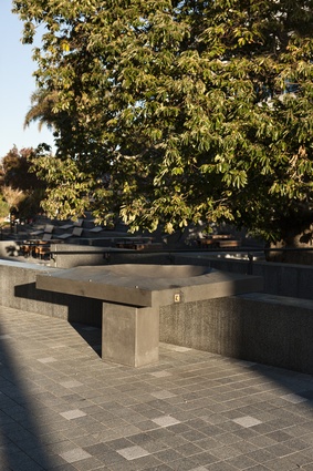
That she-oak cut out all morning sun, and other trees on site also required consideration. A gingko was retained, as was a good-sized Spanish chestnut with a nice form. The unusual aroma this tree produces 10 days before Christmas saw some retailers keen to see it removed, but, says Sills, “We didn’t want to move the tree because of the size – it’s not that old, but there are not that many big, old trees here anyway.”
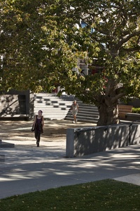
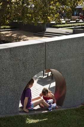
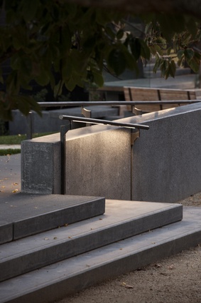
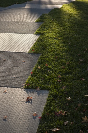
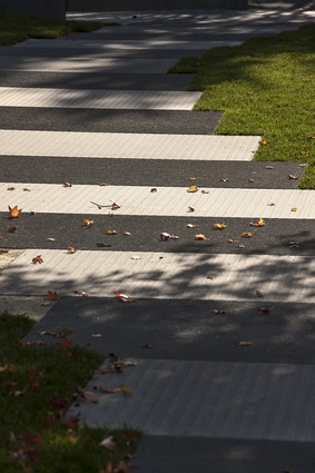
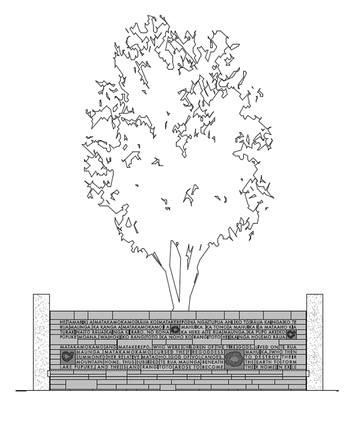
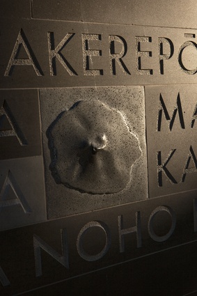
The bigger picture resolved, the firm then went to work at a detailed level. It has worked with a limited palette of materials – basalt, timber, precast concrete and bronze – but has modified the visual texture by working up the surfaces. All through this park you’ll find carefully considered elements: the diagonal pathway, for instance, is constructed from precast slabs that have been scored with vertical cuts. The blocks were then placed perpendicular to each other to create an alternating effect of horizontal and vertical markings. Elsewhere, basalt walls have been finished with circles or lines, little celebrations of pattern, and there is a magnificent story wall where the routed text has a brilliant texture. There are also cantilevered basalt slabs and a generously sized circular cut-out that makes a great impromptu play space.
There are also historical elements: a nod to the blacksmith remains, who purportedly worked on the corner and tied his horse up to the chestnut tree – although he didn’t. Sills says the blacksmith was on the ASB corner, not under the chestnut tree, which wasn’t there at that time, although the original plaque talked about him tying the horse up to the chestnut.
“I reckon that’s still quite a good story, so that stayed”, says Sills. There’s also Kate Sheppard corner, which celebrates the suffragette movement with the obligatory plaque and rock, but now also with a bench seat and an actual Kate Sheppard camellia – the white flowers of which the sufragettes once sent to politicians as a symbol of the cause.
From a material perspective, Sills says that they decided quite early to try and use precast concrete panels and bronze colours.
“I’m glad we did it now, but it was hard, hard work, because everyone makes things in stainless.”
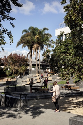
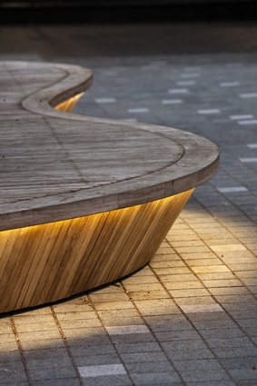
For a smallish rectangular space there are a number of things happening. There are places to linger in the sun, paths to traverse, shady spots under trees. The spaces have been divided; destinations within have been created. Importantly, there is a generous array of nicely built public seating. At the Hurstmere Road fringe, for instance, there are large “desert island planters”. The palms, already in place in planters, were retained to keep character. This arrangement is, in a way, “a little bit counter-intuitive”, Sills says.
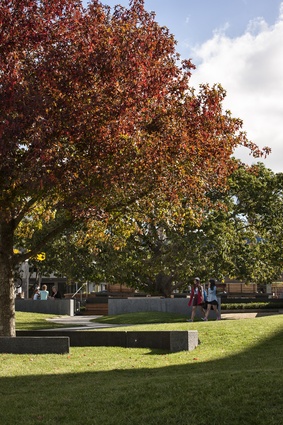
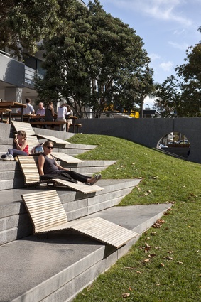
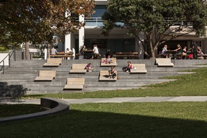
“The normal thing to do would be to try and put seats around the edge [of the space] and not take up the centre. But because the palms were already there and we didn’t want to remove them we thought we’d make them into a sort of stage/seats so people can jump up there and busk and lie on them, which they do.” Another key seating element bridges the level with the commercial building on the southern side of the space. A large block of bleachers is fitted with nicely detailed wooden-slatted loungers draws on the sunniest aspect of the park. The deck above, which is partly private, partly public space, has seating with a similar aesthetic. A maple tree in the middle of the park is surrounded with semi-circular basalt seating.
To say it again, there is great attention to detail here, texture and variety. It seems the little things, like spurning stainless steel in favour of bronze handrails and trim, have made this place seem less new, and more special.

