Iberian Study Tour
Earlier this year, 72 students from The University of Auckland made an architectural study tour through Spain and Portugal. Fourth-year student Ryan Mahon offers some learnings from Iberia.
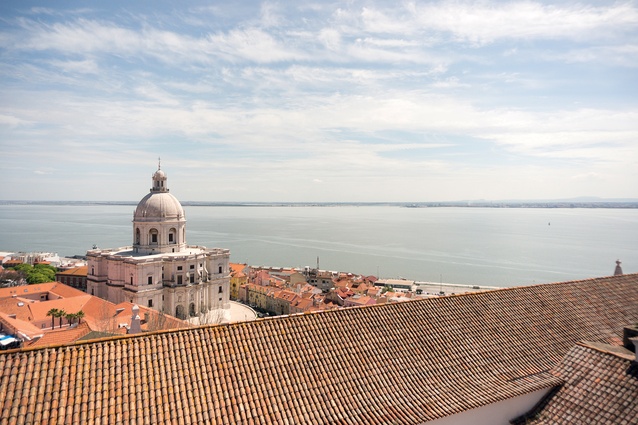
Even when viewing Lisbon at high speed from a plane, the difference in vernacular architecture and housing typology between this city and Auckland is immediately obvious. Solid, permanent and utterly at odds with the timber and sticks of New Zealand’s architecture, the buildings of Lisbon run daringly up and over the riverside hills. This, combined with its walkable heart and glorious waterfront, makes it feel a little like a European Wellington. Comparisons like this occurred readily throughout our trip around the Iberian Peninsula; relating new situations back to familiar frames of reference facilitated a better understanding of them and their New Zealand counterparts.
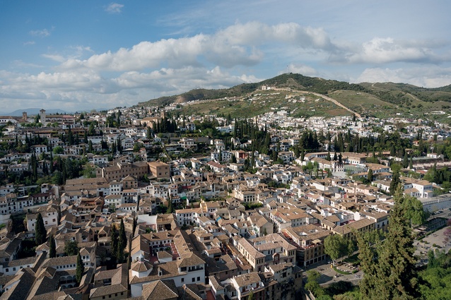
One such comparison was regarding the different approaches to density. The issue of ‘how New Zealand designs for closer living conditions’ has been such an important part of the discussion about our cities’ futures, so observing how it has been approached elsewhere was a great learning opportunity. Across Portugal and Spain, apartments prevail as the dominant housing type, not only in the large cities but in smaller towns as well. Although these are not always the idyllic four-to-six-storeyed variety that urban designers dream about, they still felt as if they are in the realm of what could possibly happen here at home.
Unfortunately, though, a visitor who is passing through has difficulty in judging the success or failure of the typology and each architect’s execution of it, especially as the values and preferences of the locals in Spain and Portugal are hard to appreciate from an outsider’s perspective. While New Zealanders viewing these dense dwellings might mourn the loss of ‘the backyard’, the locals may treasure their proximity to other people and the surrounding city.

In Carabanchel, one of Madrid’s poorest areas, a government initiative has achieved the admirable goal of bringing high-calibre architecture to those in need by commissioning a range of acclaimed architects to design apartment buildings for social housing. This led the area to be architecturally vibrant and often colourful. Carabanchel’s highlights included a building by Foreign Office Architects, which features movable bamboo screens, and Morphosis’ Madrid Social Housing. In the latter, housing units were arranged around shared courtyards and green spaces in order to emulate the feeling of a traditional village, while still achieving dense living.
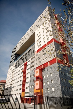
Elsewhere in the city, MVRDV has attempted a similarly unorthodox approach to apartment living in its Mirador and Celosia projects, which stack clusters of apartments into forms with some porosity. These alternative visions of how denser living can be achieved further complicate the problem of evaluating the success of apartments as a typology. Though each project can be judged architecturally using the typical frameworks, the feelings of the occupants towards their homes are the most important factors in evaluating their success. These proved difficult to establish. Although many attempts were made to question locals using entry-level Spanish, their answers could be understood only as being generally positive or negative.
Given that New Zealand, particularly Auckland, faces the challenge of a housing shortage, this experimental approach taken in Madrid could offer a possible source of inspiration. Rather than hoping for salvation in the form of newly built detached homes, could we not instead achieve the dense, city fringe living that the Unitary Plan will support by taking a creative approach to apartment blocks? Our late adoption of the typology as a staple provides a chance to learn from the successful apartment designs seen elsewhere, rather than to continue following the disappointing status quo that is evident in Iberia’s plentiful, homogenous tower blocks.
The difference between the vernacular housing of Spain and Portugal and that of New Zealand, or Australia, stems from our dissimilar histories. This was particularly evident while flying over Brisbane on the way home and observing the sprawling suburbs heroically cut into the hardy Australian bush. While Europeans arrived in the Pacific with pre-existing notions that they were entitled to carve out pieces of native forest and establish their own sections, the Iberian Peninsula had been inhabited continuously since Paleolithic times. In New Zealand and Australia, the land was divided like the spoils of a discovered treasure; in Iberia it has long since been given away, leaving no space for any kind of quarter-acre dream.
The immense time period of inhabitation in Spain and Portugal leads to the presence of historic architecture within their cities on a scale unseen in New Zealand. The reuse of historic buildings is, therefore, in no way surprising and has become a common technique for ensuring their upkeep. To facilitate this, the governments have initiated the transformation of many monasteries into hotels; these are called pousadas in Portugal and paradores in Spain. These transformations vary greatly in their sensitivity.
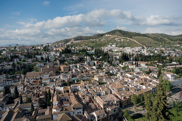
In Amares, one finds the Santa Maria de Bouro Monastery, which has been adapted very delicately by Eduardo Souto de Moura while, in Viseu, Gonçalo Byrne’s pousada takes a few more liberties. Its original outdoor courtyard has been given a roof to create a dramatic indoor space but, as you swim in the pool on an upper floor, you cannot help but wonder what the monks would think of Byrne’s additions.
More memorable than these adaptations is a building that is almost untouched. Carmo Convent in Lisbon, which was irreparably damaged by an earthquake in 1775, has been left unaltered, with the exception of some structural reinforcing, and the remnants of its Gothic church have become an open-air ruin. The roof collapsed during the ’quake, causing its nave, aisles and transept to become a courtyard open to a sky framed by the remaining stone arches.
This poignant space is used now as a museum that houses archaeological artifacts that sit against the church walls and are exposed to the elements. This response to a disaster could perhaps offer a bold solution to the issue of Christchurch’s damaged cathedral. If good heritage practice focuses on respecting the accumulated patina of history upon architecture, is the impact of these earthquakes not a vital part of the narratives of both these buildings?
Though Carmo Convent’s unusual state made it an exception, there was a worrying risk that the churches and cathedrals, ever present in Iberia, might become monotonous. Fortunately though, cathedrals, in fact, become more interesting en masse, as the typology’s repetition makes evident the idiosyncrasies and stylistic changes throughout time. The cathedral of Zamora stands out as its prominent tower is stripped of extraneous detail, giving it an almost modernist simplicity. Elsewhere, complex Gothic cathedrals, like those found in Burgos and Ávila, are attractive for precisely the opposite reason.
Most fascinating of all is the Sagrada Família. Against the backdrop of older cathedrals, it stands out as a fantastic hybrid object, caught between a simultaneous desire for modernism and historicism that is indicative of Antoni Gaudí’s time. The carved Passions Façade, by sculptor Josep Subirachs, displays this mixture of styles by depicting familiar Biblical scenes in an evocative, modern way. Inside, the expected elements of a Gothic cathedral are present but have been reimagined. Sinuous columns rise to bulges where their structural loads are divided and spread in previously unimagined directions.
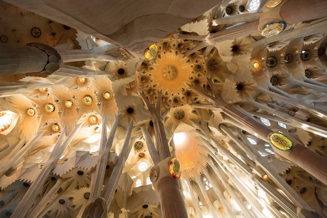
Though a relatively recent project, the Sagrada Família feels connected to the long-standing tradition of epic European cathedrals. However, the extensive time taken to construct this intricate building has allowed the world to change around it. The shift towards the secular that has occurred during its making means it will, perhaps, be the last cathedral of such vast scale and quality ever to be built.
The firmly established presence of historical architectural traditions in Iberia is juxtaposed by the introduction of grand projects by international stars. With cathedrals and castles being too common a typology across Europe to attract visitors to specific cities, newer architecture on a massive scale has been developed as a drawcard. The impact of ‘starchitecture’ and ‘the Bilbao effect’ upon Spain and Portugal is clear. Monumental examples of these consciously unique developments have been imported into Sevilla, Porto, Santiago de Compostela and many other towns.
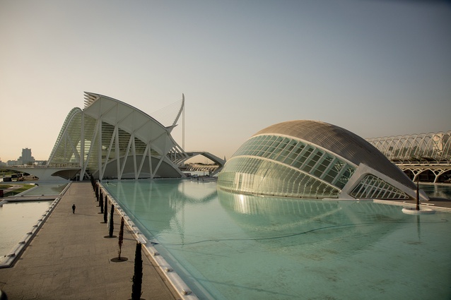
What appears to be the most outrageous of these, surprisingly, also turns out to be one of the most convincing. In Valencia, Santiago Calatrava has constructed a series of enormous buildings which, while being undeniably excessive, remain successful as they feel genuinely local and site specific. The white forms of the City of Arts and Sciences rise from reflecting ponds like great sea creatures emerging from the ocean. They appear to be exaggerations of Gaudí’s wildest fantasies of organic architecture and evidently stem from his tradition.
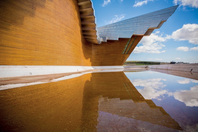
For all the ways he can be criticised, including for the expensive leaks at his Bodegas Ysios winery in Álava, Calatrava succeeds in Valencia as his buildings have a kinship to the ocean that is integral to this port city. Though contentious, these unusual buildings are undeniably more exciting than David Chipperfield’s nearby America’s Cup Building which, despite the slickness of its neo-modernism, remains a little uninspiring.

For a long time, it seemed starchitecture would never appear here because New Zealand has tended to keep its large projects to itself, notably having rejected Frank Gehry’s proposal for Te Papa Tongarewa. With the introduction of Pritzker Prize winner Shigeru Ban and an incoming project by the Tezukas, internationally renowned architects are beginning to creep onto the scene. Time will tell whether or not the Cardboard Cathedral’s success will lead other New Zealand cities to capitalise on the opportunities offered by being patrons of architectural stars.
In addition to these grand projects, a multitude of tiny towns have built vast convention centres designed by local architects. These buildings clamour to express the boxy volumes inevitably required by the typology in individual, iconic ways: a difficulty that the New Zealand International Convention Centre may need to consider also. The results of the Iberian convention centres range greatly, with some resorting to bizarre gestures in an effort to create a distinguishable identity.
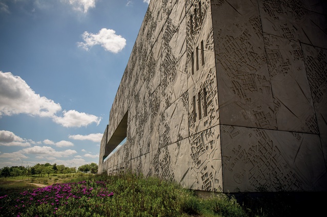
This is typified by Mérida’s Convention Centre, whose pre-cast exterior is imprinted with maps of the city, as though including this icon would somehow reconcile the project’s disconnection from its suburban surroundings. Though a number of centres are highly successful, such as Selgascano’s playful Auditorium on Cartagena’s waterfront, all feel somewhat doomed by their ubiquity. Often they occupy interstitial spaces that must remain severely underutilised at any time other than on the occasions when conventions take place.
The discontinuity between the convention centres and their surroundings highlights the importance of visiting buildings in person. While published photographs reveal a project in a single frame, with perfect lighting and composition showing the architecture at its most successful moment, designing a building that is extraordinary from all angles and in all weather conditions is a much more challenging accomplishment. Visiting buildings exposes the deceptive potential of photographs.

Ricardo Bofill’s La Fábrica in Barcelona was revealed to be half the size one might have expected, based on photographs, and the crisp white rectangles of Dosmasuno’s Carabanchel housing have greyed significantly with age. Uninhabitable images display style rather than revealing the reality. Other considerations, such as context and site, become much more important in person as the whole promenade towards a building is folded into our experience of it.
But still a trip like ours can provide only a distorted view. When experiencing projects so briefly, personal rather than objective factors can impact our judgements. At least one white building was ruined by our forgetting to wear sunglasses on a bright day. However, the best buildings
attain long-lasting success across repeated exposures. The Santa Justa Elevator in Lisbon is equally charming no matter how many times it is seen.
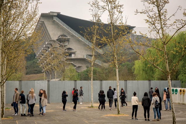
The same can be said for projects by masters like Álvaro Siza, whose buildings maintain a constant appeal across the peninsula, regardless of shifting weather conditions and angles of view. Similarly, Eduardo Souto de Moura’s Braga Municipal Stadium is awe-inspiring, even when viewed by peering at it over a fence as we did. Seeing this vast array of Iberian buildings in person allowed for a vital chance to observe the realities of architecture as building rather than as images, making the trip an immensely valuable experience.

