In disguise: Balmoral House
In Balmoral House, Sydney, a choreographed and artful sequence of layered internal and external spaces is contained within a building form that belies its size.
With the current penchant for large valuable houses having a plethora of public rooms, ensuited bedrooms, home cinemas and cellars, the remit of the contemporary architect in our capital cities can be a trying task. In essence, one has three choices: build something that looks as big as it is, refuse the job on principle (“surely you don’t need all this?”) or rise to the challenge of subverting and playing with the brief to break it into more simple components, thereby making the project look less of a behemoth. The job becomes as much an issue of disguising and enriching the brief as accommodating it.

Collins and Turner was approached some five years ago to work on this house in the Sydney harbour-side suburb of Balmoral. The site is narrow at the street frontage and falls gently to a wider rear boundary. The triangulated geometry of the block gives the back of the site views over numerous neighbours, with an oblique view over more roofs to Balmoral Beach and the harbour.
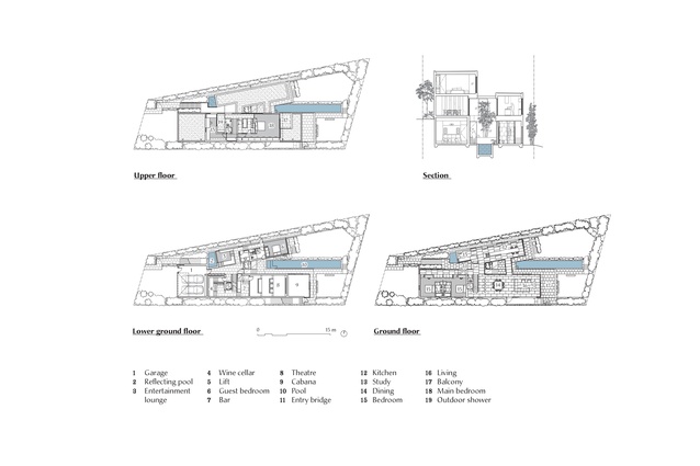
The client bought the property with a development application by others that sited a new dwelling hard against the uphill side boundary. All the rooms in the proposal faced into the rooms of the downhill side neighbour. Collins and Turner adopted a different strategy – that of cleaving the plan in two.
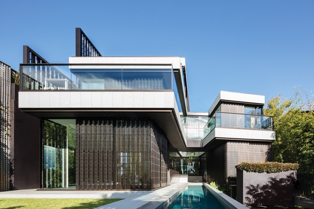
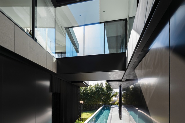
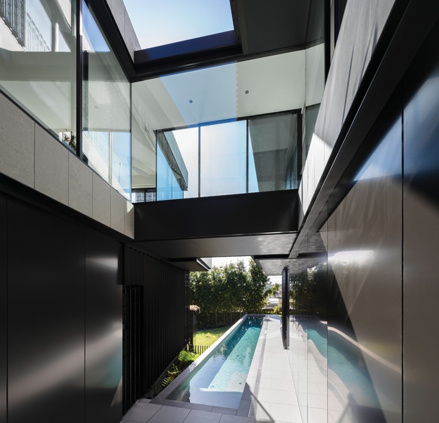
The dwelling looks like one narrow house from the street, but splits into two wings, each flanking the side boundaries. These form a new garden/courtyard between the rooms, bounded by a bridge that joins the front edges of the two wings over a lap pool. Most rooms have water views, some from both sides.
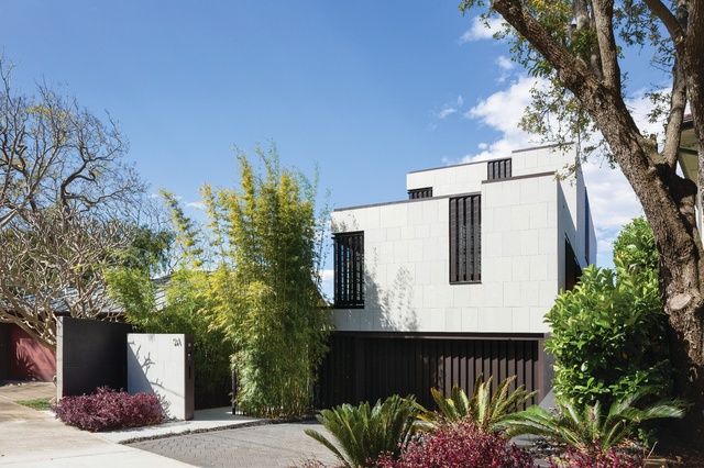
The presentation of the house to the street is both artful and subtle. The house is set back under the broad canopy of an existing tree on one side boundary. The discreet entry is to the other side, but is clearly signified by a setback wall and a wall of bamboo and adjacent landscaping. Normally any dwelling with a front facade dominated by garage doors looks grim, but the ziggurat form of the house, with the garage slightly submerged and the second floor set back from the first floor, is so eye-catching that one barely notices the garage door.
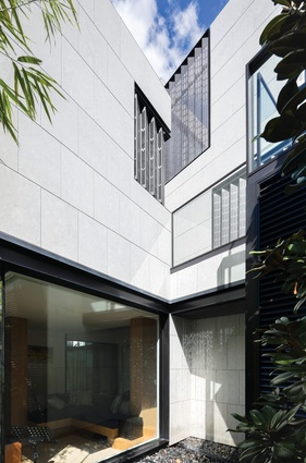
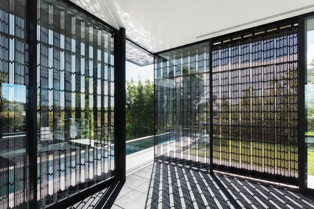
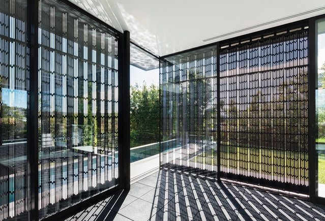
The asymmetric fenestration on each level is screened by zigzagging perforated anodized metal panels, with incredibly fine and complex patterns of openings. The building is otherwise entirely clad in stone, in a large brick tile pattern. It presents a confident authorship.
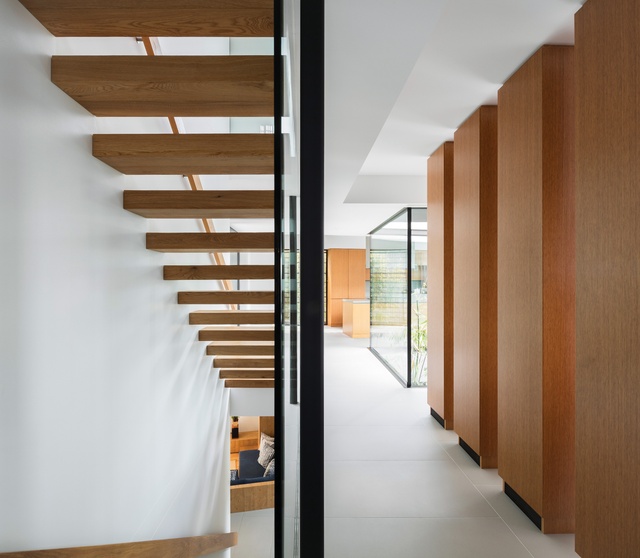
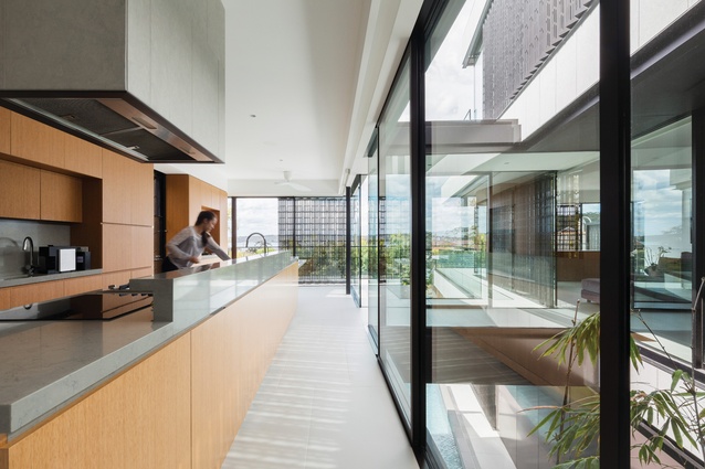
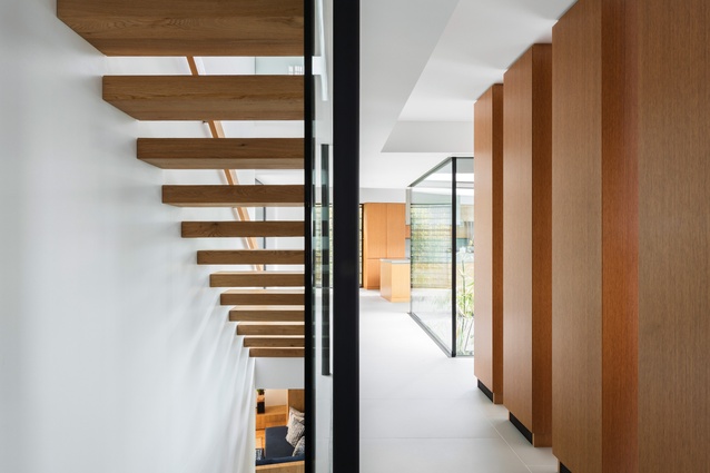
The path to the front door lures the visitor through a garden, up steps and over a waterfall wall to the main living level, a piano nobile. On arrival, one can see the kitchen and informal eating areas to the left and the main living room wing to the right. Cantilevered timber stairs to the upper and lower levels are shielded from the living areas by a series of mute timber box forms that are both discreet coat-cupboard cabinetry and service risers. The layout of the whole house is legible from this central point.
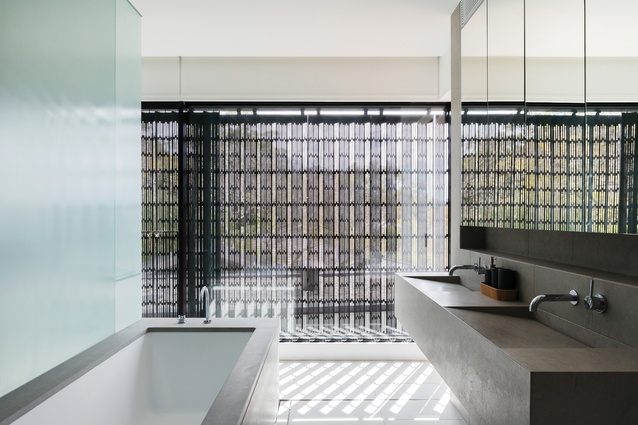
Yet the circuit through the house, and the outlook from each room, is a rich and varied experience. The upper level contains a study and a main bedroom suite. An airy stone bathroom opens onto a monastic stone outdoor shower area, where one can only see stone, foliage and sky. The lower garden level has a sunken informal living space, with landscape and water present on both sides (flanked by both the waterfall area and the central garden courtyard/pool area). A guest suite is tucked below the kitchen wing.
Below the living room one enters a darker parallel world. A stone bar leads to a home cinema, while beyond the bar in the other direction is a cellar – an evocative space lined with more slabs of stone (including a beautiful stone sink and stone handrail trim along a glazed balustrade).
The palette of materials is repeatedly the timber-panelled joinery and slabs of pale-grey stone. The floor tiles are an almost identical (but more durable) match to the exterior stone cladding.
The external perforated metal window screens act as boundary privacy panels – sometimes they are fixed, sometimes they slide, sometimes they pivot. The zigzag form of each panel, with a denser pattern on one side of each fold and a more open filigree on the other, allows the occupants to look toward the harbour but not into their neighbours’ homes. The skill in the design of these screens adds an incredible layer of detail over an already complex house.
From the rear garden, at the end of the lap pool, one can never see how big the house really is. The uppermost bedroom level is invisible, stepped back beyond sightlines. A gym/yoga or cabana area opens to the pool, and the living and dining terraces cantilever dramatically, providing shade to the garden-level spaces.
There is a wonderful ambiguity about what is inside and what is outside, where the dwelling and the landscaping are interwoven. The internal garden courtyard, with the pool inserted into that space, adds to the deliciousness of this confusion.
The house is a profoundly successful example of disguise and enrichment and a testament not only to the skill of the architects, but also to their tenacity in fighting for five years to see this project completed, at a time when their focus has necessarily shifted to much bigger public buildings with faster delivery periods.
This article was first published on ArchitectureAU.com.

