In the zone
Partner content: Houses talks to award-winning kitchen designer Davinia Sutton about her use of Fisher & Paykel appliances in this stunning kitchen that has been selected as a finalist in the 2017 Best Awards.
Houses: What is it about the Fisher & Paykel range that works so well in this kitchen?
Davinia Sutton: The brief was to create a large, modern kitchen, which would accommodate the needs of a typical family unit but be capable of expanding to allow several users to work simultaneously as well as catering for large social gatherings.

The clients requested appliances that could respond best to these requirements – the Fisher & Paykel oven, French door fridge, DishDrawer™, CoolDrawer™ and induction hobs not only meet the client’s functional requirements but also encompass a modern wow factor into the design, with the clean bold lines and seamless integration.
Houses: How do you choose which appliances to integrate and which to leave on show?
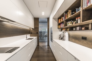
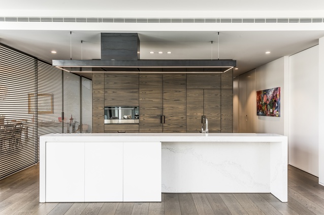
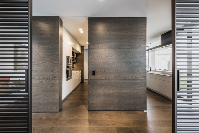
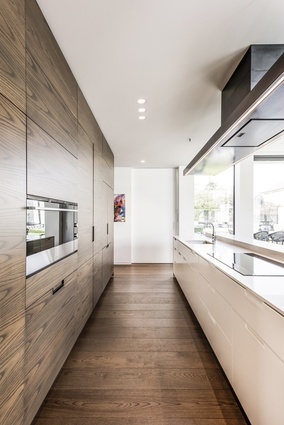
DS: The design has been formed around the concept of a ‘front and rear kitchen’, created around a central box form of two-toned dark-stained veneer joinery, linking the two zones, and intercepted with a layered island in the foreground of the space.
We wanted to showcase the art of cooking, so the oven and hob were left on display in the front kitchen space. To help accentuate the strong architectural form and boldness of volume within the space, we chose to seamlessly integrate the fridge and dishwashers.
Houses: Why choose Fisher & Paykel appliances?

DS: The appliances chosen for this project really help accentuate the strong architectural form and boldness of the end result. The clever design and clean lines of these appliances emphasizes the modern approach of the kitchen, while reinforcing a solid form, reflective of the overall feel of the architecture.
Fisher & Paykel wares not only provide the wow factor, they fit the requirements of our clients, and as a designer you couldn’t ask for anything more!
For more info: daviniasutton.com; fisherpaykel.com
ArchitectureNow works with a range of partners in the A&D supply sector to source appropriate content for the site. This article has been provided by Fisher & Paykel.


