Industrial calm
The most challenging part of this project? Finding the balance of everything,” says Kylie Dorotic, a director at We Are Huntly, a Melbourne-based design studio.
The project in question is the Richmond Residence, a finely calibrated warehouse conversion that Kylie and co-director Alicia McKimm completed recently.

The client presented the studio with a fascinating canvas – a warehouse shell in good architectural shape but in need of a new interior. “The existing bones were quite industrial,” Kylie says. “The fit-out was very ’80s, so our challenge was to make it a home, to make it feel warm, but to still respect the architecture.”
In a previous life, the building had served as a cooking school, so there was a series of raised platforms throughout the interior. The brief focused on how to make it into a warmer, more liveable space.
The project was shaped by several important parameters. First, it needed to accommodate the client and his children. Second, it needed to have a dedicated work zone to allow the client to work from home. Finally, it had to make room for the client’s impressive art collection.
The solution was to split the interior by floors. The upper floor is given over to bedrooms, a study and an open-plan living, dining and kitchen area. The ground floor takes on the role of professional space, with a neighbouring play zone (formerly a garage) dedicated to the residence’s junior inhabitants.
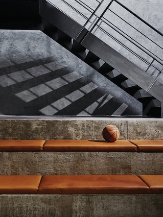
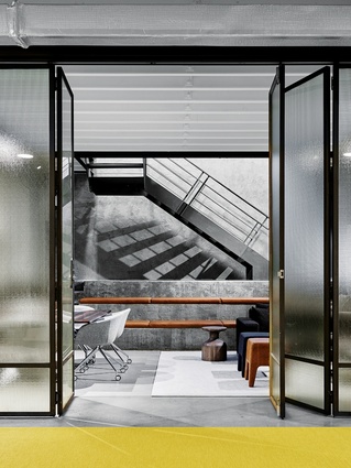
There is a robustness in the materiality that complements the building’s industrial past. On the ground floor, folding panels of translucent security glass concertina to open up the space, while hard-wearing concrete floors will endure underfoot. “We installed this big yellow mat for the kids to play on,” says Alicia. “We kept some of the existing concrete steps, which we layered up with soft furnishings and big structured beanbags for the kids.”
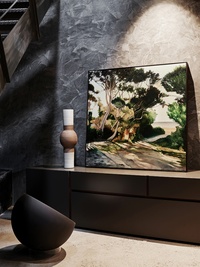
In the north-west corner of the space, an atmospheric entry connects the two levels. “He wanted it to feel residential. It’s an arrival point before you go up the stairs to his home,” Kylie says. Moody and cave-like, this entry is finished with a tactile wax plaster that ripples down one wall, while overhead lighting casts a dramatic shadow of the industrial staircase on the opposite wall. “We lined the ceiling in these beautiful walnut timber panels, which offset the plaster walls.
It’s so dramatic.”
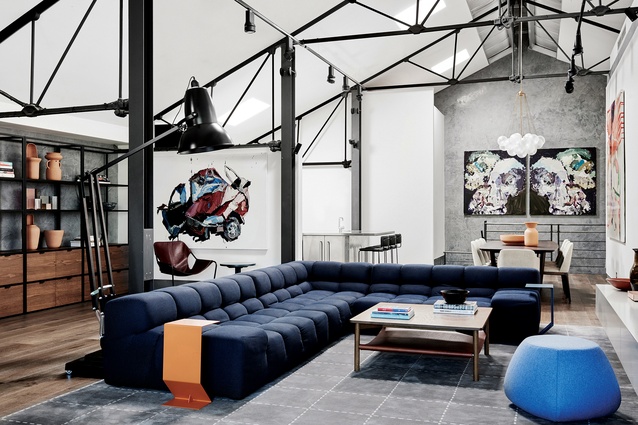
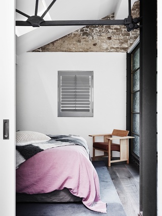
Upstairs, the main challenge was to make the soaring volume a liveable space. The kitchen and bathrooms were still in good condition, so the focus was on making the most of the living and dining space, the study and bedrooms. It is a substantial volume, traced by sturdy black steel trusses. “The client wanted this new place to feel high-end and luxe but to still have a casualness about it. It was about striking that balance,” Kylie says.
There was a great deal of consideration for scale. To make the most of the volume, the team inserted over-scaled pieces including a majestic Anglepoise lamp and a sleek Tufty-Too sofa by Patricia Urquiola for B&B Italia. The denim-y blue of the sofa gives a bit of lightness, but it still feels tailored. “The rug is a beautiful hand-made Tibetan silk rug, which we had specially made for the space,” Kylie says. Plush Fat-Fat ottomans bring pops of colour and a sense of fun.
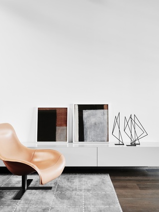
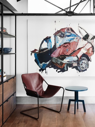
The layered neutrals of the furniture become an understated backdrop for the client’s art collection, which includes pieces by Ben Quilty, Dale Frank and Josie Kunoth Petyarre. “The whole space was approached as a curated art gallery. Everything has its purpose,” Alicia says. “We couldn’t draw from a particular style or colour within the artwork, because the collection is ever-changing and ever-growing.”
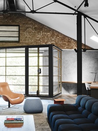
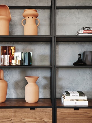
Overhead, gallery-style track lighting illuminates the space, with an elegant Cloud pendant light from the Criteria Collection suspended above the dining-room table. “It was our take on a contemporary chandelier, something sculptural and beautiful,” Kylie says. “It’s deliberately much softer, so that it creates a contrast.” Custom joinery runs along the southern wall, acting as both storage and plinth for artworks and objects. “It activates the length of the space,” Kylie says.
The designers attribute the project’s success to a rare combination of elements. “A great trusting client and an incredible space to work with – if you get one of those things in a project, it’s a great start; but when you get the two of them together, it’s amazing,” Alicia says.
It comes as no surprise to find that We Are Huntly was recognised as the Best Emerging Interior Design Practice at this year’s Australian Interior Design Awards. The team’s infectious enthusiasm and the deft touch evident in this project suggest there is plenty more to come.

