Inner-city haven
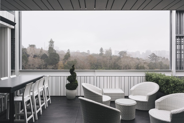
Despite its location – nestled behind the bustle of Parnell Rise – this apartment is like an oasis of calm. This might be in part due to the view; from the living area it takes in the landscape of beautiful old trees on the railway side of the Auckland Domain. From the deck, you can see the Auckland Museum and the Sky Tower, both of which are lit in colour at night. But even in the rooms where the view isn’t to be written home about – and in some rooms the outlook is masked by external screens – there is still a sense of relaxation.
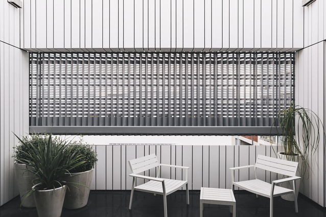
The apartment is one of two located on the new top floor of this Falcon Street building, which was previously a warehouse with offices. The extension and refurbishment was designed by RTA Studio. Externally, the top floor is wrapped in a perforated metal screen, which adds visual interest from the street while lending privacy in this mainly business area of Parnell, says Ben Hayes of RTA Studio.
“The perforated screens define the separation between the offices below and the apartments above. The clients requested a clean, crisp design for the building as a whole, with minimal materials, and these screens can be seen as a tattoo applied to the material of the building.”
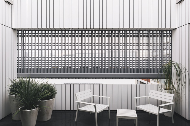
On the deck of the apartment, the retractable screens can be used to block wind chill or glare. From the internal courtyard, which is accessed from both bedrooms and is visible from the front door, they are a point of interest, almost like a mural.
“The courtyard creates a feeling of open space on entry, rather than walking straight into a corridor. It also allows for internal bedrooms along the fire-rated boundary wall, whereas normally window sizes would be limited to fire-rating rules. This enabled us to locate the bedrooms on just the north-eastern side of the building, so the western façade could be open to the living, kitchen, dining and deck, and the view,” says Hayes.
With its clean lines and soft finishes, the interior design is reminiscent of a high-end hotel. The homeowners downsized from a large, traditional house in Parnell, and called on Trinity Interior Design to achieve a more modern look for their urban apartment.
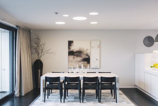
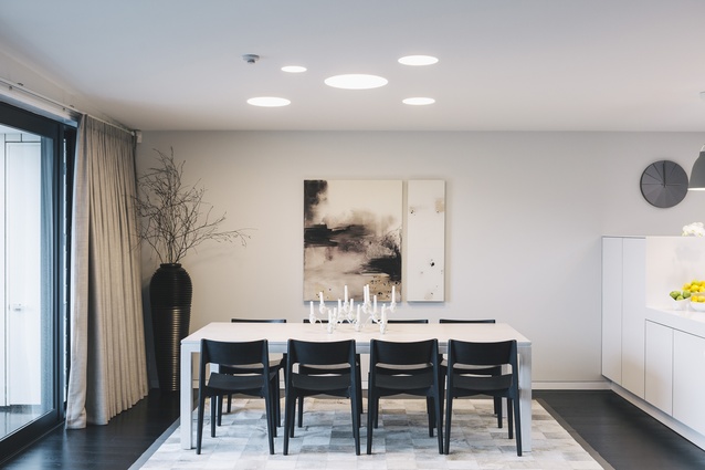
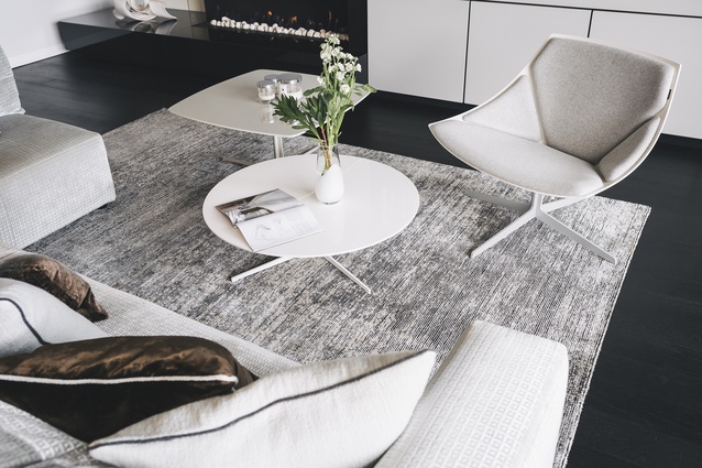
“The rooms are all tonally similar, so there is a nice sense of flow through the apartment. It may appear at first glance to be monochromatic, but for example, the floor is dark brown timber. The couch is a greyish green with a soft, almost velvety texture. As the design of the building is reminiscent of Bauhaus and quite linear, I chose textures, colours and materials that work to soften it,” says the designer.
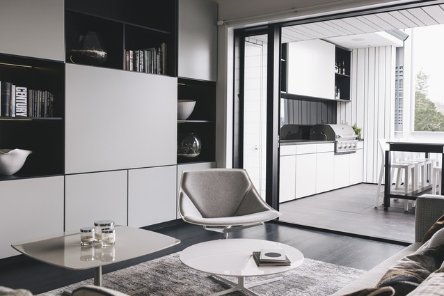
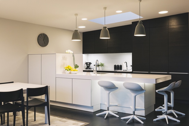
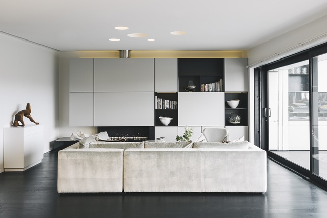
Furnishings and rugs define different areas in the open-plan living, kitchen and dining space. The L-shaped sofa defines the living space, and was chosen for its simplicity and also as a piece of furniture that is attractive from all angles, important in an open-plan space. Custom-designed cabinetry, a joint effort between the designer and architects, lines the wall of the living space, concealing the entertainment system and providing display areas for artworks.
“The top line of the cabinetry flows through to the cabinets outside, which are fully equipped for entertaining, with a TV, barbecue, fridge and sink. Here in New Zealand, outdoor living is a key part of our lifestyle, so the deck was an important part of the design, with plenty of outdoor seating chosen for its simplicity,” says the designer.
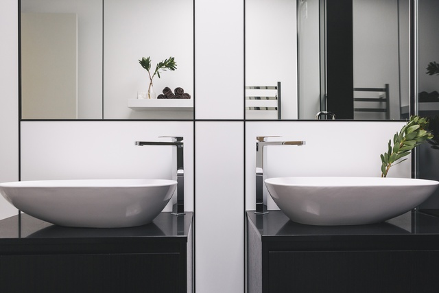
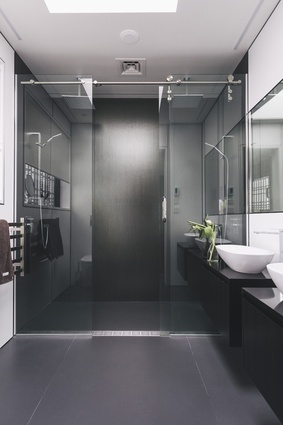
The apartment is fully automated. At the swipe of a finger or a voice command, the owners can access the curtains, fireplace, lighting and entertainment systems. Lighting adds depth and softness to the spaces, with several choices available in each room. In the living room, the overhead lights appear like circular holes in the ceiling, again creating some variance against the linear nature of the cabinetry. In the bathrooms, the basins are lit from below, which works as subtle night lighting as well as adding atmosphere.
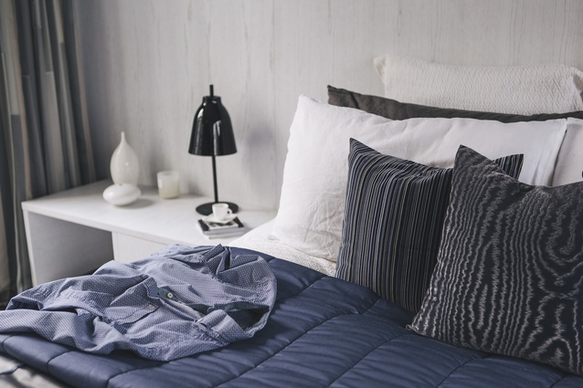
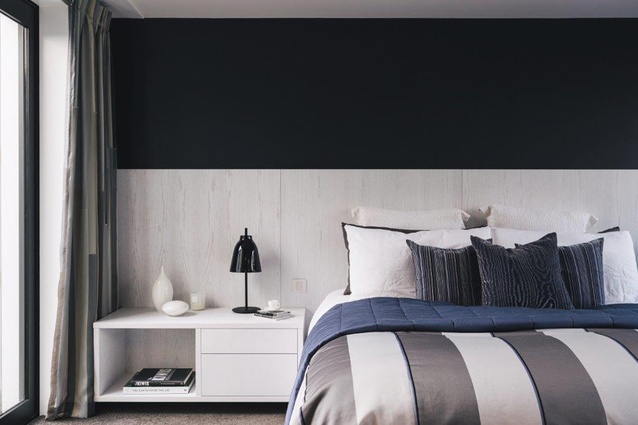
The bathrooms feature inset mirrors and a grid pattern created by metal framed Seratone panels, a refreshing change from tiles. Bedrooms feature soft fabrics and subtle colour in the form of curtains, linen and paint. In the main bedroom, a custom-designed whitewash ash panel frames the bed, with floating bedside cabinets.

