In:situ series #2: Alison Brooks
In our second exclusive in:situ 2017 conference interview, Aaron Paterson spoke with Alison Brooks of London-based Alison Brooks Architects to gain some insights into high-density building from her array of successful projects in the UK.
Aaron Paterson: You talked at in:situ about the concept of the suburb as land art. Can you expand on this?
Alison Brooks: Our expectation of a suburban development is there’s amazing landscape and rolling farmland, and then you see this tracked housing, or a generic collection of houses, that is generally arranged in a pseudo-picturesque masterplan, with wiggly streets and cul-de-sacs. It’s a model of development that’s based on really outdated typologies, old-fashioned ways of considering what families are like and how they work. There’s no unifying formal idea that the dwellings express.

Land art is a simplistic description but the idea is that a series of houses could create a new sculptural landscape – that expresses the identity of the place, with references to local vernacular, colour, a connection to the earth, and an abstraction of what you would conceive of as being a collection of many developments in the suburbs.
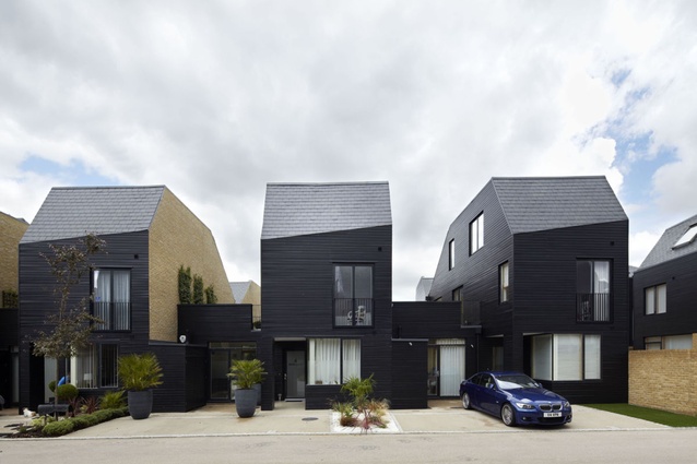
AP: That connects with your second point about restoring home and street, and that emphasis seems to be something that’s really important to you. Can you talk to this, in regards to the Harlow housing development [in Newhall, South Derbyshire, short-listed for the RIBA Stirling Prize 2013]?
AB: These houses don’t really have front gardens; they’re courtyard houses with rear courts, roof terraces and front courts and there’s quite an informal relationship between the house and the street. The kitchens are quite big rooms, more or less hidden, but they open directly onto the front court, which opens up the potential of the kitchen, and for people to put their dining tables at the front of the house to encourage sociability.
AP: Yes, and connection to the street.
AB: Right. Apparently the neighbourhoods have street parties and everybody brings their tables out to the street. That’s very unusual in suburbs because normally there’s that protective layer of lawn and driveway – these signs and symbols of a lost rural ideal that’s compressed into a 50ft-wide [15ha] lot.
AP: There are both private and public elements – like a potential study at the front which makes that connection to the street and also to privacy. So there are different spaces that can be used for different means. Is that something that’s common throughout your housing work?
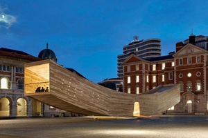
AB: Yes that’s a key idea, a layering between the ‘publicness’ of the street and the private interior and, in a way, those layers and transitions are reinforced by the study. By having the front porch recessed, with the study on guard beside it, you create this threshold space. If you want to have clients come to the house, you go in the front hall and either into the study or use the kitchen table as a meeting place. You can concentrate that public activity at the front and not relegate your office to some upstairs bedroom.
AP: Is combining work with living a deliberate thing on your behalf?
AB: Absolutely. Well before the industrial revolution, your home was also your place of work, unless you were part of the aristocracy. In the Jacobean or the pre-Victorian or the Georgian city, the house was a place of production. The separation of domestic and working life really only happened after the industrial revolution.
Digital technologies have allowed the opportunity for working to take place in the home again, and there’s a false assumption that you don’t need a workspace in the home but everybody still really does. It empowers people to feel like if they’re running a business from home, it’s a serious thing.
AP: I’m interested in how you approach history as a way of generating architecture.
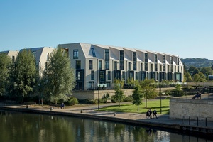
AB: I think it was James Joyce who said ‘imagination is memory for all of our imagination’. This is true of all of our creativity and it comes from our experience and understanding, and absorbing history becomes part of our memory, which becomes part of our imagination. What’s important about those historical connections is they’re relatable.
When you speak to somebody about working with roof forms that reflect the vernacular of the Essex barn, everybody can make an association with that historic form because it’s part of their collective experience. I think people – clients, users, communities – generally want to be part of historical lineage and they enjoy the reference, the association and that sense of being part of a continuum which is social, cultural and political; it’s a binding force.
AP: You talk about architectural elements like arches, cornices, mansard roofs, colonnades and quads. This isn’t a slavish postmodern referencing of the past, but a reworking of the fundamentals of architecture, like windows and roofs?
AB: I think of these elements as archetypal forms and I try to reinterpret and sometimes abstract those forms and give them a new reading, while retaining the essence of how they function. The dormers of Exeter College punctuate the curve of the roof and, although each in itself is a window, it projects through a roof and becomes a dormer – and this is a very familiar historical, age-old approach.
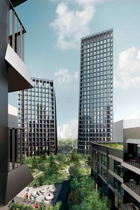
We tried to reduce the dormer volume and mass to its absolute minimum, so the dormer is like the window just moving upwards through the façade. You get this layering, this slightly more abstract approach, while trying to achieve the magically impossible concept of a window that just extrudes itself into a three-dimensional form and becomes a dormer.
I think having a sense of humour about architecture is an important thing, also. If you think of a dormer as being a window that’s trying to escape from a building, or a series of windows that are trying to move upward and approach the sky, it gives them a whole new language and they become much more interesting things to work with.
AP: One thing I enjoy about your buildings is the composition of façades.
AB: I think façades are actually the worst and hardest part of any architecture and I avoid working on elevations at all cost. We work in 3D; we model everything for a very long time in Rhino. We probably design much more from the inside out.
AP: And you’re also interested in how your buildings appears obliquely on the street, which I find fascinating.
AB: Yes, we design in perspective. I think elevations are the worst thing – a by-product of the spatial arrangement, the ordering of space, and the three-dimensional composition of the building. So when you’re working with students’ rooms in an education building, where you have repetition, you know they’re cellular spaces and they need to repeat; they need to form a module. It forces a certain ordering of the façade, but we were very keen to break that ordering and express that fluidity of the roof and the weaving quality of the S-shape plan, so it’s clear there’s not a slavish reproduction of the ordering system when you don’t need it.

AP: Your roof forms are a signature and a really interesting component of your work.
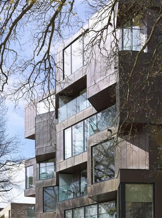
AB: It was a discovery I made doing Accordia. Each apartment has a curved sloping roof that’s clad in green copper and that was where I first realised the potential of a curved pitched roof. It’s about continuity of surface. Some of my projects are very much about polygonal geometries, and the concepts of folding and merging of wall and roof and floor, and achieving a total consistency of geometry and material; whereas, when working with curves, in a way the roof becomes the wall and that smoothness creates an automatic beauty. It creates opportunities for light and shadow and for the punctuation of that surface to become a very sculptural thing in itself.
AP: I really liked what you said about the set of guidelines and rules that you set yourself.
AB: If you are prepared to say to clients, ‘this is what I do and I cannot do what you’re asking me’ – like I cannot do a building that’s 50m long with a central court and 225m-long corridors – that contravenes my ethical position as an architect. It generates a certain degree of respect and shuts down a great deal of wasted time and arguments, because it’s about a principle. Once the client buys into that, it relieves them of a lot of compromise and baggage. It is not about questions of aesthetics and taste but about an ethos of human dignity and well-being and quality of life, which we need to defend at all costs.
Alison Brooks’ appearance at in:situ 2017 was sponsored by James Hardie.


