Richard Francis-Jones: Gallery of ideas
Design director of FJMT Richard Francis-Jones talks with ArchitectureAU about civic spaces, materials and forms that link past with present, the anxiety effect of galleries and making the 2013 World Building of the Year.

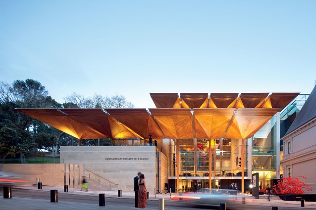
It’s been a big year for FJMT. In 2013 the Sydney practice of Francis-Jones Morehen Thorp became the first Australian firm to win World Building of the Year at the World Architecture Festival for the Auckland Art Gallery Toi O Tamaki, designed in association with New Zealand’s Archimedia. They went on to win the Harry Seidler Award for Commerical Architecture at the Australian National Architecture Awards for Darling Quarter in Sydney, and released a monograph: Architecture as Material Culture: The work of Francis-Jones Morehen Thorp. No surprise then that design director Richard Fancis-Jones is feeling philosopohical, and apt to talk.
ArchitectureAU: Congratulations on what appears to be quite a coup, given the international talent at the 2013 awards. What do you think set the Auckland Gallery apart?

Richard Francis-Jones: Yes we were honoured to win. The quality of many of the buildings from around the world was extraordinary. I think what may have set our project apart was the way the design is deeply imbedded in the specificity of the site and the bi-cultural nature of Auckland and New Zealand.
AAU: Yes, the jurors highlighted both the sensitivity of the design and the richness of ideas.
Richard Francis-Jones:We were acutely aware of the significance of this project to the city of Auckland. It was important to celebrate New Zealand’s forward-looking and open culture in a post-colonial age, and the incredible natural landscape was a real source of inspirational for us in doing so. The process was undeniably complex, and sometimes contentious, but the building has been universally embraced.
AAU: This project took seven years to realize. Can you remember your initial reaction to the site?
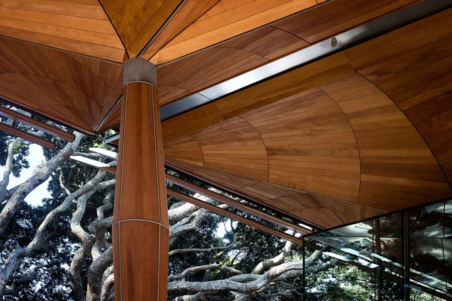
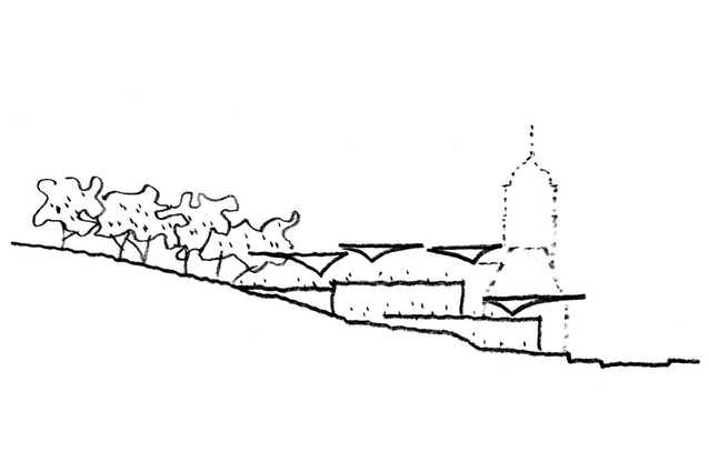
RF-J: What struck me most were the twin relationships that the new building would have to establish, one with the heritage building and one with the Albert Park landscape. For me, the strongest inspiration was the landform of the park, and in particular the beautiful canopy of Pōhutukawa trees [Metrosideros excelsa] around the gallery. We wanted to achieve a synthesis of nature and building, and we also followed this dialectical approach with the relationship between the new building and the heritage building.
AAU: Having completed a number of public buildings such as libraries and museums, what do you think is critical in civic architecture?
RF-J: The most important thing is to create buildings and places that embody social values and aspirations. The architecture needs to capture and reflect the spirit of those it is made for and to capture their aspirations for the future. Visitors to this building should feel welcome and invited; it is their gallery, and I hope they also feel in some way uplifted.
AAU: How has this been realised in the gallery project?
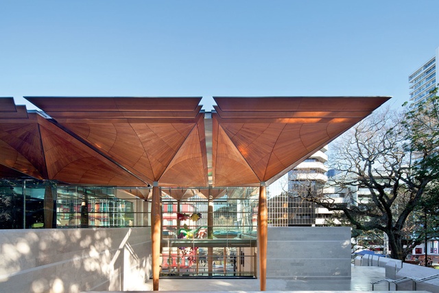
RF-J: There is often a threshold anxiety associated with civic buildings. To make art more accessible it is best if this can be blurred, so the public sees it as a very public space - a place to meet friends, have coffee, attend events and functions. As such, the gallery needed to be inviting and transparent - that’s the balance we’ve tried to achieve. With the Auckland Art Gallery there was the desire to create a building that was not over-monumentaliszd, but which declared the significance of art to the city, and indeed the country. We wanted the new building to equal the ambition of the old one.
AAU: Being a public building on an important site, Aucklanders had strong opinions on the development. How did the public scrutiny influence the design?
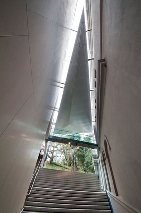
RF-J: It’s a very sensitive site – a highly valued heritage building, with a beautiful and important park around it. There was a lot of concern about putting a new building there. Our concept was to connect the gallery with the natural landscape, to create, through a series of beautifully crafted timber canopies, a building that was a little like a forest – transparent, open, and inviting.
AAU: What is the context of the work in terms of engagement with its place and the public realm?
RF-J: One of the great challenges we face as architects in this age is that our materials and our systems are sourced from all over the world. We were seeking to make a building that was really embedded in this place, in this culture. New Zealand has some unique qualities, especially its specific natural environment and its indigenous culture, but it is also very interconnected with the global economy, and has aspirations to remain so. If you are going to put any building in this city with any thought attached to it, you are going to make some kind of statement about this inter-relationship. The materials in the new gallery reflect the balancing of a sense of place and a localised culture with a globalised culture, just as putting a new building next to an old building is a balancing of present and past. Material selection was very important, particularly the kauri in the roof canopy. We were conscious of the value of this material at every level – its cultural significance, its environmental preciousness, the process of getting the fallen kauri out of the forest, curing it and forming it.

AAU: You emphasise the importance of the canopies as a central theme of your design. What was the inspiration behind these canopies?
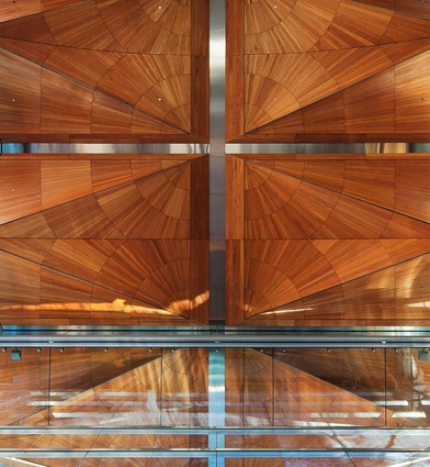
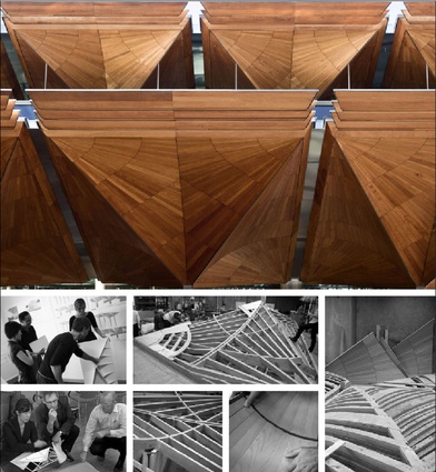
RF-J: The kauri canopies were inspired by the canopy of trees in Albert Park, particularly the Pōhutukawa. We wanted to make a building that was like a forest – an extension of the canopies through the building. The ceilings of the canopies are assembled from carefully selected kauri, profiled into precise geometric patterns and supported on slender and tapering shafts. These emblematic forms give the gallery a unique identity.
To create these canopies we wanted to use an honorific material that was very precious and meaningful to New Zealand, so we used natural kauri. It’s got to be one of the most beautiful timbers you’ve ever seen, a very warm and natural timber of great significance and meaning to Maori culture. But, of course, it’s a protected species, so we had to source it from fallen kauri or recycled kauri. We had to use it very sparingly.

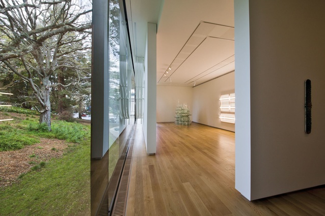
AAU: The expanse of glazing allows views through the gallery to the park, essentially forming a gallery without walls – which is quite unusual, woudln’t you say?
RF-J: While it sounds like a paradox, because a gallery needs a lot of walls to display art, the architectural expression is not about the walls. It is about the spaces in between, the transparency and the sense of shelter and enclosure created by the large canopies. The generous shading of the facade provided by the canopies allows passers-by to see right through the glass and out the other side, enhancing the sense of connection.
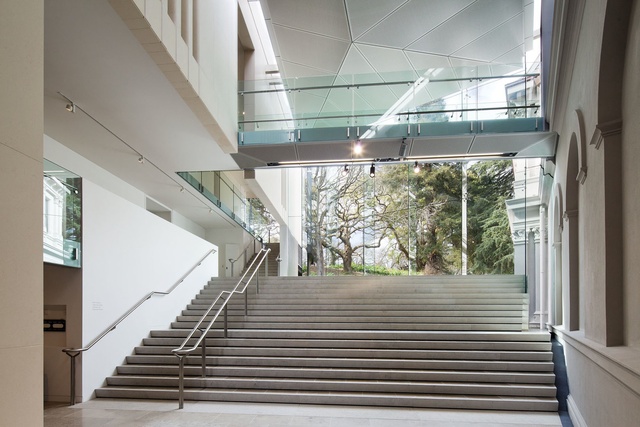
From the interior of the building you can see people sitting in the park on almost exactly the same level as you, and not very far away. When people are standing on the sculpture terrace or back inside the atrium of the gallery you get a sort of human layering. Galleries can induce a kind of threshold anxiety. People think, ‘I don’t really want to go in there.’ But if you blur that edge so that you can see the art, you get a sense of being in the building even when you’re not, and vice versa. The building, in a sense, creates a connection between the natural landscape and the city.
AAU: Being an art gallery that conceptually has no walls – and seemingly, little visible means of support – how was this concept realised? Isn’t earthquake resistance critical?
RF-J: A complex, three-dimensional double-curved roof profile was developed and tested through advanced computer-assisted design and physical models. The canopy design was then refined right down to the detail of fixings and actual board selection using full-size prototypes. The final form of these interconnected canopies transfers all the earthquake loads through its three- dimensional truss-like forms, allowing the whole roof to balance with great lightness on finely tapering timber and steel posts.
Off site, joiners from Papakura Joinery began piecing together a series of twenty-three golden tree-like canopies, crafted from local kauri stock that was either recycled or forest-fallen. Individual planks were hand-planed, curved and clamped in the manner of wooden boat-building, then fitted together for a gentle, double curve. Later, the canopies would be craned on site, to rest above slender, timber-clad engineered steel columns.
AAU: Natural light is normally a no-go in an exhibition space, but here it is in abundance.
RF-J: The idea of being so transparent is in some ways a great irony for an art gallery. Being so open, transparent and connected with the landscape became a powerful metaphor for the project, as the landscape holds great meaning for Maori people, and projects a broader and inclusive sense of welcome. From the park you get the sense of seeing the artworks, and people moving about inside, without even having to go through the door. The more we can break down the threshold anxiety of going into a museum, the more people can freely be in touch with the great works that are part of New Zealand culture.


