Itinerary: Office buildings
In this month's Itinerary – supported by Dulux Colours of New Zealand – Andrew Barrie and Julia Gatley chronicle tall towers and workspaces that populate our most populous cities.
There’s a Koolhaas quote for every occasion: “People can inhabit anything. And they can be miserable in anything and ecstatic in anything. More and more, I think that architecture has nothing to do with it.” Both freeing and depressing, this view might be truest of all about office design.
In the 1880s, the technologies of the steel frame and the lift detached office space from the ground plane, giving us the corporate skyscraper. Since that time, downtown office buildings have often been vertical extrusions of their sites, while the lower floor–area ratios on city fringes have allowed more freedom to shape buildings to create distinctive spaces.
Just as technology enabled the advent of the skyscraper, a little over a century later, the advent of laptop computers, mobile phones and WiFi allowed workers to be unshackled from their desks. Things that had previously been important in office design – uniform lighting, the ability to rearrange cabling, orderly positioning of desks to reflect organisational structures – diminished or disappeared. The specialist stuff people needed to do their work – product catalogues, company libraries, paper records, drawing boards, adding machines – vanished, much of it into computers or onto CDs and then into the cloud, and office design became largely about supporting the relationships between workers and their computers (which is fairly easy), and between the workers and their colleagues (which is much harder). Office designers began to think the latter relationships could be managed through the former.
Thus, the 2000s saw the integration of various forms of hot-desking. Staff members were divided into tribes, such as ‘home-ers’, ‘zone-ers’ and ‘roam-ers’ – some might have permanent desks, some might choose different desks on different days, and others might need desks only on occasion. Motivations were mixed: on the one hand, change was driven by the notion that staff would be more productive if free to set themselves up to their own liking; on the other, providing fewer desks was much cheaper. And, like all freedoms, it was not without its costs; constantly hunting around the building for co-workers could be draining and initial enthusiasm for such loose arrangements waned.
More recently, there has been a focus on balancing the need for workplaces to be efficient and a desire that they be energising. To foster the interactions and chance encounters that promote collaboration, or simply to allow members of staff to see one another, designers have been inserting atrium spaces and social hubs. Slabs of office space have been opened up, making room for natural light, dramatic staircases and places to meet. And, as in other building types, there has also been a commingling of functions: retail on pedestrian frontages, a café in the foyer, a mini-supermarket tucked into the basement, a bar on the roof. In buildings such as Site 3 or Geyser in Auckland, the slick atrium becomes an attractive courtyard.
The climate crisis is presenting new and urgent design challenges for office buildings. It is encouraging the renewal of older buildings rather than sticking with the established model of demolish and replace. We are all accustomed to the adaptive reuse of redundant old commercial buildings as apartments; this practice took off in the 1990s. The climate crisis now demands that more of this ingenuity be brought to other types of reuse.
Most recently, however, COVID-19 has thrown the whole office building type into question. It has shown that many office workers can work productively from home and, indeed, that many of them want to continue working from home. AMP was one of the earlier companies in this country to exit its inner-city office tower. We have to anticipate that the effects of COVID-19 on office culture will be long term, with shifts in expectations and norms, and with microbe-awareness reducing the appeal of hot-desking and, for some people, even the appeal of working
in close proximity with others.
THE ITINERARY
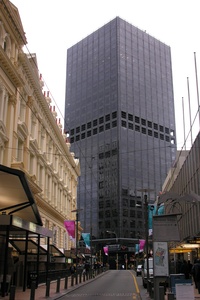
01. 1972–1984 – BNZ Building
1 Willis Street, Wellington by Stephenson & Turner
The clean lines and minimalist detailing of the BNZ (‘the big, black BNZ’) place this building firmly in the modernist tradition. It took 12 years to complete because of a lengthy consenting process and because of strikes and go-slows by boilermakers. The latter meant the building’s steel frame was a Wellington landmark for years and postmodern buildings were being completed contemporaneously. Underground connections to the Old Bank Arcade came later. The BNZ building still seems to say “HAHA” at top and bottom. See New Zealand Architect, no. 5, 1986.
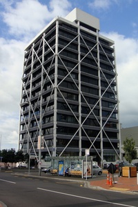
02. 1980–1984 – Union Building
2 Commerce Street, Auckland by Warren and Mahoney
The site of this building has historic associations – the Union Company had occupied it since the 1920s – but the design focused on developing new models. The external pre-cast concrete bracing for absorbing earthquake loads was a first for high-rise buildings in New Zealand; the cunning piles-in-tubes base-isolation system was a global first. The project received an NZIA Regional Award and an NZ Concrete Society Award in 1984. See Home & Building Dec/Jan 1984/1985 and NZ Concrete Construction May 1984. Warren and Mahoney’s Citibank Building, completed just five years later and a block away at 23 Customs Street, shows the firm’s swift transition to PoMo classicism.
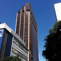
03. 1988 – Fay Richwhite Building
151 Queen Street, Auckland by Dino Burattini with Peddle Thorp & Aitken
Clad in Dutch glass and Argentinian granite to a concept design by Aussie architect Dino Burattini, this project is Auckland’s most sculptural tower; Peter Sargisson went so far as to describe it as “a virtuoso display of architectural skills”. Very much of its time, in addition to office, retail and residential space, the design included a private club, complete with fitness centre, tennis court, 25-metre pool and dining facilities. It won an NZIA National Award in 1992 and an Enduring Award in 2017. See Architecture NZ Nov/Dec 1988. Peddle Thorp fans might visit its former ASB Bank Centre at 135 Albert Street (1991).
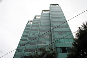
04. 1986–1988 – Telecom House
13–27 Manners Street, Wellington by Athfield Architects
Telecom House is distinctive for its wavy façade and green ceramic tiling and glass. The façade has been compared to that of Gummer and Ford’s State Fire Insurance Building in Wellington (1938–1941), which, in turn, has been compared to Emil Fahrenkamp’s Shell-Haus in Berlin (1930–1931). It is surely coincidental, though, that the green tiles on Telecom House were imported from Germany. By the 1980s, Wellington City Council was giving plot-ratio bonuses for commercial buildings that included apartments, and Telecom House included five, with contrasting terracotta colouring. See Gatley, Athfield Architects (2012).
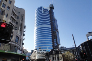
05. 1987–1991 – The Majestic
100 Willis Street, Wellington by Manning & Associates and Jasmax
The Majestic replaced Wellington’s old Majestic Theatre, demolished in 1987. The tower was the country’s tallest when it was completed, but was overtaken a short time later by the Hassell-designed ANZ Building, 23–29 Albert Street, Auckland (1991). According to Emporis, the Majestic has 29 storeys above ground and reaches to 116 metres, while the ANZ has 35 storeys above ground and reaches 152 metres. The Majestic is said to be the furthest south skyscraper (i.e. building over 100 metres tall) in the world. See emporis.com. It earned an NZIA National Award in 1992. See Architecture NZ Jul/Aug 1991 and May/Jun 1992.
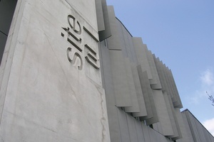
06. 1998 – Site 3
30 St Benedicts Street, Auckland by Patterson Associates
After Axis (91 St Georges Bay Road, 1992–1996) and D72 (72 Dominion Road, 1996), Site 3 was Pattersons’ third project (hence its name) for the developer Samson. An understated gem comprising five buildings, a courtyard and open-air staircases, laneways and bridges, it included the adaptive reuse of a historic stable building. The Site 3 building received an NZIA New Zealand Award in 2002. See Urbis Autumn 2002, Monument Commercial Special 2002. The relationship with Samson has continued to produce mixed-use projects that represent some of Pattersons’ best work: Cumulus (8a Cleveland Road, 2003), Anvil (109 Dominion Road, 2012) and Geyser (100 Parnell Road, 2012).
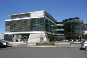
07. 2007 – Meridian Building
33 Customhouse Quay, Wellington by Studio Pacific Architecture with Peddlethorp
The Meridian Building was New Zealand’s first purpose-built 5 Green Star-rated office. Said to use 60 per cent less energy and 70 per cent less water than comparable buildings, it is a flagship for a power company wanting to demonstrate its commitment to sustainability through its embrace of energy-efficient design. It is in two parts; an elevated white box faces the harbour and a timber-louvred portion addresses historic shed buildings. It earned an NZIA National Award for sustainable architecture in 2009. Nearby, 20 Customhouse Quay earned Studio Pacific Architecture a National Award for commercial architecture in 2019.
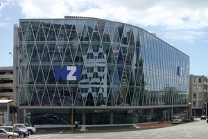
08. 2009 – NZI Centre
1 Fanshawe Street, Auckland by Jasmax
This building’s diagrid glazed façade makes it one of Auckland’s most striking commercial buildings but there is further excitement within. Those too shy to stroll the five-storey atrium might still visit the public café to take in the spatial and corporate drama unfolding on the floating floor slabs, flying stairs and projecting meeting rooms. The building picked up Timber Design and NZIA Auckland Architecture Awards in 2009. See Architecture NZ Sept/Oct 2009. While in that vicinity, check out Jasmax’s Vodafone Venue at 20 Viaduct Harbour Avenue (2005) and Architectus’ Grant Thornton House at 152 Fanshawe Street (2006).
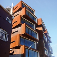
09. 2009 – Ironbank
150 Karangahape Road, Auckland by RTA Studio
Spanning a city block, this retail and office complex is arranged around a path that connects two streets. The path expands mid-way to create a plaza, and the highly sculptural composition is further enlivened by the rich textures of pressed metal, Corten and coloured glass. Given this generous and urbane sensibility, it is no surprise the building is full of architects’ offices. See Metro Dec 2009, Architecture NZ Sept/Oct 2009, Nov/Dec 2009 and May/Jun 2010. Check out RTA’s other nearby office projects – start at 582 K’ Road and head towards 54 Pollen Street, Ponsonby.
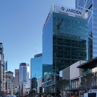
10. 2009 – 21 Queen Street
21 Queen Street, Auckland by Peddlethorp Architects
An early example of the more sustainable alternative to demo and replace, this project reused the structure of Peddlethorp and Walker’s Downtown House (ca 1974), adding six floors before recladding and refitting. Bestowing an NZIA National Award in 2011, the jury described the project as a “Cinderella-like transformation” and “a timely and standard-setting lesson in adaptive reuse”. See Architecture NZ Jan/Feb 2010. Other award-winning examples of adaptive reuse for office purposes are Architecture +’s 2006 Conservation House, 18–32 Manners Street, Wellington, and Athfield Architects’ 2010 Te Hononga Christchurch Civic Building, 53 Hereford Street, Christchurch.
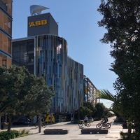
11. 2013 – ASB North Wharf
12 Jellicoe Street, Auckland by BVN Donovan Hill and Jasmax
This project became the poster child for activity-based working, in which staff could locate and arrange themselves to suit the needs of the moment. The project also included many other strong design moves – an urban laneway, sophisticated shading and ventilation systems, and restaurants on the street frontage – and was awarded the 2014 NZIA Architecture Medal. See Architecture NZ Nov/Dec 2013. BVN Donovan Hill and Jasmax have collaborated on several office projects, including C-Drive, 33 Corinthian Drive, Albany (2002) and Sovereign House, 74 Taharoto Road, Takapuna (2008).
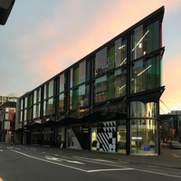
12. 2012–2014 – Stranges and Glendenning Hill
219 High Street, Christchurch by Sheppard & Rout
One old building and two new ones are together known as the Stranges and Glendenning Hill Building. A sharp, glazed corner with coloured glass fins creates a vivid image. It was the first project to be built in the city’s post-quake red zone and its structure was engineered to 180 per cent of building code requirements. The complex is also highly permeable, with laneways and a central courtyard for bars to spill into. It earned an NZIA National Award and the Sir Miles Warren Award for Commercial Architecture in 2015. See Architecture NZ, Nov/Dec 2014.
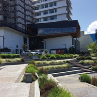
13. 2017–2019 – Mezz Box
298 Victoria Street, Hamilton by Edwards White
This project is part of an ongoing initiative to reinvigorate and extend a 1960s office building designed by the Ministry of Works. The Mezz Box required particular innovation in craning a prefabricated studio space high into the structure, and was rewarded with the NZIA’s Sir Miles Warren Award for Commercial Architecture in 2018. With the adjacent Victoria on the River, Riverbank Chambers and Riverbank Lane by the same architects, this project injects a sizeable dose of relaxed urbanity into central Hamilton and renews the central city’s connection to the Waikato River. See Architecture NZ Nov/Dec 2018.
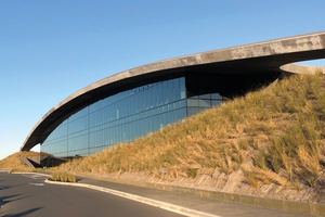
14. 2020 – Foodstuffs Headquarters
35 Landing Drive, Auckland by Monk Mackenzie
The backstreets around airports aren’t usually promising places to look for architecture but this headquarters for the Kiwi supermarket giant is one of many sharp buildings commissioned by Auckland Airport’s property arm. Responding to the vast scale of the distribution centre shed – designed by Eclipse Architecture – the glazed office block is sheltered under a huge concrete roof that arcs up out of the ground plane. Internally, a swooping atrium injects further drama into the stack of office zones, meeting rooms and social spaces. See Architecture NZ May/June 2021.
Other addresses
National Bank Centre (1987) – 205 Queen Street, Auckland by Glossop Chan Partnership.
HQ for Southland Bldg and Investment Society (1993) – 51 Don Street, Invercargill by Barclay Architects and Baxter Hesselin McDowell Architects. Perhaps the world’s southern-most example of postmodern classicism.
Deloitte Centre (2008) – 80 Queen Street, Auckland by Warren and Mahoney with Woods Bagot.
Chews Lane Precinct (2009) – Chews Lane, Wellington by Athfield Architects. An exemplar mixed-use project organised around and over an urban laneway.
Telecom Place (2010) – 167–191 Victoria Street West, Auckland by Architectus. A spectacular atrium with four buildings linked by dramatic bridges and stairs.
Telecom Central (2011) – 42–52 Willis Street, Wellington by Architecture +.
12 Madden (2017) – 12 Madden Street, Auckland by Warren and Mahoney. Winner of the NZIA Sir Miles Warren Award for Commercial Architecture in 2019.
SOURCES
New office buildings have a comparatively high hit rate for being reviewed in architecture magazines, and the existence of commercial architecture awards ensures further recognition for the good ones. Such articles have been an important source for this itinerary as, while there is a swathe of books on some building types (New Zealand houses), there is little writing that attempts to connect the dots provided by individual office buildings and offer analysis of the development of the building type over time. Gerald Melling’s series of essays in the National Business Review and elsewhere, republished as The Mid-City Crisis and other Stories back in 1989, is something of an exception, although very much of its time. On particular themes that are important to the building type, the New Zealand Green Building Council is doing a good job of tracking those with green credentials and there are people who are obsessed with ranking buildings and structures according to height.

The itinerary series is supported by Dulux Colours of New Zealand. Dulux Colour Specialist Davina Harper has selected a Colours of New Zealand palette based on this itinerary. See the full range and order colour samples here.


