Jewel box
Textures and natural materials abound in this Auckland home, yet a soothing palette ensures its art and objects does not visually burden its inhabitants.
The ability to see beyond the blank canvas to the finished result that exists in the mind’s eye is a trait that only a few of us have. It’s what separates the amateurs from the masters, the decorators from the designers and the ticky-tacky mass-produced houses from those true architectural gems.
On the hunt for a property that could be the perfect family home, the owners of this house were able to look past the dark, reddish-brown interior of a previous renovation to the mid-century bones beneath, says interior designer Jane McAulay-Frame, director of Bespoke Interior Design.

“They wanted something different to the villa homes that predominated their search area, so when they came across this house, built in 1965 and offering a host of unique interior spaces, they knew their search was at an end.
“The house had undergone a major renovation about 10 years prior but the dark, reddy-chocolate interior had not stood up to the test of time and, really, the whole house needed to be updated to give it back its original character.”

The owners are fans of the mid-century aesthetic and were looking for a designer who shared their passion for a bespoke, hand-crafted approach. After an extensive online search they chose McAulay-Frame and commissioned her to carry out the works they had envisioned.
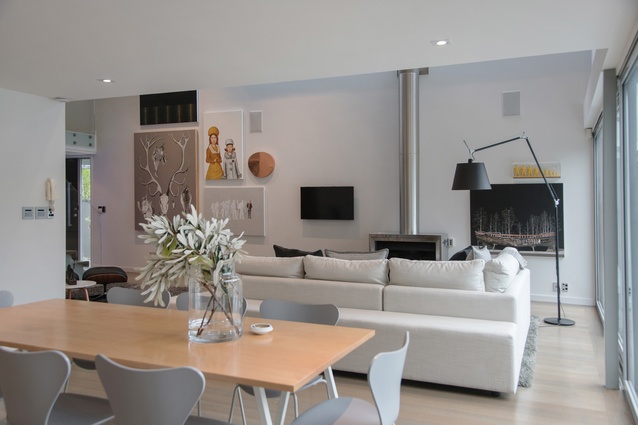
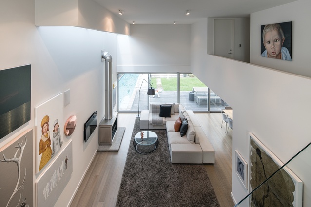
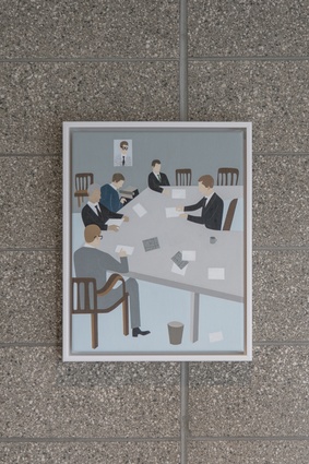
“The first task was to take the interior back to its bones and to start afresh from there. The owners are avid art collectors, particularly of modern art, so the base colour palette needed to be neutral to accentuate their collection. Also, all of the lighting was stripped out and new, recessed lighting installed.”
“We then talked about furniture and I came up with the design for the L-shaped sofa in the living area. The idea was to make it double-sided so that when the owners were entertaining and were in the kitchen, their guests could still be sitting in comfort but not totally separated from their hosts.”
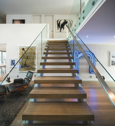
There was one piece of furniture, however, that gave the designer reason to pause. “The husband wanted an Eames lounge and ottoman, which I was against because there are so many knock-offs around that I felt, as a designer piece, it really had suffered. He was adamant, though, and so he got his lounge and ottoman and, I have to admit, seeing it in the space, it’s such a great fit. I’m really glad because maybe it’s time for it to get its designer glory back.”
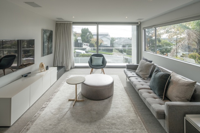
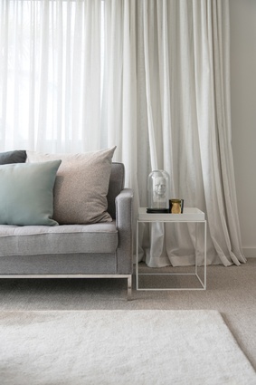
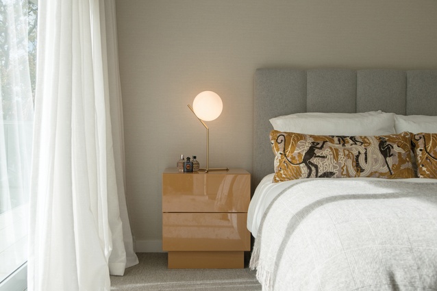
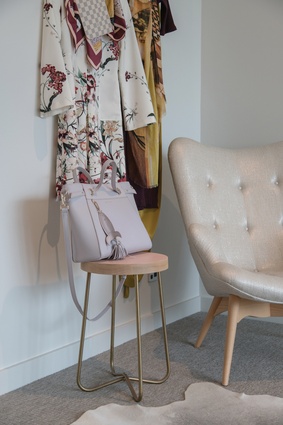
In keeping with the neutral base palette, McAulay-Frame chose to keep the furniture in similar shades of warm neutrals so as to merge with the surroundings rather than compete. Whisky shades, along with accents of copper and gold, were then incorporated throughout to offset the otherwise achromatic scheme.

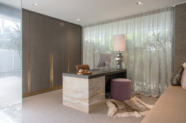
With the homeowners in place for a couple of years now, it was time to turn their attention to some of the secondary rooms, which didn’t receive the full treatment the first time round, says the designer. “There was one room in particular that was the focus of this second phase – the office. We knew it was always going to be an office so, once the client and I discussed what she wanted to achieve with the space, I came up with four schemes for her to choose from.”
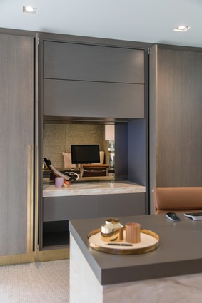
“We went a bit sexier this time, as it really is a personal space; although, that said, there is still a link with the rest of the house. We were just that little bit braver with the material choice, going with beautiful veneered wood and using opulent materials such as Italian marble, cashmere and reindeer hide.”

The designer also chose to create recessed handles on the storage doors, which she then lined with unfinished brass. “The whole room comes together very well but my favourite aspect is the brass detailing on the doors. Being unfinished it will develop a really lovely patina over time, which will only enhance the personal feel of the room.

“It was a real privilege to come back to the home – I felt a magic in it that was really rewarding. There is a general feeling of spaciousness without it overstimulating the eye. It’s gratifying to know that the clients are investing in something that has longevity.”
An opinion backed by the client. “We love the house – it feels like a home. A house has to be comfortable and relaxing, merging functionality with style. It’s not about living in a showhome; it has to work now and also be adaptable to changes in the future.
“This house is a work in progress and there are other areas and concerns that need to be addressed – storage being one of them. There’s also a pool house that we want to renovate so that our son can have his own space as he grows older.”
Mention of the pool house brings a smile to McAulay-Frame’s face: “I would love to work on that. It would have to relate to the house in a certain sense but still be its own entity – a scheme something akin to a Miami hotel of the 1950s.”

