Justice and Emergency Services Precinct
Being open and even a little friendly, Christchurch’s latest public building, by Warren and Mahoney in association with WSP Opus Architecture and Cox Architecture, inverts the norm for justice buildings.
What could be a clearer illustration of a government’s commitment to a ’quake-weary city than a building designed to protect its citizens from such a disaster? Taking up a city block and combining services that were previously spread over 22 locations (many of which were destroyed by the ’quakes of 2010 and 2011), the Christchurch Justice and Emergency Services Precinct is both a symbol of safety for the people and a true, stoic embattlement against any future events.
Officially opened in September 2017 and now operational, the Precinct brings together the Ministry of Justice, New Zealand Police, Department of Corrections, St John New Zealand, Fire and Emergency New Zealand, Ministry of Civil Defence and Emergency Management, Christchurch City Council and Environment Canterbury, with the hope of enabling the related agencies to collaborate more readily and easily.
The building is the first major project to be built by the Government post-’quakes and is seen as an ‘anchor building’ for Christchurch’s downtown area. Its site, bordering Tuam, Durham and Lichfield Streets, was chosen for proximity to the city centre, with an aim to bring more life into the city, and also for its close visual links to the Avon River and Port Hills as environmental connections to the wider city and important places for the local iwi, Ngāi Tahu. Spaces within the building also have views of the Bridge of Remembrance and Castle Rock, which is a Ngāi Tahu peak.
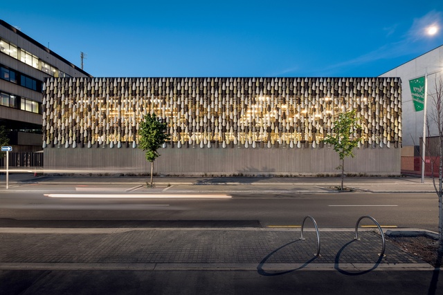
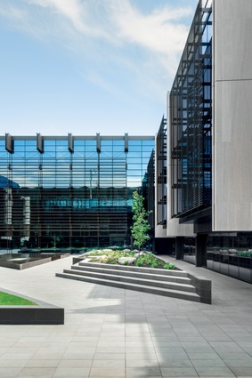
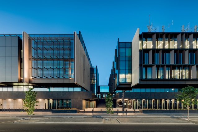
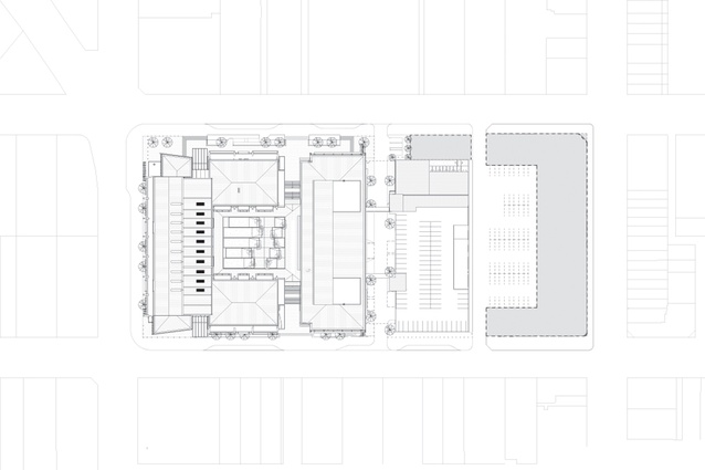
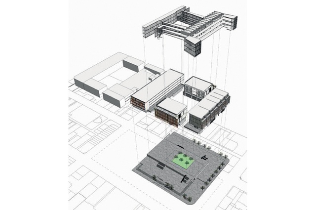
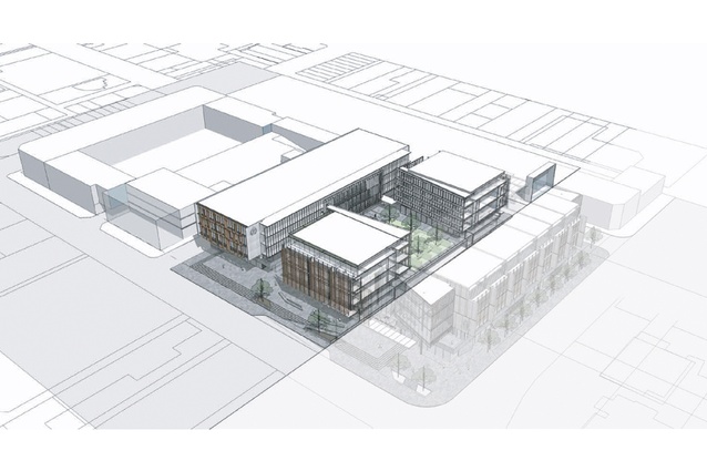
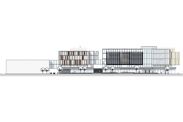
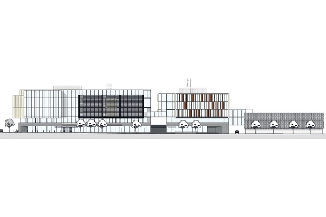
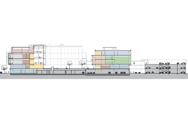
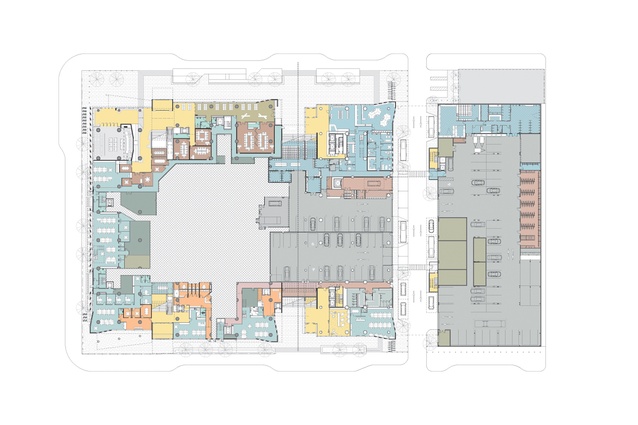
The Precinct, which has been five years in the making, was designed through a collaborative process by Warren and Mahoney in association WSP Opus Architecture and Cox Architecture. It is made up of three buildings: the Justice building, which bends around three sides of a central internal courtyard, the emergency services headquarters, which lines the remaining side of the courtyard, and a car park for operational vehicles across the road.
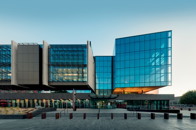
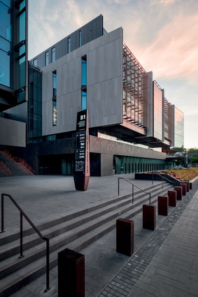
On first glance from the street, the building appears solid and steadfast, with concrete denoting its civic gravitas, but extensive glazing, external artworks and bronze accents work to soften it to a degree. There were several drivers behind the design, a key one being that the building inverted the norm for justice buildings, which traditionally bring about images of dark mahogany walls looming over those who are required to frequent them.
“Most justice buildings are dark crustacean-like objects, which are visually impenetrable in both directions – you can’t see in or get out,” muses design director Andrew Barclay from Warren and Mahoney. “The brief from the Ministry was to make the building an exemplar of justice being open. People should feel as though they are innocent until proven guilty.”

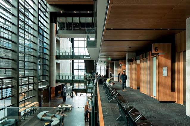
The size of the site enabled the design of the courtyard, which goes a long way in ensuring this sense of openness. A glazed public atrium adjacent to and overlooking the courtyard means all circulation and waiting areas for the courts have views of the green space or city vistas. The courts themselves look out onto the street and benefit from a good deal of natural light filtered through fins and external artworks.
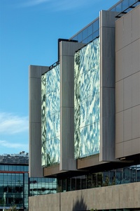
Artist Lonnie Hutchinson’s Pikihuia i te ao, i te pō covers the glazing on the Durham Street face. The work represents the feathers of the lost huia – a poignant reminder of the consequences of neglecting to act with care – and provides beautiful patterning as a backdrop to these courtrooms while also ensuring privacy.
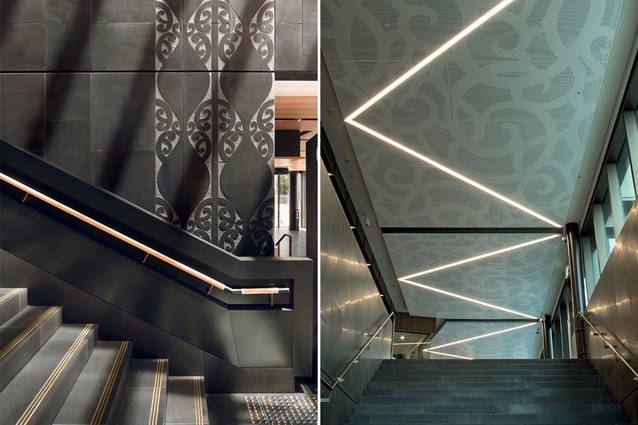
From outside, it has a three-dimensional effect caused by the layering of fritted glass. All artworks are by Ngāi Tahu artists and examples can be seen throughout the courts, from the patterning in the non-slip dots on the stairs to the tāniko designs in the timber ceiling panels.
The Māori Land Court is the only court on the ground level, a necessity for the marae ātea space, where pōwhiri can take place. The walls of this room are also glazed and look out onto the street towards the river but bronzed steel fins prevent passers-by from gazing in for too long (these double as discreet vehicle barriers).
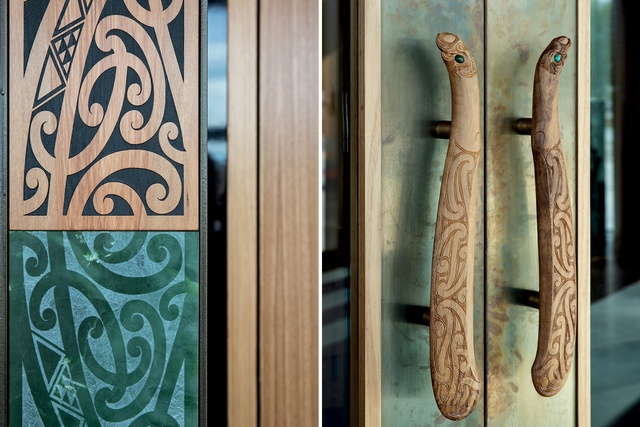
The entrance to this courtroom has been brought to life by carver Fayne Robinson, who created a sinuous kōwhaiwhai pattern framing the door, carved out of rimu and tahutahi pounamu. The door pulls, also created by Robinson, depict male and female eels in the form of patu (weapons) with aotea and Marsden stone eyes. The internal pillars are cloaked in rimu battens to symbolise Ngāi Tahu authority and mana over the lands.
The sense of openness is furthered by the layout of the building, explains Barclay. “You can see the height and length of the building from the key circulation spaces. All of the rooms that could have been enclosed are not. For instance, the jury waiting room has windows looking out: a good deal nicer than it was in the old building where the jury had to deliberate inside a closed box.”
“A lot of effort has gone into making sure you don’t feel like you are in a closed box – unless, of course, you are in the cells!” Holding cells have been located beneath the courtyard but even these have skylights.
Despite all the light and openness, materials have a certain weight to them. Fossilised limestone and bluestone make up large sections of the walls and bronzed metals provide accent. “One big move architecturally is that the ground-level plane is all in bluestone and it flows from outside to inside,” says Harvey Duncan of WSP Opus Architecture. “We took that material up to Level One, then we have the limestone above it, so, while most people wouldn’t notice it, there is a sense of the entrance being less intimidating as the materials welcome you in.”
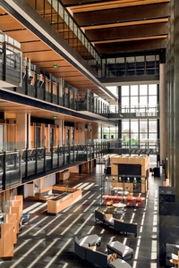
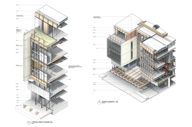
There is also a language that carries through the building, from mega-scale down to the finest detail, such as the use of light-and-heat-mitigating twinned fins on the external and courtyard glazing, which is identical in a much-smaller scale to that seen on the joins of the internal walls and also in the stair railing.
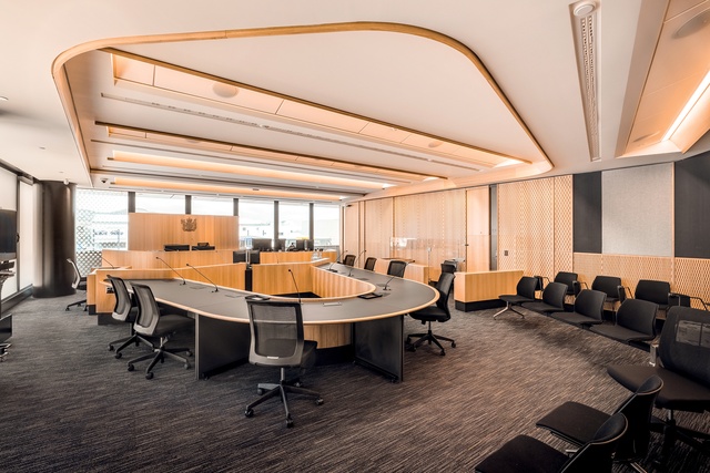
As with the building’s open atrium, there was a wish to reduce the hierarchy of the courtroom in terms of layout and furniture design. The height of the dock was reduced and detail in the furniture was dematerialised.
“We worked with Judge Doherty, who was really keen to achieve a better connection between the judge and participants,” explains Duncan. “Rather than having the court taker sit in front of the judge creating a visual and psychological barrier, we wanted a collaborative feel to proceedings. Part of that was curving the benches and also bringing the court taker out to one side. The aim was to foster closer interaction.”
Courtrooms are equipped with videoconferencing technology so that defendants and witnesses do not have to travel to the court if this is difficult or dangerous. The spaces are also interchangeable. Courtrooms have been given numbers rather than names so they can be used as needed. “Columns and beams hold the building up – internal walls can be moved. If the whole place becomes videoconferencing suites, it could take that degree of change,” says Barclay.
Circulation was a huge part of the planning. Judges, juries, defendants, the public – all need to travel through the building via different channels. “Vertically, this is really complex,” says Barclay, “However, you can spend a huge amount of money making it more complex than it needs to be. All the vertical circulation was modelled so we could understand how people moved and simplify it as much as possible.”
While the judges have their own level at the top floor of the building, with the outer circulation space doubling as a library, the Ministry also requested that there was as much equity as possible in terms of staff quarters. The Justice staff lunchroom has the best view in the house, looking out to the Port Hills and the sea, and members of staff have offices with plenty of natural light.
“These are people who are dealing with hard stuff in their daily workloads so they need quality places of respite,” says Duncan. Similarly, in the emergency services building, two levels of shared café space look out onto the courtyard, and meeting and office rooms are light-filled and comfortable.
The project was part of the ‘Build it Back Green’ initiative, which seeks to ensure all new builds in Christchurch utilise sustainable building practices and environmentally friendly utilities. Opus engineers worked closely with the architects to create efficient and well-integrated heating, lighting and cooling systems. Water is drawn from an aquifer that runs below the site and is used to increase or decrease the temperature of the building.
All lights automatically adapt to the amount of natural light in the building and also switch off – along with any heating or cooling – when a room is not in use. Heat-recovery systems reduce the need for heating by up to 60 per cent. The atrium is naturally ventilated by opening louvres, equipped with rain and condensation sensors, and an underfloor cooling system links to the aquifer to ensure the space doesn’t turn into a glasshouse in the summer.
This efficiency helps the building to achieve another goal of the design, which was for it to be able to run self-sufficiently for at least 72 hours in the case of an emergency. For this reason, it is supplied by mains electricity and has backup generators and twin water and waste systems. Thus, the building is coded to Importance Level 4 and is seismically resilient with base isolators that allow it to move 600mm from side to side.
The architects predict that the building will be used as a template for other civic buildings in New Zealand. “There will likely be nothing else built to this scale,” says Barclay, “but there will be a lot of learnings taken from this building.”

