JWT
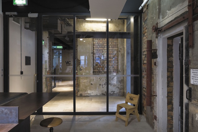
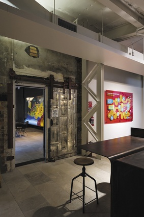
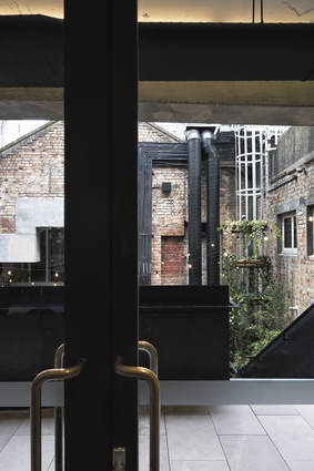
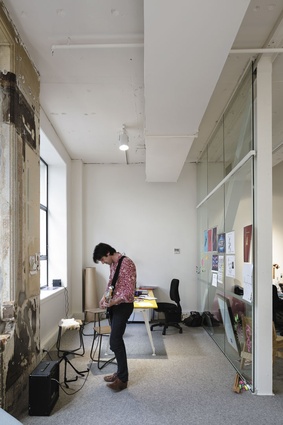
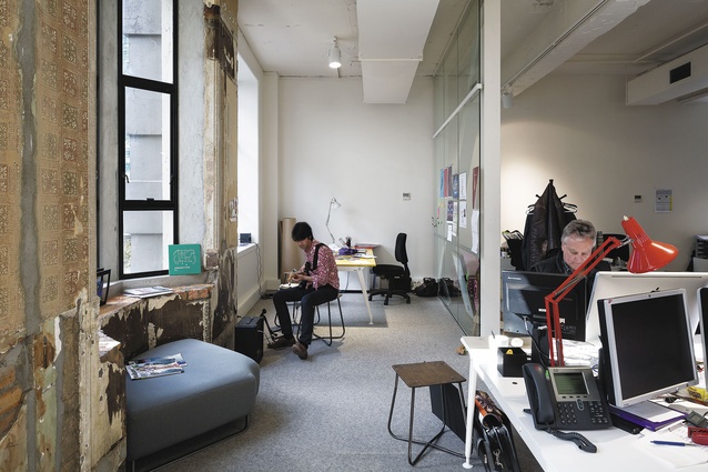
Cleve Cameron leads a happy jaunt through JWT. The ad agency’s creative director is clearly happy with the way the fit-out, by Fearon Hay, is working. He should be happy, too. For a start, and without even mentioning some of the office-specific interventions that have been instigated, there’s that raft of welcome and familiar themes that those familiar with the Imperial Buildings will immediately recognise. The material dialogue between concrete, brick and steel, for instance, which is, inside this office, complemented by a support act of accretion: geriatric bricks, for instance, peer out past crumbled concrete and, further back, at the office’s southern end, layers of wallpaper have been revealed. It’s the interior fit-out version of an archaeological dig and, fortunately, the value of these time-spanning mementoes have been recognised.
The Imperial was one of the big stories of last year; architecturally, historically, socially, it’s become an important part of Auckland’s greater story arc. This reworking of heritage building from relic to relevant shows there are rewards in the careful handling of older building stock. And, now that it’s nearly full, the atmosphere is more charged. Despite the connective laneway at ground level, this is an inward-looking building and, as such, the best activity is generated within and not around the fringe. The architects recognised this when they designed one of the building’s greatest features: the little ‘piazza’ that sits right in the heart of the building. Like Italian village dwellers hanging out a window to take in the activities of the town square, those at JWT can lean over the balustrade in front of their office and take in the activity below, or join in, should they wish.
It was during the early stages of the Imperial’s reworking that JWT perceived the advantages that the building’s overall spatial planning could have on its own office, says architect Tim Hay.
“They were really passionate about the building before they got there. They recognised in early strategy meetings the amenity provided in the lane and the other spaces within the building, such as the courtyard.”
The proximity to these spaces influenced the interior plan of the office and, in particular, the number of meeting rooms – there is just one, the boardroom, or ‘war-room’, to drop into advertising parlance. To continue the military analogy somewhat, it was at about this time, nine months before the building’s completion, that Fearon Hay began working with JWT, initially discussing “strategies of occupation” with them, says Hay.
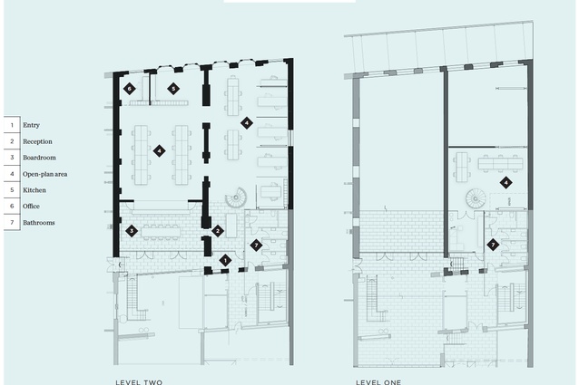
“At that point, they hadn’t found a space that particularly suited them, and that led to us, pre-completion of the Imperial, coming up with a space strategy to see how they’d fit into the building. There were a few things moving at that stage, as some of the other tenancies were being taken, and one plate wasn’t quite big enough for their needs. One idea we had was to put an aperture through the floor to pick up part of another plate that was already segregated by another tenant. They were quite into that because it tapped into the idea of the building as a discovery, which was an overall strategy in the building’s architecture.”
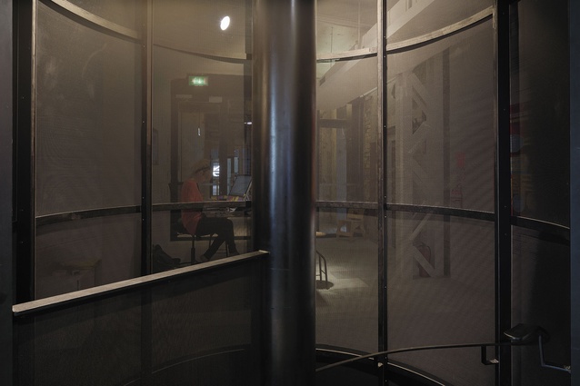
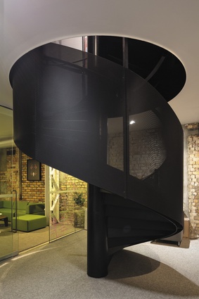
Eventually, a sculptural black steel circular stair would provide the connection to the lower level, which could be described as a ‘cave’, in the most charitable form of the word. The stair, the boardroom and the reception are the fit-out’s three key devices – “a tripartite of elements”, as Hay puts it – and all can be found at the impression-forming part of the office: the front.
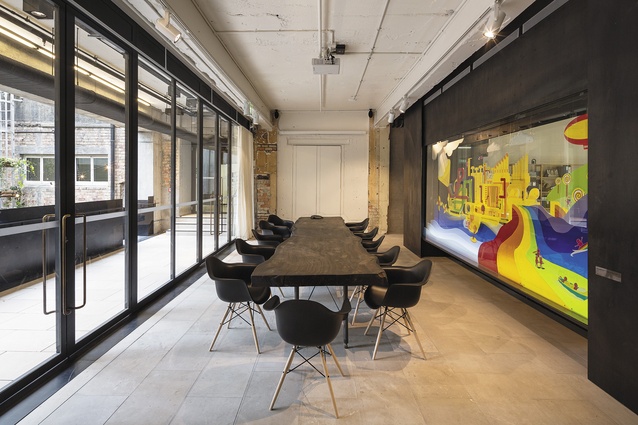
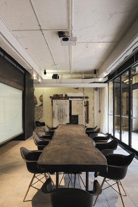
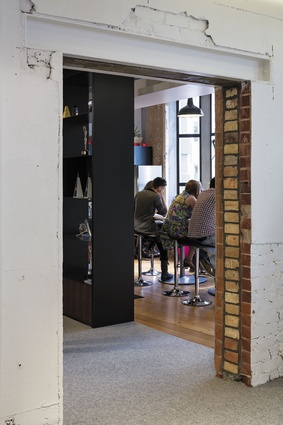
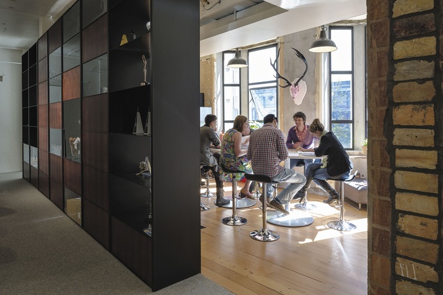
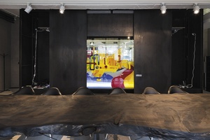
Interestingly, however, it is not the reception that the visitor first encounters at JWT. Because of the building’s layout, it’s the boardroom, sitting right on the cusp of the exterior circulation, that the visitor first encounters as the office is approached along the exterior gangway. It’s a tantalising glimpse. JWT leads with its best room forward, and it’s a room with a number of impressive notes. The most obvious is a lolly-scramble-coloured artwork called the Luphonium, a Seussian weapon of mass distraction. Devised by the agency, it reacts to the levels of enthusiasm exhibited in the room; it’s also operable by iPhone and, to the relief the introverts in the room, it can be hidden away behind a drop-down screen. The Luphonium sits in a display case that taps into the idea of permeability in a similar way that the fabric of the staircase behind reception does; revealing activity, but not so much that you’re wallowing in it, distracted from the tasks at hand. Hay likens the display area of the cabinet to the stage and the surrounding black-metal cabinetry as a proscenium (the area of a theatre surrounding the stage): “a compressed version of a theatrical set that JWT can manipulate and modify, interplay with its clients, brands it wants to present. It was a way to change the stereotypical strategies that people always use, media and screen, to something more object based”.

There’s another key element in the boardroom, and it is, to reach for some hyperbole – epic. The boardroom table has a top hewn from the heart of a 160-year-old macrocarpa called ‘Big Mac Daddy’, a tree that also comes with its own biography. It is, so the story goes, from “part of a grove planted from original settlers’ seed-stock in the 1850s in the middle of Motupiko in the Tasman Bay region”. The tree, weakened after “a strong southwesterly storm came rampaging through the valley”, produced 150 tonnes of timber. JWT’s slab came out of the “middle stem, second log section up”. As a finish, the designers opted for a black stain to the table top. “We saw it before it was cut and the weathering, sun and time had made it silvery. It did have a beautiful bark edge though, which we knew couldn’t stay for practical reasons, but the final colour is a reference to the bark,” recounts Rufus Knight, a designer on the project. There’s a nice symmetry to this story about a furniture piece carved out of a tree older than the heritage building in which it is placed; the combination of pastoral with something urban, for instance, or new life for things at the end of their tenure.
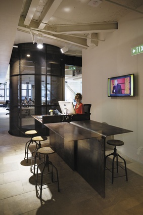
But enough musing – to the reception, where the idea of permeability is again at play. The aforementioned stair sits directly behind this space. It’s construction incorporates steel mesh that partially screens the working floor of the office, providing enough of a buffer to avoid building a wall. “There is some permeability, shadows and movement, but there is still a definite front and back of house. It just wasn’t delineated in terms of corridor and wall division,” says Hay.
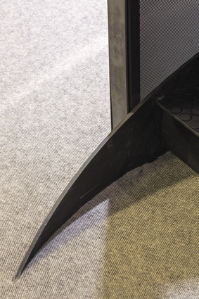
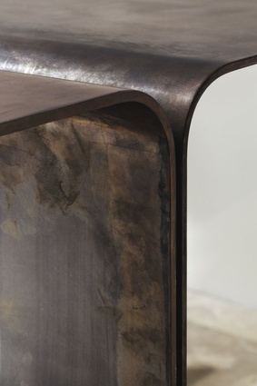
What also helps separate the spaces is the powerful and diverting nature of the reception’s furniture. In key spaces, it helps to have some key pieces of design. Here, a sense of arrival is generated by a monumental piece of metalwork, a reception table comprised of blades of bent steel. Because of its form, says Hay, “it was code-named ping pong for a while”. While this could be read as a sly dig at the propensity for table tennis tables to turn up in the offices of the ‘hip’, Hay is right to say that this table is “playful without being flippant”. It triples up in functionality as a reception desk, waiting area and off-the-cuff meeting area; it’s at once understated and, thanks to its material richness, endlessly diverting. That idea, you might say, could be an apt description of both the Imperial as a whole and this singular office.

