Kathleen Kilgour Centre
While most cancer patients undergoing radiation treatment procedures are likely to be in vulnerable states, those entering the new Kathleen Kilgour Centre (KKC) at Tauranga Hospital must, at least, gain a small visceral sense of relief. For anyone who has attempted to find their way to the Starship’s Haematology/Oncology ward at Auckland City Hospital from the car park will understand that there is nothing worse than the additional stress of becoming lost and disorientated in a poorly designed hospital when you or a loved one is seriously unwell.
The Kathleen Kilgour Centre was established by urologists Mark Fraundorfer and Peter Gilling and was named after Dr Fraundorfer’s mother, who died of cancer at an early age. It is the result of a private-public partnership between Bay of Plenty District Health Board and the Kathleen Kilgour Centre Limited Partnership. Previously, the nearest option for radiation cancer treatment was more than 100km away but, now, 500 to 600 patients, both publicly and privately funded, can use the new facility annually.
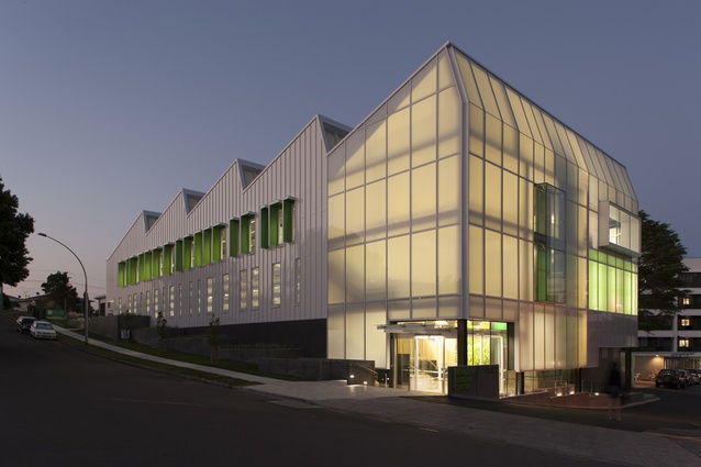
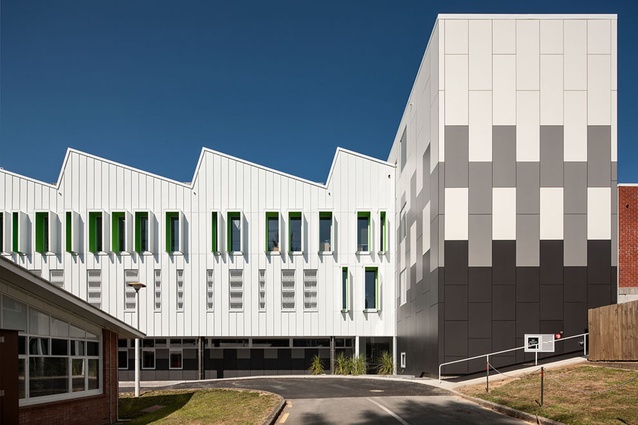
Fortunately, patients visiting the three-storeyed centre, designed by Wingate+Farquhar, are discovering a warm and welcoming building that is easy to navigate as well. Sited on a gentle slope on the edge of the Tauranga Hospital campus, most visitors arrive via a first-floor car park that is also kind to pedestrians. This can be interpreted as interior space with smart signage, a green-and-grey-striped tarmac and patterned powder-coated cast aluminium panelling.
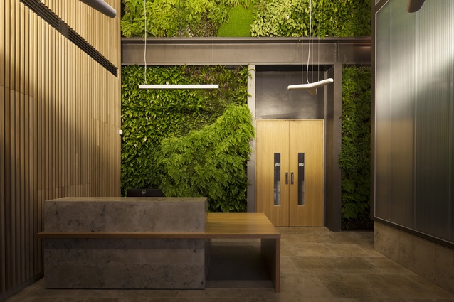
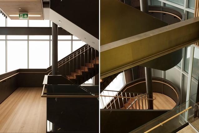
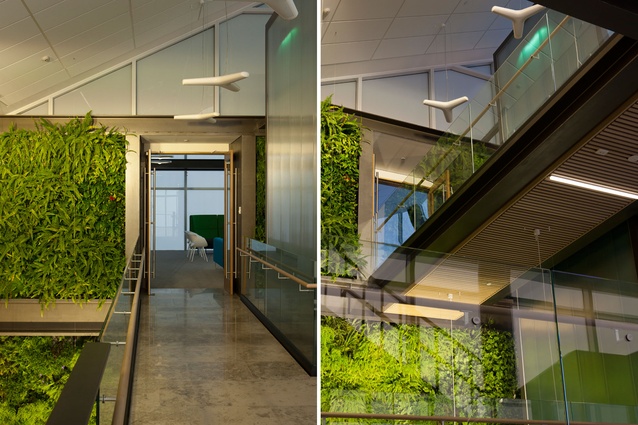
From the carpark on the same level, you enter the lobby with its massive feature green wall, which extends up to the ceiling, and timber battening lining the adjacent walls. These natural materials, combined with the atrium’s layered and confined domestic scale, are certainly refreshing in this hospital context. The ambience is enhanced further by a staircase that winds up the double-height space, assisting with orientation and offering different perspectives along the way.
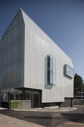
Everything is legible. Facing the main pedestrian entrance from the street, a lift in the form of an extruded rectangle stretches up to the ceiling and is wrapped in semi-translucent, green-tinted Italian polycarbonate, edged in black. It’s a sculptural and, yet, still subtle way of enclosing a lift.
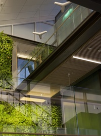
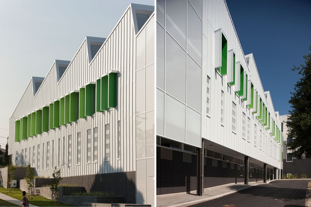
The irony is that it is also a holistic-inspired design, with plenty of natural daylight; rainwater is harvested from the roof for reuse and power is utilised from photovoltaic panels – one of the largest installations in the country – fixed to the roofscape. The efficiency of the solar array helped to inform the sawtooth design. This all adds to the project’s semi-external feeling throughout; it’s a bit like being in an incredibly fancy greenhouse.
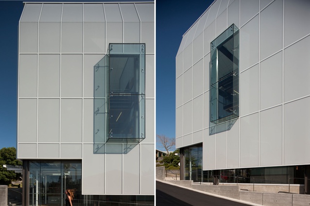
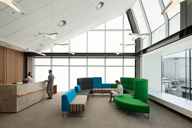
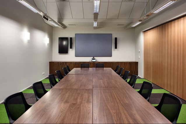
Upstairs, on the second level, are five consultation rooms, a staffroom and a waiting/reception space. One of the highlights here is the large window box through which a peaceful panorama of the distant hills can be seen. Up on this floor, there are also offices for oncologists, radiologists and physicists and a large open-plan flexible office space for meetings and training. This column-free upper floor means there are no restrictions on the floor plate, while natural light floods deep into the space through clerestory windows in the saw toothed roof.
On the ground floor, three bunker-like radiation treatment rooms have 1,200mm-thick concrete walls. They are certainly fat but this is actually a substantial reduction in width compared to what has been used previously, since radiation treatments are evolving rapidly. A pit was dug out underground to cater for the workings of the machinery, and control rooms sit adjacent to the bunkers along a corridor. Down here, there is also a room containing a CT scanner and rooms for waiting, changing, consultation and recovery.
Clearly, there were complex technical challenges around planning and programming, including the incorporation of Elekta Versa HD linear accelerators – some of the most innovative, state-of-the-art medical equipment in the country (it generates forms of high-energy radiation). Even though this floor is a serious hospital environment, weirdly, and perhaps, hopefully, it almost could be a posh gym. Along the corridor, locker doors are in dark oak and a contemporary paddle motif – which represents Tauranga as the landing place of waka – is printed onto panelling and glass.
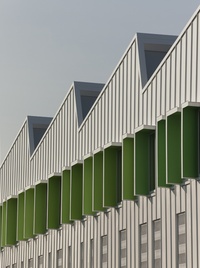
Externally, on the southern elevation, two large windows pop out of the skin, offering deliberately framed landscape views from within the interior spaces. On 20th Avenue, the clean, off-white steel skin features a raised-seam detail, punctuated by bright-green, double-sided window hoods that project from the surrounds of the fenestrations. On the northern end, wooden louvres above the car-park entrance are a hint to the more natural material and colour palette used in the interior. The base of the building is concrete and Isthmus has designed an elegant, stepped landscape up the slope. Creeping fig has been planted and will, in time, edge its way up the structure.
There is something about this building that makes it feel like an interpretation of New Zealand’s ever-changing topography, with its light-filled landscapes and never-ending foliage, ice-and-snow-laden mountain tops, and green lakes of water. But there’s still a subtlety to the overall effect; the Kathleen Kilgour Centre is lovely and fresh in this context and is surely one of Tauranga’s finest buildings.
Buildings designed for radiation treatment around the world have a tendency to be intimating and bulky, with large open atriums and a few paintings and soft furnishings thrown in for holistic measure. While KKC is certainly a large building, its scale is reasonable, connecting sympathetically with the adjacent medical oncology treatment building, and nearby is a variety of hospital and residential buildings. The 3,000m² floor area is compactly contained over its 1,000m² site. While this could have been a glowing-green Incredible Hulk of a building, instead, Wingate+Farquhar has achieved a light and airy design. I think she’s a happy building that will help lift the spirits of all who occupy her.

