Keith Hay Park
One of Auckland’s largest suburbs, Mount Roskill is seven kilometres from the central city and loosely bound by Three Kings, Balmoral, Hillsborough and Mount Eden.
Now home to one of the country’s most diverse populations, it heralds an interesting history – in 1879 it was described as a ‘cleared, beautifully undulating country dotted with picturesque homesteads and sheening in emerald green with the verdure of luxuriant crops’.
What were the swampy areas later became the state housing areas of Waikowai and Wesley, and Keith Hay Park - now a central feature of the sprawling suburban area, and utilised by a large range of sports teams from the wider region.
The park itself is a changing beast, undergoing an ongoing staged upgrade, of which much has yet to be realised. So the brief to develop a new play space as part of the overall upgrade offered an interesting challenge. While the play space would occupy an area that wouldn’t change, the context for the playground would change in line with the ongoing upgrades of the park.
As a sports destination, Keith Hay Park is sparsely interrupted with trees or paths; the orthogonal alignments and wide-open fields create an engineered austere character. Its elements are functional by nature: line markings, goal posts, irrigation, lights, and turf.
The well-patronised park already struggles with parking capacities, so the brief required a play space geared towards local use only, rather than attracting visitors from a wider catchment.
“In keeping with the character, the design idiom for the play space has a deliberately constructed feeling with straight lines, angular forms, sparse arrangements and a predominance of turf,” lead designer Catherine Hamilton says.
“The effect of this is to create a space that feels like a sub-set of the broader recreational landscape. A more organic, natural character would have felt out of place within this highly modified landscape.”
“Our starting point when developing the design was field sports,” Hamilton says. “Sophie Schmeltz and I looked at the design language that existed within the park, which gave us inspiration to draw on. This led to the development of a palette of materials and colours and the decision to use forms that mimicked the goal posts, and astro turf to reference the fields.”
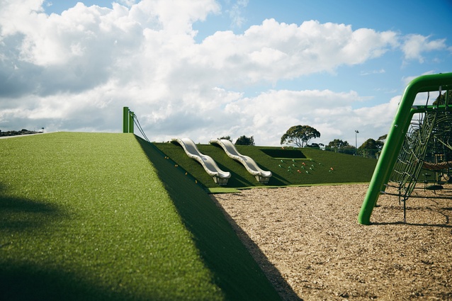
Within the context of the vast sports park, the relatively small footprint of the play space meant considerable thought was directed towards achieving an appropriate scale. As a result an earth mound was introduced to provide some containment, from the park itself, and from stray balls. “The earth mound, with its bold angular shapes, also performs a number of other functions; it shelters the space from the wind, provides play value and gives the space a distinctive edge and character,” Hamilton says.
Because the space has a northwest orientation, the mound buffers westerly winds while still allowing sun to penetrate the area.
“One of the main concerns we had was that the play space could feel a bit lost so we needed to bring it down to an intimate area and create a sub-space within the park.”
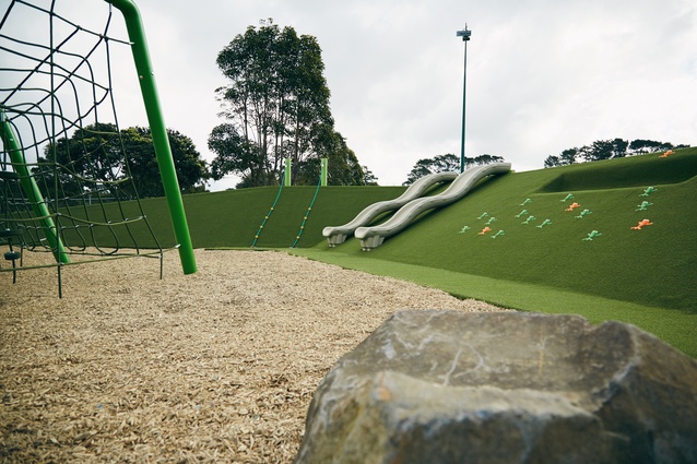
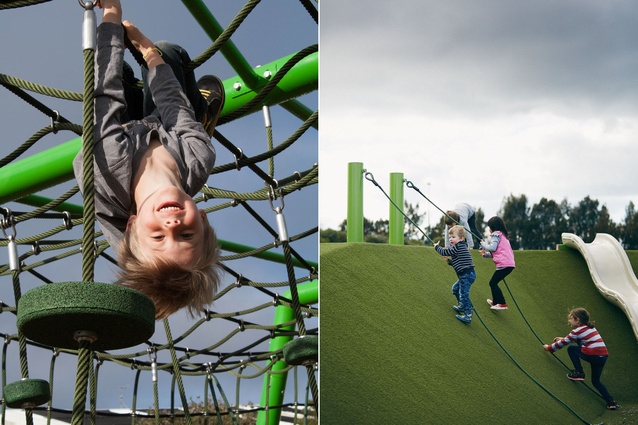
Each face of the mound has a different orientation and relationship to the surrounding landscape. While the northern slope offers casual embankment seating for viewing sports games, the western and eastern slopes offer access to the top plateau, which features in-ground trampolines. Slides run down the inward-facing slope, which also houses a small ‘cubby’ and rope climbers.
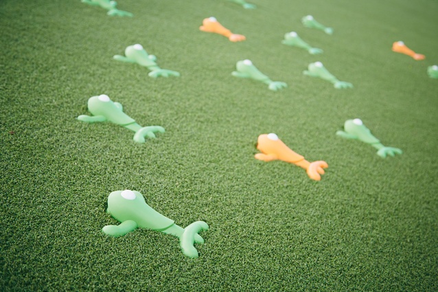
A chorus of ‘frogs’ in the form of rock-climbing grips was placed to appear as if hopping up the inward face, providing a hint of humour and bursts of colour; their orange and green hues pop out from the turfed surface.
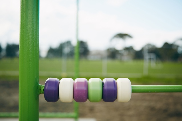
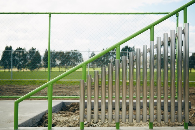
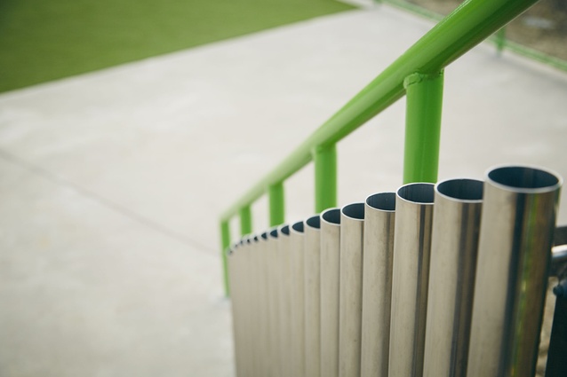
An initial requirement of the brief was fencing, an idea Hamilton resisted. Instead, the mound is used to separate the area from the playing fields. One small fence extends from one end of the mound, but it was designed to be interactive incorporating a xylophone and holes, which act as kicking targets.
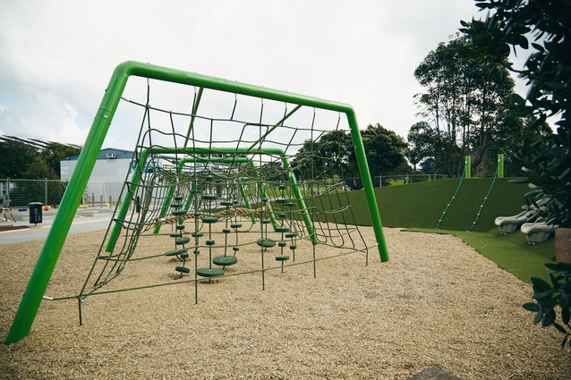
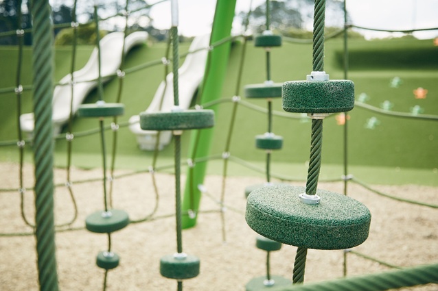
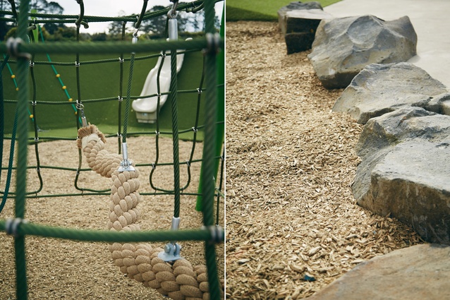
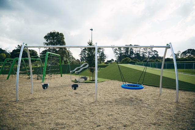
The main playscape is centred on a bespoke climbing net, which reinforces references to field sports. A series of tubular steel posts bent into the shape of soccer nets make up the frame, from which a net system is woven between. Also incorporating pommel swings and a rope swing, the net can cater for up to 30 children at one time, and aesthetically creates a striking visual centrepiece.
The mandatory set of swings sits adjacent to the net.
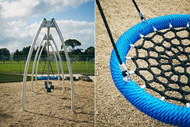
Due to budgetary constraints, a restrained colour and material palette was chosen. Informed by the surrounding fields, green is the signature colour. Bursts of orange and a lighter green hue – in the form of the rock-climbing grips – provide some contrast within the space. An orange stripe in the surrounding pavement pulls the tones together, while the blue birds nest rope swing and seating introducing a second sub-colour.
Interestingly, the blue bleacher seats were reclaimed from AMI Stadium in Christchurch and are still etched with their seat and row numbers. Stylised rock groupings, which mark the edges of the playscape, were taken from an adjoining carpark area that is to be upgraded in future.
Astro turf covers the mound, while engineered wood fibre covers the flat surface. Planting is minimal; vegetation is centred on a single Pohutukawa tree within the space, which is set to become a future landmark of the area. A planted swale at the car park interface manages storm water runoff and provides an additional element of separation for the play space.

