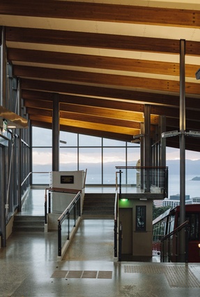
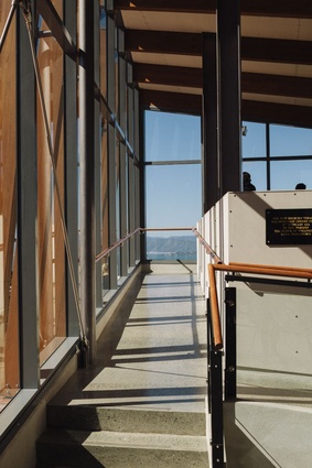
Kelburn Cable Car Terminus
Upon being invited to review Wellington’s new cable car terminus, I inadvertently leaked this news by email, text, tweet and a personal follow-up. The response was ominously non-committal. If I were to be completely honest, the reaction I wanted from colleagues was along the lines of, ‘Cor blimey, how fandiddlytastic for Architecture NZ and all those who sail through its pages’. But the sideways glances and mumbled exits took me by surprise. I may not be a regular Kelburn visitor (mercifully, that’s where my GP frets about my prostate) but it looked okay enough from a distance. So I met with Ric Slessor (of Bevin + Slessor) and, while he talked the walk, I thought to myself, yep, this really is okay.
So, why the hesitation from so many? The answer, I suspect, is a positive one with some negative consequence. As ‘creatives’, architects are tasked with finding imaginative solutions – innovation, if you will – to problems of the world. Little problems. Not, like, STOP POVERTY problems, more ‘make someone a bit poorer’ opportunities. But, unfortunately, architects aren’t so good at turning their imaginings off and this leads to a worrying tendency to read into every building; they see design scenarios for what might have been, rather than what is. I’m preaching to the converted here – you know what I mean – and I’m not about to criticise you for flexing your imaginations with the commissions of colleagues. But we do need to be mindful that
we don’t also judge a design in ignorance of the political battlefields that compromise the creative expression behind most buildings.

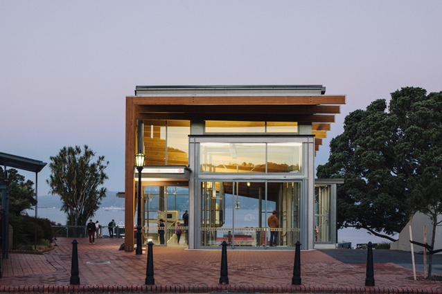
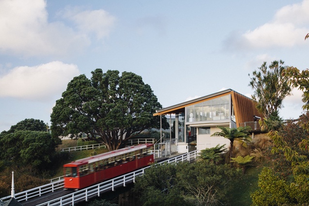
The cable car terminus is a case in point. For Wellingtonians, the cable car – or funicular (no joke) – is a precious icon designed specifically to convince all and sundry that travelling diagonally is perfectly normal (Is it a train? Is it a lift? No, it’s a cable car!). Terminating at the apex of the Botanic Garden, with the vista of Wellington below, it is one of those special sites-of-potential that makes extra demands on the imagination for what would/could/should be placed there. It is, in truth, a hopeless situation for the anointed architect. The very commission brings forth green ripples of dissatisfaction and not for the first time. Athfield had a go here, in the ’70s, with timber gothic canopies that welcomed Kelburnians home with a model for their colonial gable gentility. The interim stops of Clifton, Talavera and Salamanca retain their wooden umbrellas but, now, the Kelburn terminal looms large as a sharp, contemporary box (a reflection of the architectural modernisations going on in Kelburn?).
After a protracted gestation that included not one but two competitive stages, the completed terminus is an intelligent and robust solution to a difficult situation (by which I allude to the problems of site, brief and budget). Were we to anthropomorphise here, we might call her handsome or he distinguished: not beautiful, gorgeous, stunning or spectacular. No Scarlett Johansson or George Clooney: she or he is more a character actor, dignified and fit for purpose. In the untestable imaginary speculations that architects try out on completed buildings, it is that lack of pizzazz that they believe they could fix.
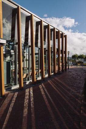
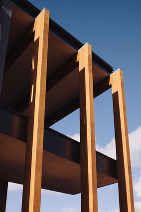
Critics (I am sure you realise) are worse by far. We don’t need to offer alternatives, just reproaches, so here goes… The ramping and steps to the upper viewing area compete with each other to the detriment of the circulation procession. The twisted animation of the glulam portals is too subtle to be read from afar, and yet they are also too aesthetically ‘weak’ to read well against the steel columns as a primary ordering system. The portals do have a progressive majesty but it could have been pushed further. For example, the formal ‘twist’ is articulated only off the end elevations, meaning that the dominant elevation addressing the Botanic Gardens is disappointingly predictable. Some movement here would have introduced an axial counterpoint to the dominant alignment to the city.
The mix of visible materials is a generally disconcerting aspect of the building: timber beams, steel columns, chunky aluminium joinery, glass and polished concrete shouts “commercial project” too loudly for my tastes. Yet, up close, the use of thin cement board is at odds with the broader commitment to material permanence. The glaring illustration here is the granite plaque proclaiming the opening of the new facility by Wellington’s mayor. In lieu of any other surface option, it has been disconcertingly screw-fixed to cement board in a decision that challenges the robustness of public buildings, even if it does say so much about the artifice of public office.
I could go on pointing out weaknesses but, you know what, I made two visits for the purpose of reviewing and on both occasions I was the only person there who gave even the slightest shiitake mushroom about these things. These micro-travellers spewed out of the terminal, digital cameras and takeaway lattes pointing everywhere but back and, in that, is an important lesson in architectural humility: buildings aren’t made only to be looked at. Like children, they are made as instruments of our ambition. The problem for architects is that the instrument can become our ambition which, in turn, can lead to projected aspirations for what could have been, if only.
Easily ignored in these imaginings are the responsibilities to the end user, of which the cable car has two distinct varieties. One is the regular commuter who starts in Kelburn and rides down to the Hades of Lambton Quay. The other is the irregular visitor who starts in Lambton Quay and is lifted to the righteous heights of Saint Kelburn. Neither party on this heaven-and-hell escalator needs care particularly for the ‘Architecture’ beyond environmental requirements to stay dry and not be swept into the view by an unfortunately energetic southerly. And, for both groups, the ever-so-slightly 1999-ness of the terminus is deceptively clever. For the tourist,
it reflects the common visitor practice of scaling the tallest tower for a photo opportunity. For the office worker, it is the first in a series of shiny foyers that define corporate life. The strength of this building lies in recognising that the architecture of the Kelburn terminus shouldn’t
compete with the psychological delight of riding the funicular.
Which brings me to another, smaller, client group and, to find out the view of this stakeholder, I took my six-year-old along for his opinion.
“What do you think of that, Boy? And make it good, I’m going to write it down.”
“It’s good.”
Okay, ‘good’ it’s going to be.
Then we went for ice cream.
Watch Simon Wilson’s film about the Kelburn Cable Car Terminus, produced in association with Architecture NZ here.

