A cosy getaway: Killora Bay
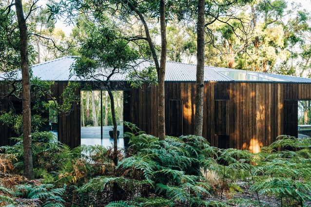
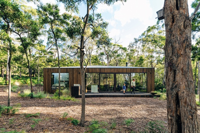
On Tasmania’s North Bruny, in an area populated by white gums and stands of grass trees, this holiday home for a young family serves as an elegant living platform that offers many ways to enjoy its bush setting.
Sometimes a bush site can present an unanticipated challenge – a place where you might do anything. Days can be spent just siting a structure, let alone planning it. But Killora Bay, designed by Lara Maeseele in association with Tanner Architects on a North Bruny site zoned with tight environmental parameters, presented anything but an open brief. Lara, a Belgian national trained to work in tight urban contexts, relished the challenge. Tim Watson, Lara’s husband and a structural engineer, joined her in this quest; in between salaried roles and raising a family, they also built much of the project together, fulfilling a dream of Tim’s to build a family shack just as his dad had done.
North Bruny is the quieter, less tourist-focused end of Bruny Island, a popular spot off the south-east coast of Tasmania. The site for the small holiday home is on the island’s western side, facing Hobart. It’s one of a string of sites in the area that steeply rises above the waterline, offering the best of Bruny: a quiet, relatively level pad for the home, a landscape of eucalypts and low scrub and a private path leading down to a pristine bay.
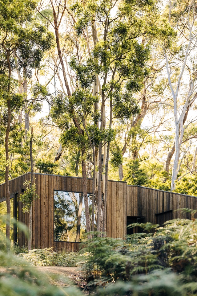
Environmental, energy and bushfire controls prescribed a long list of dos and don’ts, including an 18-metre-diameter circle that defined the only available site for permanent structures. There were many other parameters, some relating to visual impact, with wording such as, “Must not have more than four square metres of the same cladding material on any external wall.” Adding to the challenge, the site is also a haven for the forty-spotted pardalote, one of Australia’s rarest birds.
The trapezoid-like plan of the house responds to the prescribed building circle, with angles used to maximize the footprint. Even within this small plan, zoning has been used to support multiple configurations. The dwelling areas are in two primary zones, split by a generous deck and foyer that runs east–west. On one side are the children’s bedroom, playroom and bathroom, and on the other are the main bedroom, bathroom and open-plan kitchen, living and dining space. Within these primary zones are further divisions. A sizeable sliding door allows the main bedroom and living areas to be closed down when Tim’s parents stay on their own, while a fold-down bed in the playroom accommodates guests as needed. Steps down into the living areas also provide a sense of separation from the sleeping areas. Volumetrically, priority is given to living, storage and foyer spaces, with all other rooms deliberately modest. Steps, sills and built-in joinery increase the surfaces for living, maximizing places for play and offering impromptu tables or seats.
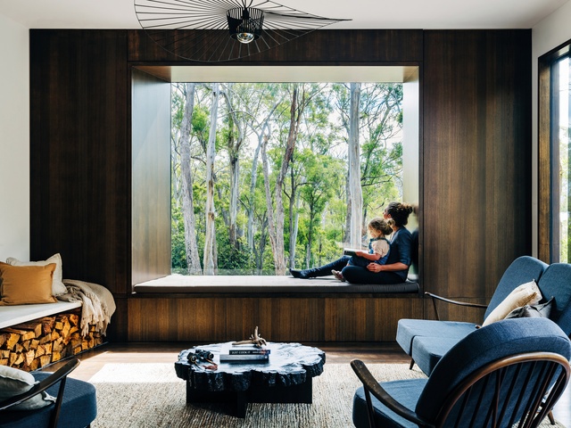
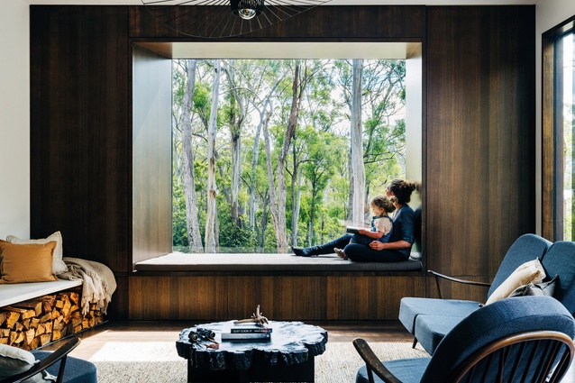
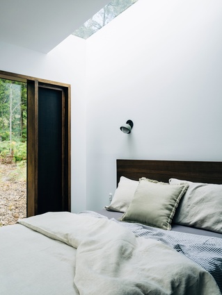
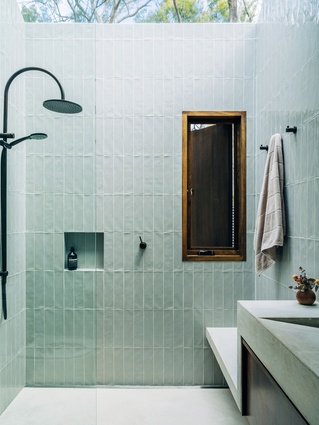
Wall openings and glazed panels bring the dwelling to life. A fixed, frameless pane at the eastern end of the foyer looks to the surrounding bushland, offering arriving visitors an immediate connection to this place. A large window in the living space frames the vista through to the bay, and generous skylights connect the bathroom with the continually moving tree canopy. Sliding glazing in the playroom and living room allows views and direct connections between the indoor and outdoor spaces. These connections are practical, allowing parents to keep an eye on kids, but they are also architecturally enjoyable: moving through the home, there are continuous sensory links to place. These connections fulfill Tim and Lara’s desire to feel like they are living outside.

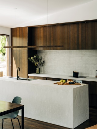
The material palette creates consistency and simplicity for the home. Shiplap vertical cladding wraps all elevations. Lara has cleverly worked with the visual assessment requirements by reducing the size of any one elevation and demonstrating that the variability of the walnut-stained timber is an alternative to using different cladding materials. The bushfire requirements have been followed in a way that supports the aesthetic consistency of the exterior – the downpipes are concealed, and the cladding to the underfloor spaces closely follows the ground line. The stain of the cladding continues into the Tasmanian oak flooring, providing a dark surface that hides the inevitable influx of sand. Concrete is used as a contrasting, cost-effective and hardwearing material for the kitchen bench, bathroom floors and vanities.
Killora Bay is a labour of love, involving five years of design and hard work. Every decision has been rigorously considered, each one requiring lateral thought. Visual impact is low, bird habitat is retained and bushfire risk is reduced. Yet the outcome doesn’t feel like a building envelope that has been pushed and pulled by rules. Instead, it is an elegant living platform in the bush that offers many ways to enjoy the environment – to easily come and go with room to store holiday gear; to quietly sit by a window and look out to the water; to follow the sun, shade or wind around the home, always having a place to sit or play. The house can be cosy for two people or expansive for several families. The scene is set for a second generation of family memories.
This article first appeared in the June 2021 issue of Houses (Australia) and was first published online at architectureau.com.
Project credits
Designer: Lara Maeseele
Project team: Lara Maeseele, Tim Watson
Architect: Stuart Tanner Architects
Consultants
Builder: Driftwood Workshop and Tim Watson
Engineer: Aldanmark Consulting Engineers
Aboriginal Nation
Killora Bay is built on the land of the Nuenonne people.

