Kindred spirit: Belmont House
Informed by the memories of the original house, this alteration and addition sets the stage for family life, providing opportunities for both connection and privacy.
Rachel Nolan of Kennedy Nolan starts her story of this alteration and addition with the description of a meeting. Not with her clients, but with the elderly couple from whom they’d just bought the house. “We were charmed by them,” says Rachel, “and we were struck by the strong sense of their personalities, which they had so clearly imprinted on the house. It felt warm with memory.”
The couple had lived in the old Victorian home on a leafy street in Melbourne’s Kew for decades, first with a growing family and then by themselves. The house had been a stage set for these many years of life, but in turn, their years of life had been marked on the house, through incremental renovations and the accumulation of furniture and objects.
The significance Rachel places on this meeting speaks directly to the distinction between house and home, a central concern for architects designing buildings that are not just to live in (or to be sold at a profit), but where their clients’ lives will unfold over years and, potentially, decades. At this project in Melbourne’s Kew, Kennedy Nolan’s role was to create an environment where this lifecycle of home would begin again, for their clients’ family.
The home they designed comprises three sections: an adult’s zone at the front of the old house, a communal living zone in the middle and the kids’ domain at the rear. Each zone feels quite distinct, yet they flow into each other in a way that encourages exploration and interaction.
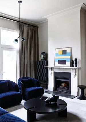
The adult’s section is something of a parents’ sanctuary, with a lounge room that is formal but also very warm and comfortable. There’s soft grey carpet underfoot, and a lounge and armchairs upholstered in quilted velour, but also an upright piano, making this front room a place for kids’ piano practice as much as parents’ quiet time.
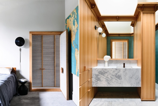
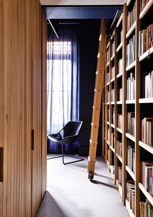
A wide doorway leads through to the main bedroom, again hinting at a desire for family connection. And a semicircular mirror above the doorway creates an optical illusion that reinforces the feeling of openness – you have to look twice to check that it isn’t a window. A study, accessed via a narrow hallway, is the only explicitly private space in the house. It’s a room for working and, judging by the wall of books, reading too.
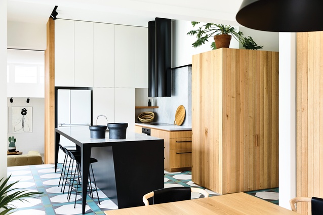
Deeper into the house, the grey carpet gives way to beautiful large-format porcelain tiles in a geometrical pattern of black, white and green, which demarcate the central dining and kitchen zone. Natural light washes in from east- and north-facing windows, amplifying the sense of contrast to, and transition from, the older part of the home.
The geometric theme of the tiles is echoed in the neat composition of the kitchen, a carefully arranged presentation of white cabinet doors, Victorian ash veneer joinery, timber lining boards, an angular black steel island bench topped with white natural stone, twin black cylindrical rangehoods and natural stone splashbacks. A timber-clad nook houses a secondary meal preparation area; the walls here rise up to a vaulted ceiling, creating an ambience reminiscent of a tiny chapel.

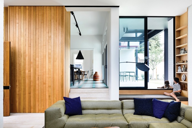
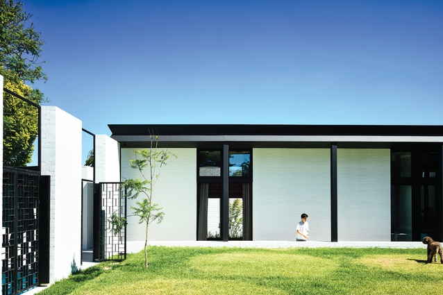
From the kitchen, the floor steps down to the lounge room, roughly square in shape, which occupies the elbow in the house’s L-shaped plan. The room can be accessed directly from the front yard via a secondary door to the right of the main entrance.
There’s a fireplace, a TV concealed by joinery and a large modular lounge, and it’s easy to imagine the kids running in through the side door after school, and later, the entire family coming together on the lounge at the end of a busy day.

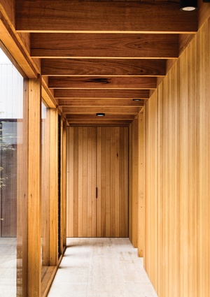
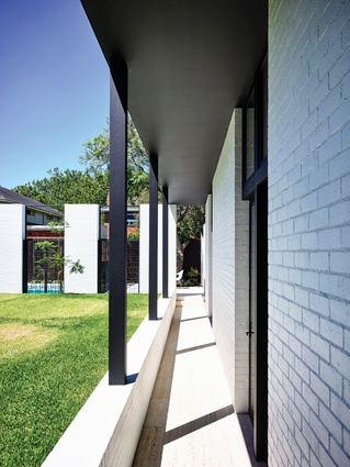
With the drop in floor level to the lounge room, the floor surface changes again, to travertine tiles, and these continue through to the kids’ bedrooms at the rear of the house. The bedrooms line up along the southern boundary, creating a discrete wing to the residence, each room having its own mini-mezzanine as well as a door out to an external walkway that sits below the level of the lawn.
On a summer’s evening it must be the best place for the kids to hang out, with siblings and friends perched on the retaining wall to the lawn, or legs dangling off the edge of the mezzanines, resting between dips in the pool at the bottom of the yard.
But then this house has so many distinct spaces suited to different kinds of occupation, some aligned with traditional room functions, others more spontaneous. There are changes in materiality, ceiling height and floor level, myriad places to be quiet or to come together, pass through or linger. The house is once again a stage set for everyday family life, where everyone can find their place at any time, the building interwoven with lived experience.
This article was first published in ArchitectureAU.com.

