Urbane ambition: King Bill
A collage of the textures and colours of Fitzroy’s built history, this playful addition to an 1850s terrace by Austin Maynard Architects aims to ‘give something back’ by creating a lush oasis in the heart of the inner city.
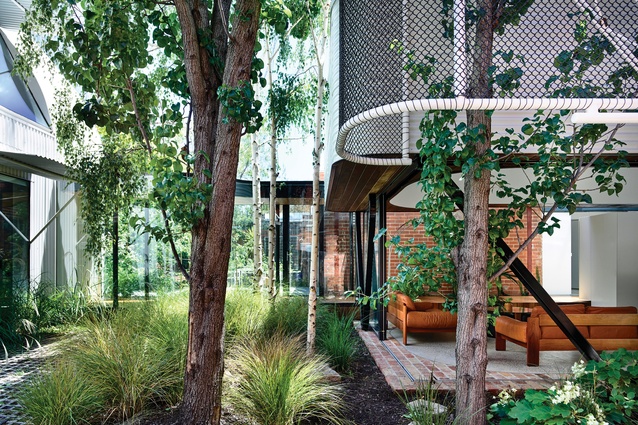
Several exceptional elements coalesced in this project: clients who had lived in Fitzroy, Melbourne, for a long time and loved the neighbourhood’s texture and colour; civic-minded architects with a talent for inventive urban design; and a structurally sound 1850s Victorian terrace abutting that most elusive of creatures, an empty parcel of land in the inner city (well, empty save for a stand of lovely silver birch and ornamental pear trees).
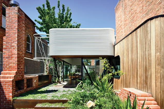
“The clients said from day one that they wanted to give something back; there’s something really urban and generous in that,” says Andrew Maynard, director of Austin Maynard Architects. The concept was singular in its approach – a glass pavilion, connected to the original terrace and surrounded by garden, in tribute to the pocket parks scattered in the surrounding backstreets. (The initial concept included a perforated street frontage that would share the garden with passers-by. Alas, council-wrangling stymied that transparency, and the house retains instead its charmingly graffitied corrugated fence.)
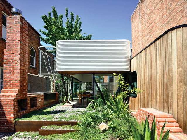
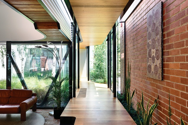
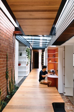
Beyond a timber entry pod, a glass-ceilinged corridor joins the terrace to the pavilion. Holes punched in the eastern wall of the original residence connect the two volumes. “It was really nice to do a new bit of architecture next to an old bit of architecture and have the circulation being the separation between the two,” Andrew explains.
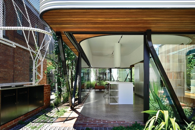
The pavilion houses an open-plan dining, kitchen and living zone. At each corner, glass panels slide back completely to bring in the garden. Between the circulation spine and the kitchen, a double-sided bank of joinery houses appliances on one side and an array of storage on the other, including a neat enclosed desk for quotidian administration.
“When we think about these spaces, we think about the stuff that ends up on the dining table – we make sure it has a home,” Andrew says. “When new clients meet us they’re always surprised by how much we talk about the really boring stuff – kitchens, laundries, storage.”
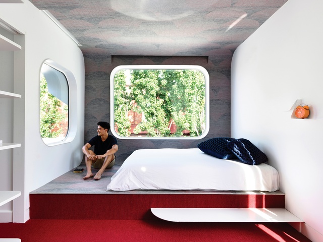
The lower level of the terrace was reconfigured and the upper level was given over to the kids. Between their two bedrooms, an open space – “a demilitarized zone,” Andrew cheerfully calls it – provides a double-sided partners desk and abundant storage. Hinged hatches in the walls enable inter-sibling communication.
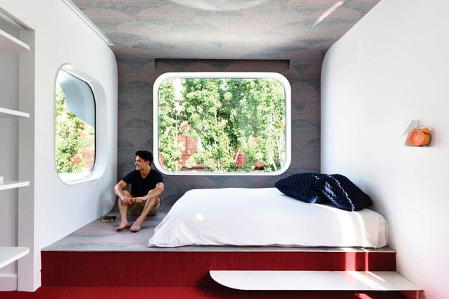
The second bedroom at the rear was an addition, popping out over the title line. “It’s almost a little beacon to the street, which hints at what is happening with the rest of the place,” Andrew says. This cantilevered portion houses a platform bed with round-cornered windows on two sides.
When it came to designing the pavilion, the first iteration was neat and rectilinear, except for a few manoeuvres to accommodate the quirks of the title. However, at the client’s request, the architects incorporated curved elements that characterized some of their previous work, including the Mash House.
The introduction of curves also guided the project’s materiality. “We had been looking at the standard rolls of Colorbond – in the eighties, lots of Australian architects were exploring the standing curvatures of the material. So we started piecing together the design. We knew it would be cost-effective and would have longevity,” Andrew says.
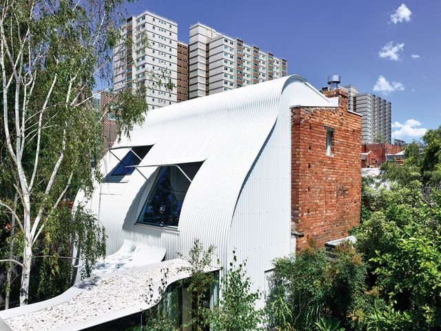
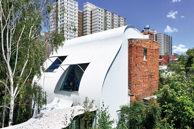
Curving Colorbond steel became a key part of the project’s design language. It encases the drum-like upper portion of the pavilion and the pop-out bedroom appended to the terrace. But perhaps its most striking application is the former stable at the back of the property. Here, its sinuous ripples rise up two floors and over the roof, punctured only by scooped awnings that shield the windows.

Within the old stable, a study/library at ground level peers back toward the main house through a grove of birch trunks and low shrubs. It is a serene spot. “They wanted a separation from the rest of the house,” explains Mark Austin, the other director of Austin Maynard Architects. “There’s a visual connection across the garden, but it’s also private.”
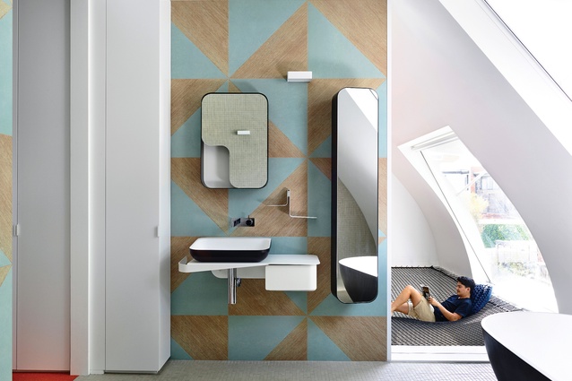
Alongside is a garage with a car stacker and, above, the parents’ bedroom, walk-in robe and ensuite. While the bedroom is a mezzanine, instead of having an open void, a heavyweight net hangs over the space below. It is playful and whimsical, the perfect spot to look out to the tree canopy and back to the terrace. “One of the great things about this spot is that you can see the curve of the wall all the way up into the roof,” Mark notes.
Quirky alignment of the stables with the terrace demanded an inventive approach. A curving linkage slinks back to the house proper, its timber floor kinking to follow the swoop of its glass walls and align with the circulation spine beyond. Like the study/library, it affords an intimate connection with the gardens on either side.
The architects are proud of having retained all the trees that shield the site from the driveway along its eastern edge. To offer the pavilion some privacy, an intricate system of lightweight trusses stretches along its perimeter. The chain-link sections will eventually be covered in greenery, creating a lush vertical oasis in the heart of the inner city.
This article was first published on architectureau.com

