Kiwibank
There is something slightly quaint about bank branches and post offices. They evoke, among other things, the retiree clutching stamp books and accountants making transactions that Generation Y can conjure up in seconds and at the swipe of an overworked thumb.
Yet it is not only the digital revolution that is ruffling the petticoats of these classic institutions. According to some of the leading global professional services firms, demographic changes, customer expectations, economics, and rapid urbanisation are some of the elements conspiring against these retail bastions of trust and bureaucratic solidity. “Banks need to get ahead of these challenges and retool to win… They need to rebuild their organisations around the customer, simplify and structurally reduce cost,” is one of PwC’s edicts from a recent report on the future of the industry.
At a more local level, Statistics New Zealand reports that the number of articles posted annually has dropped by over 200,000 pieces between 1999 and 2011. They also say that “almost three-quarters of recent Internet users have opted for the virtual banking experience”.
Put both of these rapidly changing businesses under one roof (as is the case with Kiwibank and the New Zealand Post) and you have retail spaces that are ripe for an obituary or strategic
re-invention.
It seems the latter is forthcoming.
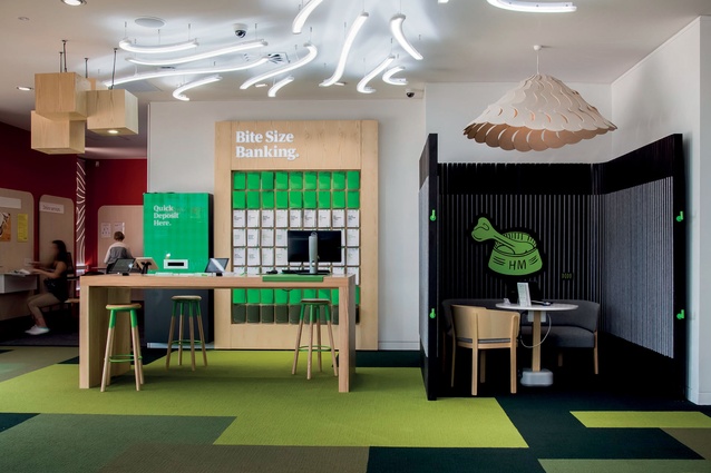
In 2011, Designworks, an Auckland-based firm that had been involved with Kiwibank since its inception, was tasked by the New Zealand Post Group to reshape its branches. The brief sought mainly to create further differentiation between the two neighbouring businesses through a spatial rethink.
The aim was to imagine the future cohabitation of these institutions while keeping in mind the nature of the industry’s evolution.
Yet, the question remains: why invest in bricks and mortar when pixels seem to be the piggy bank of choice of the new generation?
“While internet banking and mobile apps fulfil many customers’ day-to-day needs of checking balances and moving money around, sometimes people have needs that warrant conversations,” says Regan Savage, Head of Marketing and Content at Kiwibank. He mentions home loans and financial advice as reasons to unplug but also admits that the purpose of the physical branch is changing: “what we generally see in banking is that customers, when given another channel, continue to use the old ones as well but at different times”.
One of the initial steps for Designworks included putting together a test site in Wellington and populating it with cardboard versions of meeting areas, counters and other bank furniture. The pieces were pliable enough that basic ergonomics and positioning could be modelled and changed quickly and inexpensively before further, hi-tech versions needed to be prototyped. Analyses of customer flows and needs and how various spaces were being used played a critical role in this user-centred redesign.
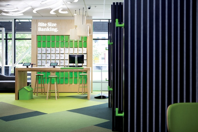
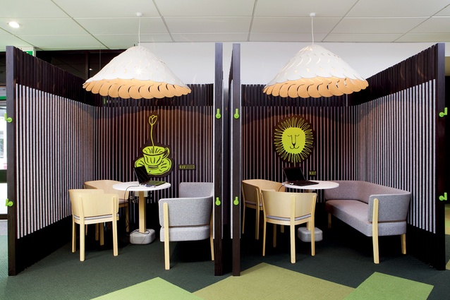
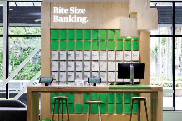
The design firm also understood that sees retail spaces are more than just distribution network for products and services, but places for human interaction. The creation of spaces for “comfortable conversations”, was one of the main drivers of the design concept. “Counter heights, orientation of meeting rooms, signage, lighting… they all seek comfort and relaxation,” says Designwork’s Group Head of Spatial Design Clark Pritchard.
For the nascent bank, the need to make its presence felt and eke out a recognisable personality was also part of the design context. Paul Johnson, who worked with Designworks on this project, speaks of the bank’s branding position at the time: “Kiwibank had one of the most loved brands in the country and our challenge was to retain that likeability but work on the credibility.” He says they were dealing with a retail store where people wanting to “speak to someone about a mortgage had to wait in line behind someone wanting to buy a stamp” and that needed to change.
However, one of the obvious and perhaps most immediate brand assets was the imbedded emotional power of its nationality. The ‘Made in New Zealand’ motto has pushed many an institution to try and incorporate larger themes of nationhood and patriotism into its discourse. Yet, the translation of a national identity into a corporate design persona is a path fraught with as many dangers (a fall into cliché or kitsch) as it is with potential rewards. “We needed to translate ‘Kiwiness’ into something progressive, something that celebrated success,” continues Johnson, “something that didn’t go for the usual buzzy bees and gumboots.”
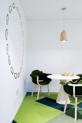
To accomplish this subtler form of Kiwiana, Designworks in collaboration with furniture firm Backhouse, used what is probably the sharpest tool in this redesign’s shed. Clark Pritchard collated a list of some of the top 15 furniture and light designers in the country. From there, he and Gary Backhouse shortlisted five (see interviews with all five designers in the upcoming pages) who they thought would work well together and set out to create a look for the branches (a variation of this range is sold to the public by Backhouse). The project put together veteran and promising design talent towards the creation of an intrinsically Kiwi look and walked them through the entire process of creating such product. Although the whole range was imagined and devised in record time (six months), Gary Backhouse says some of the best rewards were: “the collaborative and mentoring experience. [It was] great to watch the five designers critique each other’s work and offer advice on resolving design and manufacturing problems. You just don’t get to experience that every day.” The result is soft, palpable, natural materials and light woods. There are subtle evocations of rural landscapes and fauna (on carpets, sofas and a fantail shade). One encounters lightly humorous allusions to popular culture (popsicle sticks, concrete umbrella stands) and decorative hat-tippings to successful locals (Margaret Mahy, Ernest Rutherford). Although there were five very distinct creators behind the range, the result feels cohesive, united by materials and a common aim.
Will the resulting design revolutionise local retail banking? Regan says the proportion of “highly satisfied costumers” in their test branches (Auckland’s North Shore and the Kapiti Coast) is up 20 per cent vs a comparison set of stores. From a commercial perspective the bank has seen increases in lending and deposits of over 40 per cent vs the comparison set. How much of this is due to beautiful furniture and an inviting enviromment is up for debate… but, as Gary Backhouse says, “the process was unique for this country”.

