Kiwirail by Warren and Mahoney
This colourful fit-out derives its visual features from aspects of rolling stock and other railroad-related devices.
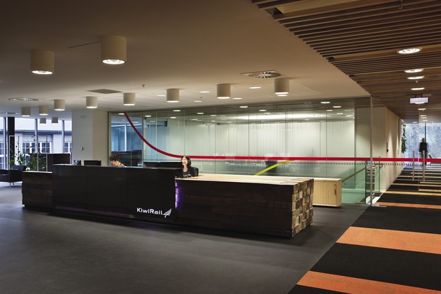
A stack of railway sleepers forms part of the reception desk at KiwiRail; if the name didn’t already give it away, from that moment on there’s little confusion about what industry this company is in. This office is in the Slider Building, Parnell, designed, as was this fit-out, by Warren and Mahoney. The building is distinctive – a cantilevered form that fits neatly with the scale of the surrounding buildings. The fit-out is distinctive too. For one, there’s a generosity of space that makes one hope that the floorplate size might relate to a growth of rail infrastructure; secondly, it’s bright, bold and colourful.
KiwiRail occupies the second and third floors of the building. As it often is, a driver for the project was consolidation, with three separate KiwiRail offices conjoined into this one location.

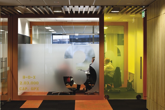
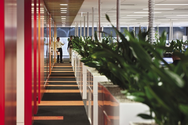
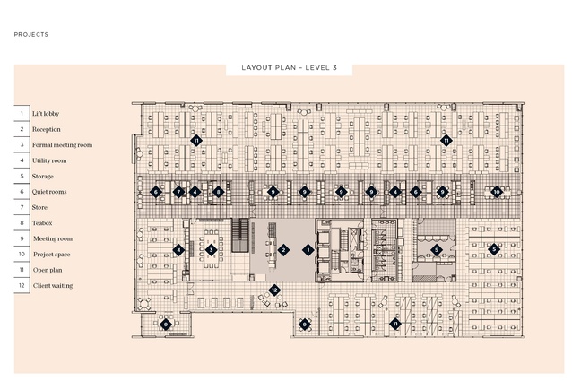
Both levels of the office, which accommodates 300 people, work around a clever device: a colourful linear spine runs across the breadth of each level. These are, at once, an unmissable navigation device, a collection of meeting and utility spaces and an expression of a design metaphor that starts out as abstract but becomes more literal as you spend more time with it. At first the blasts of colour seem unrelated, but, as designer Libby Haseldon explains, the colours represent the blur that you might experience if sitting at a level crossing watching a train thunder past. Look a little closer and you’ll notice that some of the rooms aligned on the spine have rolling-stock-referencing motifs: stencilled text, rolling doors, metal framing… ah, the penny drops.
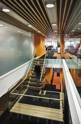
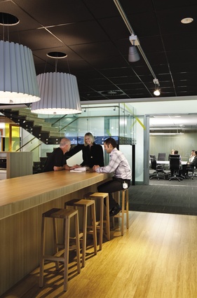
The spine, which houses at intervals ‘box car’ meeting rooms, ‘teabox’ kitchen spaces, generous utility rooms and those typically unused but nice-to-have-anyway quiet rooms, is a “natural buffer between public and private zones without visually separating the two areas,” says Haseldon. Each floor’s spine connects via a large void and stairway which provides the vertical circulation and visual interaction between floors. The colour of each spine also leaks out horizontally into other areas in a slow diffusion of colour. For ease of access and to encourage use, says Haseldon, the communal breakout spaces are in prime positions, connected to the stair zone with views to the building atrium and Stanley Street, so providing relief from open-plan working areas and an opportunity for informal interaction. High-backed seating in such areas brings to mind carriage seating of the trains of yore, and offer an opportunity for a casual, private conversation. A few relics from the good old days of rail dot the space as well, including a rather impressive control panel from a train.
The design intention at KiwiRail is clear, and the designers have done a good job of taking their cues without getting bogged down in twee. Rail has a long, mixed history in New Zealand. If a fit-out can be taken as a sign or symbol of intent, then perhaps it augurs well for rail.

