High Street Law
Never underestimate the unifying power of a quality piece of custom-made furniture. For evidence, look no further than the clean-lines of this concise office space.
Jose Gutierrez is fast becoming the goto architect for spatially challenged inner city spaces. His latest project, an office for a tax lawyer in the heritage 35 High Street building, is on the floor downstairs from his practice and upstairs from The Research Agency, for which the architect received a Best Award last year. Like that fit-out, the new office had its challenges. “The space was similar, a little unloved, you might say,” says Gutierrez. “The plan is basically a square, with windows on two sides, and a big column right in the middle. But because of my experience with the building, I knew what I was in for and what to look out for.”
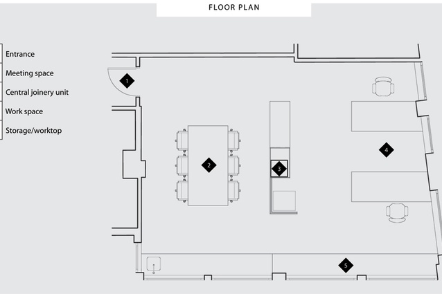
Like many from its era, 35 High Street’s lofty stud and deep-set casement windows give it a head start in the charm department. On the downside, the building has been pretty badly neglected over the course of its life, floor plans can be awkward and the all concrete environment gives it a booming echo. “Good acoustics are something that really help people appreciate good architecture,” says Gutierrez. Installing near invisible acoustic ceiling panels was the first step to making the office feel more personable. The client also wanted to establish two distinct areas within the 60 m2 space: a working side and a meeting side, the first private, the second public. “My first thoughts were that the last thing I wanted to do was put up a big wall — that would kill it,” says Gutierrez. “But I didn’t want to build a half-height unit with a column sticking out of it either.” With two large desks, a kitchenette and a very large printer to also take into consideration as well, floor area was filling up fast before the architect even began.
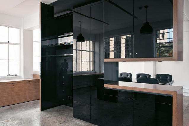
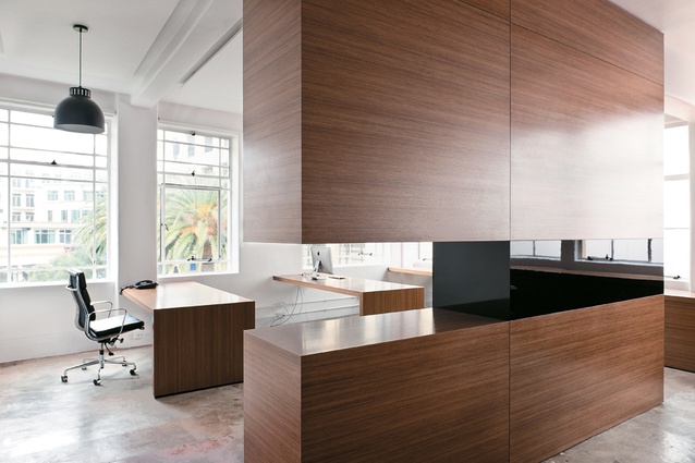
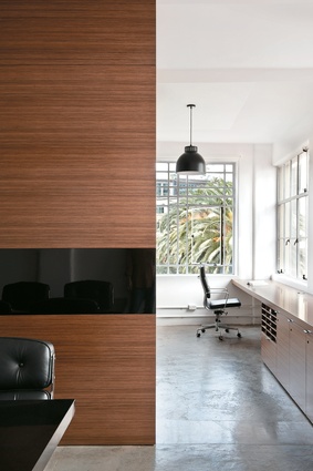
The brief also called for a certain seriousness in aesthetic terms: “[The client] had seen The Research Agency and liked it, and he didn’t want a stereotypical lawyer’s office filled with stuffy old books, but he did have to factor in what his clients expected.” Gutierrez turned the problematic centre column to the room’s advantage by building it into the room division. It now doubles as a piece of utilitarian sculpture that houses the printer, file storage and hanging space for suits, with a cut-out that lets the light through and gives it a less weighty presence in the room. Seen from the door and public meeting area, the interior furniture is clad in reconditioned walnut veneer — a modern take on traditional wood panelling. On the window side, the centre unit is coated in a high-gloss black lacquer, a visual trick that adds a contemporary edge not necessarily on view to clients, but which also bounces natural light around the room. “Everything has a place and all of the furniture is bespoke for the client,” says Gutierrez. “The way I design is just a thorough process to make everything as rational as possible — once you have that right you can’t go wrong. The rest is just aesthetics.”


