Layer by layer: Concrete House
Made of timber, stone and steel, and topped with concrete, this rectilinear house by Matt Gibson Architecture and Design is the result of exceptional integration and interaction between layers.
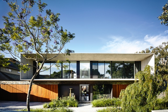
To describe this new house, designed by Matt Gibson Architecture and Design and located in bayside Melbourne, is an exercise in the careful use of adjectives and qualification. For to speak solely of the materials as we see them from the street – stacked stone, blackbutt timber, black steel, glass, lots of concrete – is to risk conjuring mental images of something massive, monolithic, possibly austere.
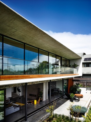
But in the hands of this practice, these materials have been used to achieve a very different effect, as you can surely see in the photographs accompanying this review. The timber-and-stone-clad lower level recedes among the shadows of the front garden; this part of the facade is wonderfully textured, with the black-steel-shrouded entry providing a central focal point. But what really catches the eyes of passers-by is the upper level. Essentially a concrete frame to a wall of glass, it’s large and rectilinear but certainly not massive or monolithic, flaring outwards like some elegant aperture for observing the outside world.
The surprising lightness of the upper level is largely a result of the concrete’s wide, flat profile and artfully tapered edges – it narrows from a four-hundred-millimetre-thick wall to one-hundred-millimetre-thick rounded edges at the front. This combination of materiality and execution explicitly represents the architect’s synthesis of his clients’ brief: they wanted a home imbued with a mid-century modernist sensibility, and concrete was to be a key building material. The brief led director Matt Gibson and his team to consider the work of Oscar Niemeyer and a selection of his acolytes, but the finished design, while clearly imbued with some of that spirit, is more modern than modernist, and certainly more Australian than Brazilian.

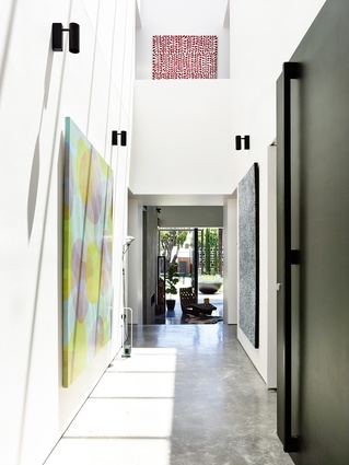
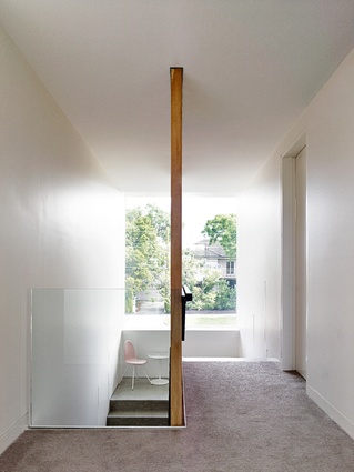
Although the house looks from the outside as though it is clearly separated into two levels, inside the relationship between lower and upper levels is far less binary. Passing through the black front door, visitors are delivered into a double-height lobby that feels as much like a gallery as it does a residential entrance. The white walls are hung with paintings and awash with sunlight coming in through roof windows, and a short balcony provides a glimpse of a walkway between upstairs bedrooms.
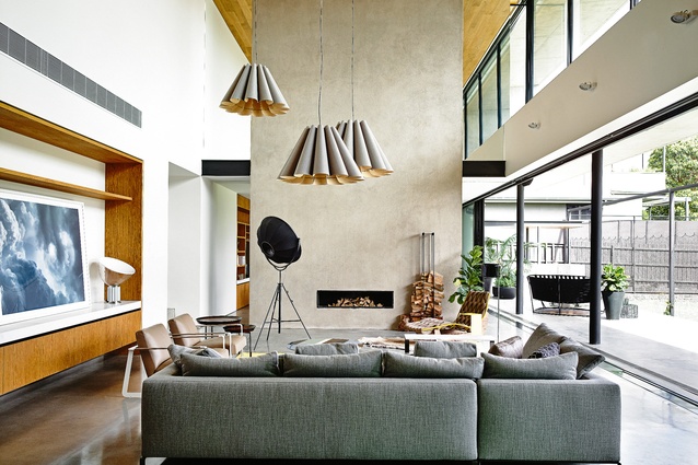
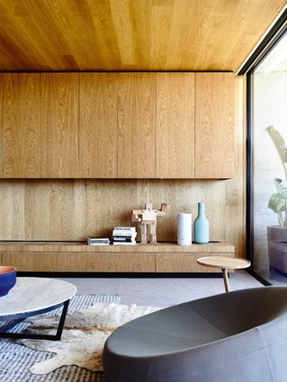
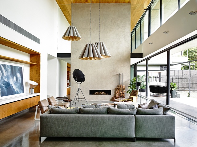
A few steps further into the house, the ceiling height lowers before opening out again into another double-height space, this one much more expansive, with living, dining and kitchen areas, and concealable sliding glass panels that open out to the north-facing rear garden and the pool and cabana beyond. It’s a lofty space made all the more airy thanks to its direct connection to the outdoors, and the subtle palette of white plaster walls, polished concrete floors and oak-panelled ceiling does little to distract from the outward view. Materials and colours have been chosen as a subtle backdrop to the clients’ daily life as well as to their art collection.
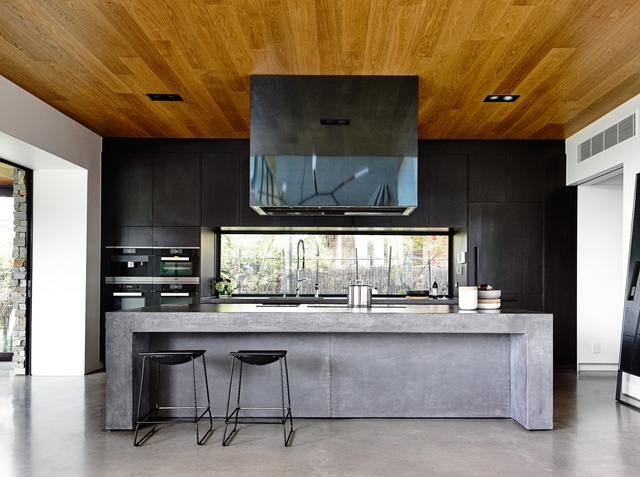
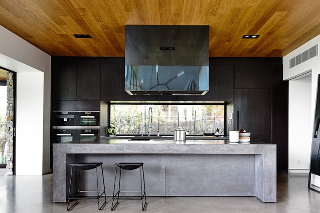
At the western end of this rear section of the house, behind the fireplace, a single-height space is used as a formal living room, complete with a grand piano. At the eastern end, the open living area flows into a sleek black kitchen that also has a lower ceiling. And so it seems that almost every transition from one space to another is marked by this change in ceiling height, the sense of containment or openness matched to the function of each zone and, I imagine, to individual moods on any given day (it makes sense – sometimes you want to stretch out and breathe in the open air and other times you just want to be cosy). Walking through the house becomes a journey of contrasting feelings, the experiential flux of compression and release mastered by Frank Lloyd Wright and many since.
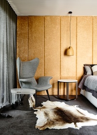
Upstairs, there’s a retreat for the clients’ kids that looks out over the back garden, while the front half of the house is left aside for sleeping quarters – the kids’ upstairs and parents’ down. The main bedroom on the ground floor is afforded an extra touch of luxury, with a leather-clad wall behind the bed, plush carpet and a sanctuary-like series of spaces comprising a walk-in robe, ensuite and light well. Like every other room in the house, the bedrooms enjoy generous views out to a garden. The outlook from the main bedroom is filtered through the leafy plantings of the front yard, while the kids get to look out to the world through the great concrete aperture above.
Matt describes the house as a kind of layered cake. From the outside looking in, you can see what he means – there’s the base, comprised of timber and stone and steel, and the concrete on top. But it takes only a quick peek inside to see that it would take an exceptional pastry chef to make a cake with the level of integration and interaction between layers that has been achieved here. And for the people who get to live their lives in this home, that’s sweet reward.

